Thursday, January 31, 2008

MIA

Man, it's been a rough week, computer-wise. My old machine is gradually losing its fight with entropy, and is spiralling down towards complete electronic oblivion. *sigh*

I've also been working on a submission for The Little Dreamer Designs' Apprentice program. I've come up with a pack of 3 papers and 3 elements, and am pleased with most everything except one of the elements, which I have plenty of time to work on, as the final deadline isn't even until February 29th... I can't imagine how many submissions they'll have to wade through--seems like a lot of work to me! But it's wonderful practice, even if it takes me forever, and it's a terrific opportunity to break into the selling portion of digiscrapping. I mean, if I'm going to spend this kind of time on something, it really should have some revenue attached to it...

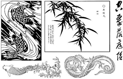
Also, the Year of the Ox (2009) and Year of the Tiger (2010) sheets will be out in February. I'm working on a floral/faunal sheet next. I've discovered some really cool tricks doing the digiscrapping that I can apply to the rubber stamp designing, even though designing for rubber stamps requires that you work in 600 dpi, and only 2 colors, black and white (no grayscale). Makes shading much more difficult, since also anything smaller than about 5 pixels wide tends to disappear, or merge with neighboring lines. But I think I've managed a workaround...

Couple of things about recent layouts that I learned or liked:

Heather Taylor, 'Dirt's the Best'
(Click for credits)

I like how those flowers in the background turned out--reminded me of Helena Jole's beautiful potato prints (heck, I tried to find the exact post where she explains how to do it, but I can't find it). I also used another of my crazy backgrounds--this one was black embossing powder over Versamark that I just randomly swiped over a piece of cardstock... btw, helps if you cut your cardstock to 8x8 before you get started (so it'll fit on a standard scanner bed). On the other hand, for textures, you can easily just stretch your 8.5 x 11" background to 12x12 -- nobody's going to know how it really started out!

I just finished this layout for both the White challenge at Little Dreamer Designs and the Just My Type challenge at Designer Digitals. I ended up using the freebie by Leora Sanford for the white and blue papers, but the rest is mine. I think I'm channeling Stefdesign over at 2Peas, though, with my little train...

Heather Taylor, 'Vroom!'
(Click on photo for credits)

I've also cranked out a couple of clean nature designs, which I think I really do best, cuz there's nothing to them. Heh. On the other hand, that's not going to get me anywhere as a designer, because really, all I use pretty much is one background, a couple of photos, and some words... Recently I've done Rock, and Icicle...

Sunday, January 27, 2008

Challenge Day

Two challenges today from Designer Digitals: Patti Knox's fun multi-squares template, and Katie Pertiet's beautiful baroque-style frame.

The first one I did was the template. Boy did I become familiar with ctrl+e, merge layers -- if only one layer is highlighted, it just merges with the one beneath it. Beware: if you have any layer styles, make sure you move them to the top layer before merging, as it will discard all but the top ones. Another shortcut that was hugely useful was ctrl+g: group together (but not into one smart object, just into one folder together). Actually, first I used ctrl+click to highlight the squares I wanted, then ctrl+g to put them into a separate folder together. I highlighted all those layers, then used ctrl+e to merge them. Then I imported the paper (can you believe, *gasp*, I actually laid out cash to buy Anne Langpap's beautiful Sunflower Field paper pack? It was just so perfect...) into a layer above the merged squares, then used the handy dandy clipping shortcut of ctrl+alt+g, which takes the top layer, and maps it into the confines of the bottom layer. I did that for about 5 papers, I think. Then I had to color all the letters of that adorable font (Abcdaire enfantin), which took a while too. Compared to that, the extraction was nothing! Though I do have to remember: don't feather before you inverse the selection, feather after. I'm not so pleased with the graying halo around Allen, even though I did try to erase as much of it as possible...

Heather Taylor, 'I Love You'

The second challenge (I see I'm still channeling VShalini Pearce, however ;) was a tad more straightforward, though that extraction did take some time. Funnily enough, the background I stuck in there kinda looks like that horrid brown shag rug that actually was there! I re-used some of the texture brushes that I worked on before, and made up some new ones. I used some Dover clip art (background strip, white decoration to left of frames, swirls, and trefoil dingy) -- those things are really great. I also used a handy dandy trick: stamp your brush in black in a new transparent file, upsize it, then make that into a brush. If you're just using it for texture, that works just fine! I played a lot with saturation and blending levels on this one, as well.

Heather Taylor, 'Basket Case'

Saturday, January 26, 2008

Pensive

This is a scraplift of Designer Digitals' Designer of the month, VShalini Pearce (in particular, "A Boy's First Hero"). I have long loved all of her stuff, so I encourage you to check out her elegant layouts. Everything's mine in this layout. Font: Garamond Premier Pro Bold, Semi-Bold Italic, and Regular.

Heather Taylor, 'Pensive'

You would not *believe* how much time I spent on this sucker. =) The background has an immense amount of layering (the more layers, the more I was convinced that it looked awful). Those brown blocks behind the paper (which is based on a scan of wallpaper) are a whole separate texture file that took me at least an hour to feel comfortable with.

At least I finally discovered the difference between setting your opacity lower, and setting your flow (or fill, in the layer palette) lower. If you're trying to make marks in white on a black background, for example, setting the opacity lower means you get varying shades of gray. Adjusting the flow, however, means it's still white, just variations on faint--so if you "scrub" with your pen/mouse you'll eventually get a fat white line instead of just a faint one.

I'm also pretty pleased with my colombine stamp, too.

Ok, off to play with my little pensive boy... isn't he gorgeous?

Lifted!

I can't believe I was scraplifted... and in a big way! Designer Digitals wizard designer, Lynn Grieveson, chose my Winter Day layout to be featured as the Saturday Scraplift challenge. Whoo!

Friday, January 25, 2008

In the age of speed...

...it's so easy to become frustrated over the funniest stuff. Like tonight, when both 2Peas AND Digishoptalk are down at the same time. Yeesh, and me with a new layout to post! Fine, I'll post it here then... =)

A touch of melancholy, again. Allen and I had a wonderful hour or so at Ona Beach Park, between Seal Rock and Newport. Here's a picture of him running on the sand--we were playing catch the shadow. Look at the golden glow around his hair! I know you're not "supposed" to shoot into the light, but it really gives some cool effects--this photo was hardly retouched at all (I just took out a few distracting bright spots from shells on the beach).

Fonts: Footlight MT Light & Playwright (err, I didn't mean for them to rhyme!). Shell image is my design for a stamp at Art Neko. Journaling reads: "I just hope that these fleeting bursts of ecstasy will somehow be inscribed on your psyche, and accompany you throughout your life to draw on in darker moments."

Heather Taylor, 'The Golden Hour'

It's not anything spectacular, but I did work with the paper a bit (the bottom layer is a scan of gold momigami).

Thursday, January 24, 2008

Tigers

W00t! Definitely more inspired by tigers...:

Heather Taylor, 'Moon Tiger'

Based on an old painting, probably Japanese, but I couldn't find any references. Still need a few more to fill up that half-sheet...

Wednesday, January 23, 2008

Comin' Along

It's been cold, but beautiful here--more great beach pictures coming down the line! In the meantime, it's time to work on another sheet of rubber stamps--this time for the Year of the Ox (2009) and Year of the Tiger (2010). It may seem early... but some folks want to participate in calendar swaps that use the next year's image already.

So, a quick preview, in a different style: I've found a way I can actually draw pretty realistically. This picture is based on a 14th century jade carving -- nifty, eh?

Heather Taylor, 'Ox and Young Boy'

I'm done with the ox half, now it's time for tiger half. Maybe because I'm born in the year of the tiger, I feel like I have more affinity for this animal, and hopefully I'll be finished with the whole sheet soon!

Monday, January 21, 2008

Speaking of running with what you have...

A couple more challenges today. The first on 2Peas was to use an image AS IS - no cropping, focusing, changing light, sharpening, nothing. So I used this fun picture of Allen from the other day--he was a bit too close, and the focus is actually on the far part of his hair.

Heather Taylor, 'Mischievous'

I had fun playing with the typography (font is Coolvetica) on that one: the bottom of "Mom..." touches the red line and the left edge, the top of the "you'd better..." is touching the red line, and the end is touching the right edge, and the "mischievous" is touching both edges and the bottom of the lower line of type. I love it when it all works out! By the way, did you know you could kern type (move letters closer or farther away) by using alt+right/left arrow? I used the kerning on "mischievous" between the e and v, and v and o to make the spacing more balanced.

The second was in response to a challenge by Jessie Edwards over at Designer Digitals for the ad challenge. It's a series of brushes with very jaggedy, rough edges. Definitely not my style, but I love pushing myself, so went with it:

Heather Taylor, 'Fashion Slide'

Fonts are Sabotage and Antique Type. I used the heavy wax crayon smear brush to do the erasing, which was kind of fun. After I'd finished these two, I realized that they're both "flat"--no drop shadows or any kind of 3-D effects. I guess that works here!

Sunday, January 20, 2008

More Stamping Backgrounds Fun

I used, as basis, Marion Davis's class on OrientalStampArt.com for making the background for this card's stamped panel, with a few variations (of course!). I do wish I could get those silly Ranger color washes to spray evenly. No matter whose bottle I use, somehow the mister always gets clogged, and I get all these spatters. But hey, you have to run with what you have!

The stamp is one of my new ones off the last sheet, and I got the idea for the various strips of paper from Estivalia's blog, {Paper Leisure}. Here, I used strips of yuzen washi from StoneHouse Stamps -- I adore Anne Stone, the owner. She has the most *fabulous* paper EVAH... =) and she has some pretty cool stamps, too! Whenever she sends an order, she also includes all kinds of end scraps from other sheets--that's what I used here--so you're always lusting after something other than what you got. Heh--isn't that always the case?

The fishie is painted with Brilliance reinkers, after being embossed.

Heather Taylor, Hanging Water Garden

Cloud Dragon: Some Alternatives for Coloring

Got a card order the other day for 5 of these:

Heather Taylor, 'Cloud Dragon'

(Stamp by Art Neko - Taylored Stamps)

It's not the best picture--for some reason I couldn't get the really bright tones to come out of hiding. But, notice that I painted the dragon with alcohol inks, which is something I really like to do on an alcohol ink background, and I also "painted" with embossing powder over the clouds. These are both alternatives to your regular coloring techniques, whatever they might be.

The way I do my alcohol ink backgrounds is thusly:

Make a zigzag and circumference with blending solution, then randomly drop about 3-5 big drops of the colors you've chosen about on the page (not too random, because you need ink in every part). With your finger (I wear disposable nitrile gloves), start smooshing the inks around. The blending solution should be lifting the outer coating of your glossy paper off, and mixing it in with the inks and blending solution (which is why I like working with colored gloss, such as the marigold in this example). You don't want to end up with a huge, monochromatic puddle in the middle, so try to just lightly blend the edges of your different colors, but rub around hard enough that you don't leave behind obvious trails of white where the blending solution dug in. You have to work quickly; if it starts drying too soon, add more blending liquid judiciously, and if the blending liquid appears to be "eating up" the ink, then add more ink as needed. Try blowing gently on the drying liquids, as this will keep the nice smooth blends--sometimes the ink tries to bead up on the surface of the paper. Heat set with a heat tool (don't bubble the ink, though!), and you should be good to go. I usually stamp with Versacraft Black on this.

When you paint with alcohol inks, you're not only adding color, but you're also removing it from the background, as the addition of fresh alcohol makes the underlying stuff retreat to the edges of the stamp. This gives you a light background which really allows the color of the new ink to shine.

The painting with embossing powder is pretty easy. Just put a couple of drops of Versamark ink on a small dish, and paint in over the embossed areas you wish to color. Use non-opaque embossing powders; the Ranger Pearls are good for this (I used the gold in this example), and I love to work with Moonglow powders as well (I get mine at The Frantic Stamper -- scroll down on the linked page to find "Mica Embossing Powders"). Heat to melt, but don't overheat, as you don't want to overcook the previous embossing!

Saturday, January 19, 2008

Another Attempt

My sister had been wondering where her baby got his deep blue eyes... no more! Scraplift of Chris's layout for the Designer Digitals Saturday Scraplift. I'm still trudging along trying to figure out how to use patterned papers...

Fonts: You Are Loved, Baby Bowser, and Century Gothic. Tech notes: Photo cropped, eyes slightly lightened with the dodge too--they were so dark that with the resolution you can see here, they appeared black, so I lightened them for the web versions. Copied that layer, then desaturated the top one, and erased the eyes until the blue peeked through. Frame is from a vintage photo; paper is from Dover clipart of a dogwood branch. Other paper is from a brush made with a photo of vintage lace. "2" is grunged and distressed with various brushes, then I used the bevel/emboss layer effect in the down position, with the "shadow" at 100%.

Linked to Digishoptalk photo, since 2Peas appears down at the moment...

Heather Taylor, '2 blues'

Friday, January 18, 2008

Happy Moments

Well... I'm kinda pleased with this one! Why did it work? I think partly it was because I followed (more or less) a successful scrap to begin with, and partly because I used other peoples' stuff. Guess that's another area I need to work on...

Heather Taylor, 'Happy Moments'

Back to Paper

Ok, well if I'm bad at something, I need to practice, so here I go! I was cruising through the Designer Digitals fora today (for some reason--HOF 2008?--the forum at 2Peas has been really dead lately, and I'm looking for inspiration), and found a link with a cool challenge to ideabooks4u.com. The challenge was about tying your photo to your journaling by using colorblocking (or at least, that's how I read it). They used an inspiration by Jessica Sprague, I think, in one of her books, that was indeed very pretty.

So here's mine for that:
Heather Taylor, 'In The Now'

(Font: Rosemary Modern.)

Took me forever, as usual... I like it ok, but it's not super. The background is pretty cool, and I think the journaling block works ok, especially after I put that third blue one in the middle, but it's lacking... je ne sais quoi. Annoying to not be able to pinpoint it! =) The brushes were fun, though.

So, from there I flitted to Designer Digital's main blog, Designer Details. There, I found a Saturday Scraplift that I think is still current, about patterned paper. Perfect! I've been cruising through galleries taking notes on what I like about people's use of paper. This is a scraplift, so there's a certain format, and that will help me get a start on trying to CONQUER PAPER *said in tones of triumph, but with a certain tinge of stark terror* ...

Thursday, January 17, 2008

Back To Your Regular Programming

See? I can just spit these out in an hour... helps to have wonderful photos. We spent an hour and a half playing yesterday--I took 133 photos!--and this morning, zippedy-doo, there's another that I really like.

Heather Taylor, 'Winter Day'

(Fonts: Miasm & Erie Light. Dots by Rhonna Farrer from her Celebration kit @ 2Peas. Journaling reads: "January 2008. Don't be fooled by the pretty colors--it was freezing out there, and we wandered around with red hands as we explored our found objects in the frigid waters of the bay. You jumped over rocks and stepped in lurking puddles, and flung yourself in front of the camera so I'd stop taking pictures. We made leaf boats (that turned upside-down), and threw cedar sticks to watch them float into the ocean, and played catch-me-if-you-can with the waters tumbling in as the tide rose." )

Tech notes: See how the dots (which are one brush) and the title are light on the top, yet dark enough to show up on the white background? I duplicated both layers. One was set to normal, the other to screen, then I simply deleted the top half from the normal layers... easy! Oh, and I squooshed the Miasm font. Usually, it's a bad idea to warp type like that, but the body of the type stayed uniform and regular in this case, because all the parts were the same width and got squooshed by the same amount. I wanted something grungy to go with the dots, but couldn't find a lot that wasn't a pseudo-typewriter font...

Wednesday, January 16, 2008

Wherein Our Heroine Has A Bad Hair Day

So, I worked crazy hours on this ridiculous layout today--enough that I felt guilty for not being more with Allen, so I did penance by deep-cleaning the bathroom. Heh. Anyways. I really like these papers, separately. I think I did an ok job on the ribbon, although it's incredibly flat still. The frame is a little ridiculous and over the top, but it was kinda meant to be. I *really* like the embroidery piece, though I think I fiddled with it too much here--I'm glad I still have the original. And the photo, of course, is cute. But all together? Meh, at best--and really pretty bleh. *sigh* Here it is:

Heather Taylor, 'Precious'

I don't know why I can do fine with layering paper on cards, but just can't seem to get the hang of making something decent with papers when digiscrapping...

So, back to the Nature photos, I think. ;) We got some really good ones today--beautiful sun and cold, clean air, and a lovely sunset. Hope you had a good day!

Tuesday, January 15, 2008

Leading The Way

Another chapter from the subconscious...


It's important to not only have a focal point in a piece, but it's also important to consider how the viewer's eye is going to move through it. Where is the viewer's eye going to enter? What path will it follow? Will it be recycled and retained, or will it exit the piece at a certain point? I don't -always- thing these things through, but it certainly is a consideration in many of my designs. It's especially interesting when you're considering art in a style which is read from right to left, for example, or up to down and then across.

Anyway... I finished this piece the other day and when I was done, realized that there's actually quite a strong path, or even paths, through the piece. I didn't consciously do it this way--it was one of those "this feels right" and then I figured why afterwards.


Heather Taylor, Just The Way You Are

(Fonts: Baby Boston & heathert. Frames by Katie Pertiet for the Designer Digitals Web Challenge this week. Everything else mine... =)


From a Western perspective, your eye is likely to enter a piece from the top left (because we're trained to read from left to right, top to bottom), or to be dragged into the piece by the focal point. In this particular piece it could happen either way: the top photo could lead downwards, or the eye could go directly to the big round red spot. However, the rose is pointed up, towards the photos, and so redirects the eye that way in case it got lost. What I found really interesting, however, was the positioning of the tiny little hearts I did. It's really hard to make things look random, and yet retain some control over them. In this case, the little hearts make a nicely subdued, colorful trail that leads you down the photos (with a stop at "Companion" for the pink heart linking the two of us... can you spell "sappy"?), back up to the rose, and right to the final message. Those little hearts are repeated in the background; the repeated elements tend to tie in all the parts of the layout. (Note: the little hearts were punched out of magazine paper, and then I scanned a whole bunch, and then I selected a few out.)

Just something to keep in mind next time you have a layout with a ton of elements...

And a small toot: I was chosen by Rhonna Farrer, of all people (cuz she's like my digiscrapping flourish hero and all *shuffleshuffle*), as the digital member inspiration of the month for how I used her kit in my "A Boy and His Lunkhead... Uh, Dog." layout! *happy dance*

Oh, and speaking of flourishes... I'm thinking of making a freebie alpha with my "Flourished" font, examples of which you can see here:


Heather Taylor, 'Beauty'

[no longer available, sorry]

Sunday, January 13, 2008

Challenges

I really love challenges. For some reason I can always come up with stuff I'd never think up on my own in a million years! I've done lots of card-making challenges (I guess you could consider a swap somewhat of a challenge too), where somebody sends you a pre-stamped image and you have to make a card with it, or a background that you have to incorporate into one of your own designs.

In digital scrapbooking it's even more fun--not only do you get to create fun and unexpected pages, but on top of it, you get some remarkable loot!

Here's the result of Kellie Mize's Ad Challenge at Designer Digitals, with her great template:

Heather Taylor, Never Turn Your Back On The Waves


(Font: New Gothic Standard. Template by Kellie Mize. Japanese kamon.)


The frame I made the other night by smooshing some white acrylic paint on a piece of black cardstock with a scrunched-up paper towel (yes, those are the technical terms!)--then inverting it for this layout.

Saturday, January 12, 2008

Mapping Texture

Ok, I'm a little bit pleased, and a little frustrated too. Here's the culprit:

Heather Taylor, Free As A Bird
(Font: Birch Standard. Elements and background paper from Lynn Grieveson's Catalina kit @ Designer Digitals.)


The part I'm really pleased about is the background (check out how even the stitching actually follows the contours of the cloth!). How'd I do that? Sooooo glad you asked... ;)

I scanned a white t-shirt and made a desaturated image with it. Then, I overlaid Lynn Grieveson's beautiful paper on top and changed the paper layer to an overlay blend. Then I also did a displacement filter (distort-->displace using the t-shirt psd file) on the paper. What this does is actually warp the paper so that it's not only a flat illusion, but the displacement changes the paper so it looks like it goes "down" on the dark areas, and "up" on the light ones; by superimposing the distortion over the grayscale image you get much more of a sense of depth (props to Photoshop 7 Wow! for the technique). I did the same thing with the word art (clipped it to the grayscale background first, though). For the stitching, I only used the displace filter, but I had to go in and clean up with the smudge tool afterwards. The stitching is really cool, though--it "makes" the effect by being so zigzaggy directly on top of the fabric folds... Fun stuff!

The frustrating part is that I still need lots and lots more practice with that darned "curved photo" look. Still looks pretty amateurish to me...

Friday, January 11, 2008

Extractions

Well, the challenge at 2Peas this week was to de-emphasize a background. It's actually a really good skill to practice on, because very often you have one great subject... but it's a cruddy background, cluttered, too loud, etc. This can really happen a lot if you have a lousy digital camera like I do, with no way of changing the depth of field (though occasionally I get lucky). One of the ways to do this is of course to cut the background out altogether, which is what I did in the layout below. But to do this, you have to isolate the subject... and that's the tricky part.

There are several ways you can do it. One is to use your pen tool, and working very up close, touch the pen down along the edge of the subject, dragging it lightly every time you touch down in the direction of the edge. Later you can go back and adjust your points so that the path matches the edges. In the Paths window, click on the little icon at the bottom that will change your path into a selection. Feather it one or two pixels if you think the line might be too harsh, then invert your selection, and delete the background.

You can use almost the same system by using the lasso tool, except here you're dragging continuously (a little harder on your fingers). Use the shift key to add to your selection, and the alt key to subtract from it.

In Photoshop CS2, there's also an Extraction *filter*, which is what I've used here. It's tricky to get the hang of it, I must say--today's attempt is the first one I've actually kept. To use that, work also very up close on the image in the pop-up window. The goal is to outline the subject (you don't have to worry about the photo edges--the selection automatically includes those as a line) using a marker of varying widths, then adjusting with another tool, then filling in so it keeps whatever is filled in. Preview it, adjust with the paintbrush tool that allows for varying levels of opacity (handy for hair), and when you click ok, it just strips all the rest.

I always use a fairly wide and soft blur brush around the edges. This allows the image to look less like it's just plastered on, and more that there's actually some perspective going on there...


Heather Taylor, School


Here's the original photo (notice that large white square of paper, which would really detract from the sweet little boy listening to a story):


Ooh la la Artsy! Not!: Extractions


Oh, and also, the newest sheets for Art Neko are out:


Art Neko P050 - Hokusai Dragon Sheet by Taylored Stamps
And the second half-sheet:

Art Neko P050 - Hokusai Swallows Sheet by Taylored Stamps
Enjoy!

Thursday, January 10, 2008

More on Combining Efforts

The place where it all began was on OSA, Oriental Stamping Art. Side note: I found out about OSA because of my friend Brenda Marks, who's branched off from stamping into her own stuff, which you can admire at http://www.brendamarks.com/ (I'm particularly enjoying her embossed pastels right now). Anyway, Asian art has always been a fascination of mine, and stamping in a westernized Asian style has fit me to a "T" (bad pun alert, sorry... ;). Now that I've started delving into digiscrapping I'm exploring a more Western style--my family and I are unfortunately way too white to fit, photographically, with a lot of Asian-style layouts (though I do try and sneak it in, of course! *lol*).

But (I was going somewhere with all this, I promise), I can combine techniques, and reuse what I make for stamping with what I do in digiscrapping. Who knows--eventually maybe I'll be able to make stuff commercially, too! In this case, I'm referring to this card, which I made for the OSA ACE9 round for January (ACE=Asian Card Exchange; you send 3 cards a month rotating down a list until you get back to your own name):

Heather Taylor, Winter Pine


(Pine Bough by Stampendous, Winter kanji by Art Neko, punched branch by McGill)

The background is a piece of 8.5" x 8.5" white column cardstock that I distressed with sanding paper, an embroidery needle, and the sharp point of my X-acto knife, then covered with blue dye ink and silver pigment ink. I added the darker inked edges after I cut up the paper (I made 4 cards of this style), but I'll have to do another like it--love the effect, and it would work great for a photo frame in digiscrapping. I scanned the larger square piece. Now (with a bit of fiddling in the contrast area) I have a great grunged overlay that I can use!

I can foresee a lot more of these stamping/digiscrapping combos coming down the line... ;)

Saturday, January 5, 2008

Making Your Own Stuff

There is so much beautiful stuff for digiscrapping out there, it's hard to know where to start. When I began last June, I Googled for freebies and challenges--I like challenges, because they force me to do stuff I wouldn't do on my own--and rapidly became rather overwhelmed with the profusion of papers, elements, and fonts out there (I got over myself on the fonts, though ;).


'Sides which, I don't much like to be beholden, so I began to explore how to make my own stuff. There were a couple of things that I really wanted: frames, and ribbons. I still haven't figured out the ribbon thing (mostly because I can't tie a nice knot, so it looks ridiculous when I scan something), but I quickly found a great source for all kinds of different frames: vintage photographs.


There are many places on the net where you can find photos that have wonderful, old-timey frames. There's even a Live Journal group called vintage-photos that posts all kinds of family stuff from way back when (and they give permission to use the pics, of course).


It's usually pretty easy to isolate the frame--I just make paths with the pen (working very close-up), convert them to selections by clicking on the little round dotted circle at the bottom of the paths window, then invert the selection, and delete. Do the same for the inside and the outside of the frame, and make sure you have it on its own layer, and there you go, instant frame! Make sure you go around the edges with your blur tool to soften them. Changing sizes slightly to fit your photo is pretty easy, because many of these frames are very worn. Simply drag the corner boxes to fit around your photo, and you may find it doesn't even affect the quality very much.


Here's one I used recently:


Fonts: You Are Loved and The King and the Queen for the word art; Baby Boston for the journaling. Background guitar picture by 'xenia' from the Morgue File, small metal guitar made from a guitar picture by 'messa' (also Morgue File). Everything else mine.


For this particular layout, I also incorporated a couple of images that I found on Morgue File, a free photo-sharing site. One of them (by "xenia") is blended into the background (which, by the way, is simply a scan of wallpaper used in exclusion mode over a simple fill--the texture is the same in the word art), and the other (by "messa") I extracted, then made into a little metallic pin (Johnny is an excellent guitar player and musician, and he's really keen for Erik to follow in his footsteps!) by using the bevel and emboss function, and filters for bas relief and chrome, then adjusting the hue/saturation sliders until it looked passable.

Of course, the scanner is your best friend, but it's amazing what you can do with old photos--yours, or others'!

Friday, January 4, 2008

Musings on the Subconscious in Art

I remember, a long time ago when I was taking a Creative Writing poetry class in college, a shocking moment: somebody--quite innocently--pointed out something my poem was saying that I hadn't known about. I forget the exact words, but the gist of it was that one way the poem could be read, seemed to refer to a certain kind of situation. And indeed, that very unpleasant situation -had- happened to me, but I certainly had never intended to make it "public"!

The subconscious really can sneak things through on you. And as much control as you'd like to think you have over your creations--be they words, or pixels--you can't prevent the reader or viewer from interpreting the work, and sometimes their interpretation might surprise you by its truth.

Somebody (Mary Ann, from 2Peas) did this to me just the other day, by remarking on how the vines and the water images in the layout below really supported my journaling:


Fonts: The Blue Cabin & BD Oxford. "The Cape" color palette by "High 5" on pantone.com. Vine is clip art from Dover. Journaling reads: "What a wonderful little boy you are... full of smiles-most of the time-and joy and interests... just a perfect addition to the family. The younger years have now passed. With reading and writing come more weighty concerns, and we're definitely in the "Why?" stage instead of the "What is... ?" stage. This is the time to try out defiance and opposition, to test limits, to see for yourself what rules really are, and how flexible they are. This is the time when we can really start to communicate concepts, when we can begin to make nuances in our requests or explanations, and know that you'll understand. This is the time for experimentation no longer on physics, but on sociology. It's... an interesting time, but one in which we have some small nostalgia for simplicity."

Allen growing like a vine, time passing like water, memories rippling to the surface like sand... all these are elements that work along with the content--but it was entirely subconscious. First of all, I started with the background, then found some pictures, and as I added them, I started thinking about his growing up, and then I did the journaling, then I found the vine, and it tied things together perfectly--from an aesthetic point of view. I wasn't even thinking about subtext!

I also notice these synchronicities from a purely artistic point of view: once I've finished something, I'll see that all the elements point to the focal point, for example, despite me not being conscious of that fact at the time. I often move things around until they feel "right"--but it's not until I'm done that I'll understand why something feels right.

I'm not talking about anything earth-shattering here, but just little things, for example how the clouds and the horizon line point to Allen's eyes and face:


(Click on image for credits)

or here, where the two half-circles tie the main image together with the smaller ones by creating an intersection kind of in the middle:

(Click on image for credits)

Such a cool thing, the brain, eh?

Wednesday, January 2, 2008

Single Photo Layouts

I find it really difficult to suborn some of my amazing nature shots (I rush to clarify: amazing because of the content, not the technical skill) to the dictates of scrapbooking--I always want the photo to be front and center. It's really difficult to figure out what to do if you have a photo that just claims all the attention!


Here's a recent shot that I hope I've managed to frame subtly, without detracting from the photograph itself. I think it does help, also, if you really pay attention to the narrative that accompanies the visuals--journaling should enrich and deepen the viewer's understanding of the layout's story.


Fonts: Times New Roman Italic & Mea Culpa. Journaling reads: "If the tide shoulders its way through this narrow, rocky gullet deep against the sheer cliff--the highest point along the Oregon coast--the incoming waves bear a weighty layer of dense foam that splatters against the patient and frigid shore in dripping white frocks. The waters may be turbulent, but it is really that ocean-whipped cream that calls forth the name of Devil's Churn."


Sea Foam by Heather Taylor