Sunday, April 27, 2008

Botanical Overlays No. 1 and a Blog Freebie

Yay! I finished some gorgeous overlays today, based on the layout I showed you below in the previous post:

Heather Taylor, Botanical Overlays No. 1 Preview

Get them here! These overlays are a ton of fun to play with (read the TOU for a recap of hints). Change them from black to some other color with your hue/saturation sliders, then set the layer mode to something besides normal. You have to play! Everything is different depending on what color you've made the overlay, and what color your background is. You can get such cool effects, though!

ETA: Sorry, this freebie is no longer available! The freebie part of this kit is the frame and botanical brush. For the freebie, you only get the .png file, but when you get the full element kit, you'll get the layered .psd file which will make it easier for you to change colors on the different elements, if you want to. Here's the freebie frame:

Heather Taylor, Botanical Overlays No. 1 Freebie

I hope you like it!

Saturday, April 26, 2008

Ooh la la, Artsy! Shop!

Heather Taylor's Digital Elements Shop, Ooh la la, Artsy! Shop!

Well, I've done it! It was a week of small hassles--getting code to run, paying fees, clicking my heels three times, a bunch of times--but here's my little (growing!) shop: Ooh la la, Artsy! Shop!

And here's a preview of some elements that might be coming along down the road:

Heather Taylor, Such Joy In Color
(Some elements not mine! Daisy graphic from the Freestyle Frolic kit for April 2008 and butterfly embroidery lower right from the Vintage Valentine, Feb 2008 kit at DSAG; Border overlay by Anna Aspnes (12x12 Grunge Overlays No. 1, Designer Digitals).)

Come and visit!

Fun With Typography

Lots and lots of work this week, which is why I've been silent--I'm setting up my new store! Real announcement in the next post... =)

But I have been making layouts. This layout is actually a scraplift of neat freak's, because I just love her spare, minimalist style (and I happened to have some elements that looked like hers =). Here it is:

Heather Taylor, Hidden Treasures

I really enjoyed her idea of type on type, and I just took it a little futher by having 3 different opacities. I was surprised at how legible it still remained! I always try to arrange type so that it has a purposeful relationship to the elements around it. Although neat freak's type actualy went into her photo, that wasn't going to work here because of the very different light levels in the water (bright to dark), but shoving it up against the photo still produced that really intense focal grouping, highlighted by the darker spot in the middle, and the yet darker cursive type right above that.

When dealing with typography, you want to remember readability and legibility issues. Legibility deals with how easily or not the brain processes what it sees; readability is how the brain makes meaning of what it sees. O

One aspect of legibility in this layout is the fact that the brain can make sense out of the tops of letters more easily than the bottoms (if you were to cut them in half horizontally), as well as from the beginning of words more easily than the end (if you were to cut them in half horizontally). This is one of the reasons I chose to scoot the overlapping "804 trail" to the right--not just because the "hidden treasures" is also aligned that way, but because this leaves the top half of the upper word visible, and the beginning of the lower word visible, so that they're each recognizable.

Meaning-wise (a readability issue), the title ("hidden treasures") is the most important element, which is emphasized by its size and lighter color. Contrast is what's at work here--the light against the darker background attracts the eye. The other chunk of important info is "804 trail", which is where the photo was taken--that is the next-sized nugget, leaving the linking words "along the" as the smallest--if the eye doesn't catch those, it won't really impact the meaning, or readability. Contrast (dark against the lighter background of the title) also plays a role here--it was fun working the two parts off of each other like that. Wikipedia has a good beginning explanation for these issues, btw.

Monday, April 21, 2008

And Another from DSAG (One Cute Kid)

This is a combo of the two kits which I used in the layouts of the previous post: February 2008 Vintage Valentine, and April 2008 Freestyle Frolic.

Heather Taylor, One Cute Kid

Sunday, April 20, 2008

Digital Scrapbook Artisan Guild Goodies

I just found out about these guys--and I'm really enjoying their "stuff"! Here are a couple of layouts I made today:

A kind of vintage-y one:

Heather Taylor, Ruth & Allen

A kind of freestyle-y one (I just learned that term today--kinda funny, as it seems I do a lot of that anyway):

Heather Taylor, My Enchanted Garden

A Green Mood & Some Thanks

Not sure why, but I just happened to make 2 really green/teal layouts yesterday. The beach one is for my review of Lynn Grieveson's Catalina Kit at Designer Digitals, for an upcoming issue of the new online scrapbooking magazine Scrapbook News & Review -- you should check it out!

Heather Taylor, Peaceful Joy

A lot of blending went on in the layout above, and while I didn't change any colors, Lynn's background paper does show through and affect them. In the next layout, however, I did -not- change the colors in the photograph. Which is weird, because Allen usually has *blue* eyes! You can click on the photo to read credits and the poem, as always...

Heather Taylor, Just One Eye

I also wanted to thank Karen for sharing her layout with me, in which she used the Boys and Girls mini-kit:

Karen, Puddles and Mud

Isn't that darling?? She also used Lynn Grieveson's freebie wordart just perfectly!

And a couple more I found on my own:

Bara, Cheeky
"Cheeky" by Bara, at http://brambrlkascrap.blogspot.com/

"Spaceball" by BAMPI imagens, with the alpha from "Clearly Cinnamon"

"She Loves Sudoku" by Snojewel, also with the same alpha

(For some reason the above two wouldn't allow hot-linking of the images, sorry!)

Friday, April 18, 2008

Type in a Circle (Photoshop CS2)

-Select your custom elipse tool (appears under the type tool). Make sure you've chosen "Path" up in the options menu (the middle icon in the left-most section on the options bar), then make a circle of the size you want. You'll see a line that's just sitting there, that's good.

Note: If you want to make any other type of path text, the steps are basically the same: use any of the custom shape tools, or draw your own path.

-Select your type tool, make your font, size, etc. selections, then click anywhere on the path. Where you click will be your starting point. If your text is left aligned, that will be the left-most point. If you're doing centered text, the exact OPPOSITE of the circle will be your center, and where you first clicked is where the END of the text will be (a little confusing, that, in my opinion).

-Type your text. You can adjust by adding spaces at the beginning or end, or even just nudging it a bit using the alt+(right/left)arrow key.

-In your paths palette (usually in your layers box), click anywhere NOT on the path layer--that will deselect your path so you don't see it (and also so it doesn't copy when you do ctrl+c).

-You should be good to go!

Spring Freebie

Phew... This one took a while, probably because it's on the more whimsical end of the spectrum, and sometimes those are difficult to work with... But I think the layout I made is pretty cute!

Heather Taylor, Splish-Splash

The freebie includes 4 papers, 2 frames (with photomasks included--check the TOU.txt for instructions), 1 tag (I left the inside of the tag blank, though--you can fill it with a semi-transparent gradient, like I did in my layout, or any other color you choose), 2 stickers, and 2 pebbles ETA: Thanks for looking! I've taken this one out of circulation (as usual, after 1 day) until I can find a store...:

Heather Taylor, Hoppy Spring Freebie

Wednesday, April 16, 2008

And the font in my banner is...

...not Selfish, which is pretty cool in and of itself, but Porcelain.

Just a note for Ely, who asked (and who has a very cool, new blog, by the way), but didn't leave an e-mail addy.

Catching Up...

So, after a busy weekend in Portland, we're back in our gorgeous little town. Portland was fun, but man--do NOT miss the traffic! Or the pollution!

It was Allen's 5th birthday, so of course had to make a layout with that:

Heather Taylor, On Your Birthday

I loved using Julia Makotinsky's kit at Little Dreamer Designs -- it was the only kit I bought. Only a couple more days left till they make the choice, I guess... I had fun lining the little stars up with the tram picture, as I had to blow out the sky (overexpose) in order to make the tram look good. The star was a perfect way to fill that space, which was bleeding into the layout!

I took a Naturescaping class while in Portland, too: all about gardening in such a way as to minimize your impact on the local ecology and watershed. The golden rule: the right plant in the right place. Using primarily native plants, or at least plants that fit perfectly with the soil and weather conditions, minimizes the need for pest management, attracts animals (and pest managers ;), and makes for a lovely, healthy garden with no need for extra watering or special care. After the class we dropped by a nursery, and I shot this incredible picture of a daffodil, outside, with my old trusty point and shoot!

Heather Taylor, As Allen Would Say

Then finally, I wanted to use this strange picture that I shot (by mistake?) of Allen while we were riding on the streetcar. It was raining outside, and the light reflected off the drops, and also gave the reflection a pretty fuzzy quality. Changing the color made it blend really well, and this kit by Anna Aspnes (Designer Digitals) was SO fun to play with! She included *all kinds* of textures, overlays, grunged up stuff--really very cool and wonderful.

Heather Taylor, treasured

So, that's it for now... I'm working on some stuff--froggies are in the works. =)

Tuesday, April 8, 2008

Asian Mists Freebie

Ran out of time to do anything more to this mini-kit, what with Allen's birthday coming up and a short trip to the big city. So here's a fun little freebie... Stampers, try printing out the papers and using them as backgrounds--I'd love to see how they turn out, since I don't have a color printer! Here's what's included:
* 3 traditionally-themed papers (plum blossom, chrysanthemum, and pine)
* 2 plum blossom and dragonfly frames, 1 regular, 1 distressed
* 1 photo mask for inside the frame (shown offset in preview) NOTE: I made this because if you try to simply put the frame over a 4x6 photo, you'll have all kinds of stick-outy bits in the flowers, which isn't too aesthetically pleasing. So, just place your photo in a layer above the photo mask layer, clip them (alt+ctrl+g), then move the clipped photo into place so it lines up nicely just inside the blossoms in the frame. You can either just let the paper show through, or else color the blossoms on a different layer beneath it... Should be fun!
* 1 overlay of sakura blossoms
* 2 distressed borders
(personal use only)

As always, I so much appreciate comments. It makes it more worth it to me to offer more freebies further down the line. And if you use my stuff in a layout, I'd love to hear about it and spread the love! ETA: Thanks for stopping by! This kit is no longer available.

Heather Taylor, Asian Mists (Freebie)

Masks & Overlays

Did a couple of fun things today. One was creating some masks to clip paper to so it would look like torn, hand-made paper, and another was creating some brushes from overlays to use as grungers.

The masks are pretty easy--on a separate layer of the paper document, or in a new document, draw a basic shape. You can either use these as accents (like I did with the faded purple paper in the first layout and the flower paper in the second), or as photo mats, like the bigger-sized one in the first layout, so make the shape according to the use. Then, fill it with black, or a grunged, fairly dense, texture. I used various brushes (chalk in one case, and the queen anne's lace brush of mine in another) to "feather" the edges of the mask--you can be kinda crazy, or keep it subtle, as you please. Once you have this shape down (save it!) place it in a layer beneath the paper you're trying to use, and ctrl+alt+g/clip it the top layer to the bottom one. Ctrl+e/merge the top layer to the mask, and now you have the shape ready to be dragged into your other document. Easy! As you'll see, I used this method twice in the first layout, once for the striped paper, and once for the faded purple paper.

Heather Taylor, In This Picture (click for larger image, credits, and journaling).

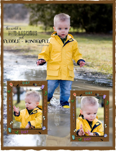
In this second layout, I had fun trying to replicate Kate Teague's scratched wood texture which was present on her alphabet. I created the little circles from some paper in her same kit (the April Freebie on 2Peas), then made a layer beneath all that for the "border". Then, I used an overlay from Denise Liemert at Digital Scrapbook Pages (a site I just found last night while looking for elements--I have the hardest time finding stuff because I don't really know how to use it, I suppose! I did get those wildflowers in the first layout there, though). I just cut out a circle from the overlay and pasted it in a new layer, then hiked the contrast to have an uneven brush with some white and pure black in it. I hid the bottom layer with the complete overlay on it, selected the part I wanted to work with, and then clicked on "Create New Brush" under the Edit menu (if you don't select just the area you want to work with, it's likely that at 300 dpi that particular menu option won't even be available, since Photoshop has an upper size limit with which it can make brushes). Then, I just selected that as my brush, went in and grunged up my border layer, and was pretty pleased! I also used the same brush on an overlay that I created for the photo, which lent it some nice texture, as well as reduced the brightness to match that of the kit elements.

At some point, you'll need to actually save your new brush. Don't forget to go to Preset Manager (also in the Edit menu, a bit lower). In the new window, select all the brushes you'd like in one set (I have a Textures set, for example, so I load those before saving the new one and just add it to them), and save your set--I have my own folder of brushes, or you can save it in the regular Photoshop folder. Make sure you credit the designer each time you use the brush, though! I actually added the designer's name in the brush label so I wouldn't forget whose it was...

Heather Taylor, cute

Saturday, April 5, 2008

Extractions

No, not teeth. Though that may yet come.

For this one I used a dark brown linen bookbinder's thread stitched loosely into some light, white-coated chipboard with a large embroidering needle, then scanned it at 600 dpi. Because of all the little "hairs" coming off the thread, I decided to use the Extraction filter (up in the top portion under Filters).

This filter is pretty tricky, and I find it useful only in some very specific cases, such as when you have fine lines that are burned through with background color, which makes extraction with a selection marquee (either with a pen or the lasso) pretty useless, and very frustrating in its fiddly-ness. The Extraction Filter works by painting over the edges of what you want to retain, then filling the inside. You can even set the opacity in terms of what is retained, and that's where it comes in handy... For this one I used a 1 pixel brush to go over the contour of the thread and the "hairs"! On the image below you'll see the original scan, and the extracted thread used on my "Tangle" layout, which follows:

Heather Taylor, Stitching Extraction

Heather Taylor, Tangle
(click for credits and description)

Friday, April 4, 2008

Google-Trolling

Looking for my name... do you *know* just how many Heather Taylor's, Heather T.'s, etc. there are out there? Not to mention the Heather T's in medium, large, and extra-large... *sigh*

Of course, there were all of Julie K's pretties (here's one:)


Anyway, found Scrappassie in the Netherlands, and Brigitte van Tienhoven who used the Clearly Cinnamon freebie:


Another use of the frame by LyndaMarie:


I just love how that frame comes out over a photo!

Oh, and here's one with the less distinctive paper by Terri over at Jessica Sprague's site:


Hmm. That took a phenomenal amount of time. Heh. Hey, if you use my stuff, how 'bout leaving a link in the comments? Sure would save me some time. =)

New Stamp Plate: Japanese Gardens 4

Here's a little preview of the new stamp sheet (at Art Neko by the beginning of next week?):

Heather Taylor, Japanese Gardens 4 (for Art Neko)

And heck, I might as well try my hand at a Japanese-themed mini-kit as well! So here's the first paper I've come up with (I'm tentatively calling the mini-kit "Asian Mists"):

Heather Taylor, Asian Mists Paper 1 (Preview)

In Honor of Soccer

Well, first the layout (I used the clone brush to clone out DH in the middle photo -- sorry honey! and again in the first photo to clone out the woman in grey sweats):

Heather Taylor, Soccer

By the way, notice how the title type is all jammed up against itself (I used Dream Orphans as the font for this, btw)? While in Type Tool mode, place your cursor in front of the letter you want to modify, then press alt+right/left arrow key to make that particular letter shift forward or backward a couple of scooches. You can also highlight a group of letters and do that, or a whole word, or even modify the spacing between words--this is really useful when you don't want a word to break/hyphenate at the end of a paragraph or something (you should never have just one word dangling onto the next line, either--so sayeth the typography ghods!).

I also applied the "reticulation" filter to the rasterized type, which I'd never played with before. I think it's under the Sketch filter group, and it gave the title a nice texture. Stroked it, gave it an inside red shadow (base font color was cone orange), and set it to color dodge, which allowed the middle picture to not be so obscured. I'm still not entirely pleased about the arrangement of the journaling, but I have corrected the typo. =)

And then Allen and I were goofing around today, and here's our second installment of Crocodile the Worm (wherein our hero learns that using your head is not always all it's cracked up to be):

Heather Taylor, Crocodile: Unexpected Consequences

Thursday, April 3, 2008

Little Red Plane Freebie

Well, after *days* of trying to figure out how to include a subfolder in a zip file, I am finally victorious. Phew. Anyway, if you want a little red plane, you're welcome to have it. I also made a frame, a cloud alpha, a Happy Birthday banner, and a little zoomy trail. This is the layout I made with the zoomy trail one:

Heather Taylor, Evergreen Museum

And here's the freebie ETA: The Little Red Plane has been taken out of circulation until I can find a shop to sell in; thanks for looking!:

Heather Taylor, Little Red Plane Element Pack Freebie

My Three Wishes

My friend Brenda Marks was just musing today on what she could really use in terms of her art, and asked what other people's wishes were... so here are mine:

1) A new computer. Before this one crashes.

2) A mentor/teacher of whom I could ask design & computer questions. It just takes so much darned time stumbling around in the dark, yanno?

3) Like Brenda, I wish I could have easy access to gazillions of art classes. I just can't ever see learning enough!

I'd love to know what your wishes are too... leave me a link!

Recoloring With the Clone Tool

Is this too simple a tip? Please forgive me if this is really obvious...

Don't forget that items can be recolored in non-uniform colors, too! You can clip them to a patterned paper, of course, by placing the paper in a layer above your item, then pressing ctrl+alt+g (in PS CS2). But you can also use some unusual functions of the clone tool (the one that looks like a little old-fashioned rubber stamp) to add texture and color to otherwise "flat" items, and tie them in with your layout as well.

The unusual functions are 1) the non-aligned function (unclick the little check mark next to "aligned" in the tool options bar at the top), and 2) Sample all layers (click the check mark on that one).

1) The non-aligned function will allow you to pick up the photo in such a fashion that you'll clone just as usual starting where you alt-clicked on your source, BUT, when you lift your pen/mouse and put it down again, you'll return to that same first source instead of staying a measured distance from it. This allows you to introduce some randomness into the cloning.

2) If you're trying to recolor an item using this method, you're in a bit of a quandary if your source is on one layer, and your item to be recolored is on another. That's where the "sample all layers" comes into play very nicely, allowing you to alt-click to set the source on any layer you please, then clone into the layer of your choice. This is helpful if you're not quite sure of the placement of your recolored item yet--having it on a separate layer allows you much more freedom than if you had already merged it with the source layer!

Oh, and I almost forgot: remember to restrict the painting of the cloned image to just your item by cntrl-clicking the thumbnail of the layer you want to be working on. This will select just the colored elements of that layer, allowing you to work without fear of messing up the edges or something!

The next two layouts show how I used this. In the first one, I used the sunset picture to recolor the frame. It's kind of interesting how the frame seemed to take on a metallic sheen! I also used both these methods to recolor the squares and word "Forever" in the second layer. It really looks much better than just a "flat" color, and repeating the bit of ocean in the upper right hand photo kind of ties the layout together in terms of "water".

Please click on the thumbnails for larger versions and credits:

Heather Taylor, Beauty As A Function Of Time

Heather Taylor, Against Water

Wednesday, April 2, 2008

Homeschool Silliness

Our newest venture: comic strips. Featuring Crocodile the Worm. Heh.

Heather Taylor: Crocodile, A New Job?

In more serious news, I'm working on another stamp plate, with a *gorgeous* plum blossom arrangement. Well, I think it is, anyway. =)