
Showing posts with label line drawing. Show all posts
Showing posts with label line drawing. Show all posts
Tuesday, April 22, 2014
A little bit of drawing...
Just practicing hatch-marking, which I've never done much of. Sure helped the owl drawing--I've always been afraid to tackle them because of their incredible detail. So far, hatch-marking strikes me as the lazy person's out... =)
Sunday, November 2, 2008
Illustration Friday
"vacant"

Art Rage, Photoshop CS2. It was just going to be the line drawing base for a collage-type thing, but I ended up kinda liking it this way, too...

Art Rage, Photoshop CS2. It was just going to be the line drawing base for a collage-type thing, but I ended up kinda liking it this way, too...
Monday, October 27, 2008
Answered my own question...

Credits: Background paper & drawing by moi. Frame and tag by Katie Pertiet (Designer Digitals, Playground Layered Template and Curled Journal Spots 3). Flower by Monica Larsen (Floralis). Glass pebble by Vinnie Pearce (Pixel Canvas). Stitching by Anna Aspnes (DD, Stitched by Anna White). Font: Inked God.
Sunday, October 26, 2008
Flowers And Birdie, Redux
Ok, remember this little guy? I love how this came out, but do you think it would be useful as a scrapping paper?? I didn't use a single drop of paint on this, by the way. It's all dodging and burning and saturating the underlying piece of paper...

Thanks to "Splendor & Demise" on Flikr for the use of the great paper texture!

Thanks to "Splendor & Demise" on Flikr for the use of the great paper texture!
Thursday, June 19, 2008
Line Drawing--An Easy Way Out
I really had fun being inspired by http://www.doisg.com , an urban clothing outfitter from Portugal I found cruising around on the web today. My layout started out the same, but I didn't have the kind of picture they did, and the way things were placed on an 8x8 layout, I had to change things around slightly... then there was all this unsightly white (black) space. So I filled it in with the giraffe and the train!
Both were from photos I'd taken. I extracted the objects, then ran the Stylize-->Find Edges filter on them. This produced some funky white images with variously colored lines on them. I then fiddled around with the levels to get the colors as dark as possible, then desaturated the layer, then fiddled around more with the levels to get as close to pure black and white as possible. For the final step, I inverted them (so the lines were white, the bulk of the object black), then lowered the opacity so they didn't stand out so much...
By the way... I recalibrated my computer today. What a difference! (I like this calibration site as well: Photo Friday)
Sunday, June 8, 2008
Experimental Digiscrapping
I just happened to read a post on 2Peas the other day referring to a RAD set of actions by a guy named Boutwell (Totally Rad). They give away a set of 3 actions as a demo, too, so of course I wrote off for them. Although the actions themselves are probably nothing I'll ever use, I did have fun breaking them down and trying to analyze just how Boutwell accomplished certain of his steps.
A lot of it seems really complicated and lock-step dependent (i.e., if you just do 1 or 2 of the things, you'll end up with something unrecognizable as a photo--you really need to do all of them to get somewhere). But, I did some fooling around, and came up with a pretty nifty way to jazz up a totally unremarkable bedroom background, as seen in the Flying Sitflop layout. One of the main concepts I finally grasped was the idea of doubling up layers, with one being blurred, and the other still crisp, and using varying degrees of opacity or layer modes to blend the two. In this particular layout I first extracted Allen, and duplicated that layer into a new document (for safe-keeping purposes). Then I desaturated the original photo, hiked up the contrast, duplicated it, blurred the bottom-most layer, then lowered the opacity on the top one to produce this kind of blurry crisp background that really gives the picture a neat dreamy effect. I think I did the same thing with the extraction of Allen as well, though what I was going after there was just the slightest halo effect--there's no opacity change for the figure, or else it wouldn't pop as it does... (click for credits and larger version).

The second layout I had a great deal of fun with tonight was inspired by the wonderful ad challenge freebie by Kellie Mize over at Designer Digitals. She offered up a grunged up, be-splattered background clipped to a blue gradient, with blue text in a very cool tilted cross pattern. She suggested completing all the typography work, then merging the layers together before clipping to a photograph (I think that's what she was suggesting!), but the photograph I chose really didn't work for that--there wasn't enough detail left and it was totally confusing. So I kind of changed the layers around a bit...
The photo ended up looking really cool as well: I desaturated it, hiked the contrast, then did a "Find Edges" filter on it. I ended up with a very neat-looking line drawing; unfortunately, the photo was from my old camera and just WAYYYYY too small to do anything cool with it. So, I brought it into Illustrator, live-traced it on the "detailed illustration" setting, then brought it back as vector art into Photoshop. Now I was able to enlarge it as much as I needed and wanted to without losing resolution. Here's an image of the 2 versions of the photo, and the original look of Kellie Mize's template:
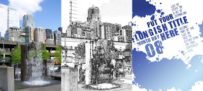
And here's my layout, Another Beautiful Day (click for credits and larger version):

To get this effect, I put the gradient at the bottom of the layer stack, then just the splotches from Kellie's template, set to overlay. On the layer above that I put the line drawing of my photo, also set to overlay. Above that I put the text in multiply blending mode. To make the second portion of the journaling stand out better, I duplicated that part of the layer and put it on its own layer at the very top, then filled it with a much lighter gradient, gave it a slight outer glow with a dark color, and set the whole layer to Linear Dodge. I'm really in love with the way it turned out, if I do say so myself! *lol*
A lot of it seems really complicated and lock-step dependent (i.e., if you just do 1 or 2 of the things, you'll end up with something unrecognizable as a photo--you really need to do all of them to get somewhere). But, I did some fooling around, and came up with a pretty nifty way to jazz up a totally unremarkable bedroom background, as seen in the Flying Sitflop layout. One of the main concepts I finally grasped was the idea of doubling up layers, with one being blurred, and the other still crisp, and using varying degrees of opacity or layer modes to blend the two. In this particular layout I first extracted Allen, and duplicated that layer into a new document (for safe-keeping purposes). Then I desaturated the original photo, hiked up the contrast, duplicated it, blurred the bottom-most layer, then lowered the opacity on the top one to produce this kind of blurry crisp background that really gives the picture a neat dreamy effect. I think I did the same thing with the extraction of Allen as well, though what I was going after there was just the slightest halo effect--there's no opacity change for the figure, or else it wouldn't pop as it does... (click for credits and larger version).
The second layout I had a great deal of fun with tonight was inspired by the wonderful ad challenge freebie by Kellie Mize over at Designer Digitals. She offered up a grunged up, be-splattered background clipped to a blue gradient, with blue text in a very cool tilted cross pattern. She suggested completing all the typography work, then merging the layers together before clipping to a photograph (I think that's what she was suggesting!), but the photograph I chose really didn't work for that--there wasn't enough detail left and it was totally confusing. So I kind of changed the layers around a bit...
The photo ended up looking really cool as well: I desaturated it, hiked the contrast, then did a "Find Edges" filter on it. I ended up with a very neat-looking line drawing; unfortunately, the photo was from my old camera and just WAYYYYY too small to do anything cool with it. So, I brought it into Illustrator, live-traced it on the "detailed illustration" setting, then brought it back as vector art into Photoshop. Now I was able to enlarge it as much as I needed and wanted to without losing resolution. Here's an image of the 2 versions of the photo, and the original look of Kellie Mize's template:

And here's my layout, Another Beautiful Day (click for credits and larger version):
To get this effect, I put the gradient at the bottom of the layer stack, then just the splotches from Kellie's template, set to overlay. On the layer above that I put the line drawing of my photo, also set to overlay. Above that I put the text in multiply blending mode. To make the second portion of the journaling stand out better, I duplicated that part of the layer and put it on its own layer at the very top, then filled it with a much lighter gradient, gave it a slight outer glow with a dark color, and set the whole layer to Linear Dodge. I'm really in love with the way it turned out, if I do say so myself! *lol*
Tuesday, March 25, 2008
Line Drawing, Part II
Today I created this little airplane graphic following Melissa Clifton's instructions for non-people line art derived from a photograph, and it turned out really well, though I did add a step: once I'd inverted the line drawing, I brought it into Illustrator, did a Live Trace, Expand, Flatten Transparency (then get rid of the white spaces). LOVE that vector art! The dotted line was just a fat little rectangle that I made into a brush -- just drew a path with the pen tool, and stroked it.

Monday, March 24, 2008
Line Drawings and a Freebie
Yikes, that was a long flu! Thank goodness the rest of the family didn't get ill as well--it's hard enough taking care of a well little boy while sick, much less somebody who needs a lot of attention...
This week's challenge @ 2Peas was to do a line drawing of any kind. Being sick, I kind of used the easy route: the photocopy filter (foreground color set to black, background to white). For some reason this picture responded really well to that treatment, and all I had to do was some minor clean-up afterwards, then paint it with a low opacity brush until I liked the results. I chose a thin font (Birch Standard) then stretched it up until it fit the original lines of the photograph--that way, nothing looks cut off. Here's the result:

But there are many other ways to go. This tutorial by Deke McClelland uses the photocopy filter, then enhances the end product with double cross-hatching, which produces a semi-comic book look.
Here's another by John Sweeney that I'll have to try, so this is also a note to myself.
Wow, and here's another by Stanley Ashbrook that uses the Smart Blur filter! (Don't you love Google?)
And finally, this fabulous one by Melissa Clifton (actually, 2 of them: one for inanimate objects, the other for people--the latter involves actually drawing with the pen tool).
Ooh, can't wait to try those!
And finally, a freebie of those frames and doodles that didn't quite make it through the criteria of Little Dreamer Designs (I've fixed the main objections, anyway!):
Boys and Girls Element Pack. ETA: Element pack is no longer available. Thanks for looking!

And here's a layout I made with the little frame:

This week's challenge @ 2Peas was to do a line drawing of any kind. Being sick, I kind of used the easy route: the photocopy filter (foreground color set to black, background to white). For some reason this picture responded really well to that treatment, and all I had to do was some minor clean-up afterwards, then paint it with a low opacity brush until I liked the results. I chose a thin font (Birch Standard) then stretched it up until it fit the original lines of the photograph--that way, nothing looks cut off. Here's the result:
But there are many other ways to go. This tutorial by Deke McClelland uses the photocopy filter, then enhances the end product with double cross-hatching, which produces a semi-comic book look.
Here's another by John Sweeney that I'll have to try, so this is also a note to myself.
Wow, and here's another by Stanley Ashbrook that uses the Smart Blur filter! (Don't you love Google?)
And finally, this fabulous one by Melissa Clifton (actually, 2 of them: one for inanimate objects, the other for people--the latter involves actually drawing with the pen tool).
Ooh, can't wait to try those!
And finally, a freebie of those frames and doodles that didn't quite make it through the criteria of Little Dreamer Designs (I've fixed the main objections, anyway!):
Boys and Girls Element Pack. ETA: Element pack is no longer available. Thanks for looking!
And here's a layout I made with the little frame:
Subscribe to:
Posts (Atom)