Showing posts with label overlays. Show all posts

Thursday, November 21, 2013

More Splishy Splashy Goodness: CU/PU Overlays & Masks 5!

Man, the CT went to town on this one! Here are my commercial/personal use Overlays & Masks 5:

http://www.mscraps.com/shop/HeatherT-CU-PU-Overlays-and-Masks-5/

Some awesome layouts:

By Astrid:


 By Fu:


 By Linda:


 By Ona:


By Jo-Anne:


Of course they come in color, and as grayscale, AND as .abr, and they're 20% off through Sunday. Tons of fun to play with!

Have a great weekend!

Thursday, October 3, 2013

Autumn has struck!

This month's Memory Mix products at MScraps are all about the fall. I have two packs available, Autumnal Bits, which is a set of elements; and CU/PU Overlays & Masks 4. There is a set of coupon codes (listed on the main Memory Mix pages) available per tier of purchase total on these packs, so don't forget to use them!


Here are some fabulous CT pages, made with either of these two packs and other of my products:

By Annette (with This Right Here): 


By Astrid


By Jo-Anne

 By Julie
By Vera
 By Annette
 By Jo-Anne
 By Sandrine
 By Vera


Hope everybody has a wonderful weekend! Last weekend for us was storms, storms, storms...

Thursday, August 22, 2013

New: PU/CU Overlays & Splats 1

Oh, these are fun! You get 6 almost-full-page-sized color splats, and 6 transparent grayscale .png files. These things will dress up any page or paper you want!


And look at the gorgeous layouts:

By Ona:


By Petra:


By Marianne (notice how she clipped some wordart to the splat and changed the color):


And by Linda (also changing color):


Hope everybody has an awesome weekend! ♥

Thursday, May 15, 2008

MIA

Wow, May 8th... I've really been remiss!

Causes:
1) Designing a new kit
2) MIL in town
3) Major tooth problems (so bad I don't even feel like scrapping today--what does that tell you! =(
4) Doggie sick, needs to go to lots of Dr. appointments. Poor doggie. =(

But I have been scrapping. Several of these will probably be used as illustrations for an article on typography in digital scrapping I'm writing for Scrapbook News & Review. Here are a couple more (I used my Botanical Overlays for both of these--I love how it makes the background just slightly textured!):

Heather Taylor, The Second One

We took Allen to the dentist's (hmm, that guy is featuring large in my life right now!) for the first time, and the latter was pretty impressed that he'd already lost both bottom front teeth, and that the first one was half-way grown in already--apparently that's not supposed to happen until between 6 & 7! My little boy... *sigh*

I have a bunch of little birdies now, too--I can't decide if I want to dress them up, make elements that you can combine, or what. =)

Here's a fun one that's totally different from my usual style, with a bunch of elements (mostly by Katie Pertiet and Lynn Grieveson) combining into a sort of fantasy feel. I was influenced by Vinnie Pearce's house layout in the making of the window frame and curtain, too.

Heather Taylor, A Quiet Fantasy

Oooooh, I just thought of a bright spot for the day: I'm getting my NEW COMPUTER today!! 500G of hard disk space! 4M of RAM! Oh frabjous joy, halloo, hallay! Perhaps I'll even be able to have Photoshop and Illustrator open at the same time now. =P

Sunday, April 27, 2008

Botanical Overlays No. 1 and a Blog Freebie

Yay! I finished some gorgeous overlays today, based on the layout I showed you below in the previous post:

Heather Taylor, Botanical Overlays No. 1 Preview

Get them here! These overlays are a ton of fun to play with (read the TOU for a recap of hints). Change them from black to some other color with your hue/saturation sliders, then set the layer mode to something besides normal. You have to play! Everything is different depending on what color you've made the overlay, and what color your background is. You can get such cool effects, though!

ETA: Sorry, this freebie is no longer available! The freebie part of this kit is the frame and botanical brush. For the freebie, you only get the .png file, but when you get the full element kit, you'll get the layered .psd file which will make it easier for you to change colors on the different elements, if you want to. Here's the freebie frame:

Heather Taylor, Botanical Overlays No. 1 Freebie

I hope you like it!

Tuesday, April 8, 2008

Masks & Overlays

Did a couple of fun things today. One was creating some masks to clip paper to so it would look like torn, hand-made paper, and another was creating some brushes from overlays to use as grungers.

The masks are pretty easy--on a separate layer of the paper document, or in a new document, draw a basic shape. You can either use these as accents (like I did with the faded purple paper in the first layout and the flower paper in the second), or as photo mats, like the bigger-sized one in the first layout, so make the shape according to the use. Then, fill it with black, or a grunged, fairly dense, texture. I used various brushes (chalk in one case, and the queen anne's lace brush of mine in another) to "feather" the edges of the mask--you can be kinda crazy, or keep it subtle, as you please. Once you have this shape down (save it!) place it in a layer beneath the paper you're trying to use, and ctrl+alt+g/clip it the top layer to the bottom one. Ctrl+e/merge the top layer to the mask, and now you have the shape ready to be dragged into your other document. Easy! As you'll see, I used this method twice in the first layout, once for the striped paper, and once for the faded purple paper.

Heather Taylor, In This Picture (click for larger image, credits, and journaling).

In this second layout, I had fun trying to replicate Kate Teague's scratched wood texture which was present on her alphabet. I created the little circles from some paper in her same kit (the April Freebie on 2Peas), then made a layer beneath all that for the "border". Then, I used an overlay from Denise Liemert at Digital Scrapbook Pages (a site I just found last night while looking for elements--I have the hardest time finding stuff because I don't really know how to use it, I suppose! I did get those wildflowers in the first layout there, though). I just cut out a circle from the overlay and pasted it in a new layer, then hiked the contrast to have an uneven brush with some white and pure black in it. I hid the bottom layer with the complete overlay on it, selected the part I wanted to work with, and then clicked on "Create New Brush" under the Edit menu (if you don't select just the area you want to work with, it's likely that at 300 dpi that particular menu option won't even be available, since Photoshop has an upper size limit with which it can make brushes). Then, I just selected that as my brush, went in and grunged up my border layer, and was pretty pleased! I also used the same brush on an overlay that I created for the photo, which lent it some nice texture, as well as reduced the brightness to match that of the kit elements.

At some point, you'll need to actually save your new brush. Don't forget to go to Preset Manager (also in the Edit menu, a bit lower). In the new window, select all the brushes you'd like in one set (I have a Textures set, for example, so I load those before saving the new one and just add it to them), and save your set--I have my own folder of brushes, or you can save it in the regular Photoshop folder. Make sure you credit the designer each time you use the brush, though! I actually added the designer's name in the brush label so I wouldn't forget whose it was...

Heather Taylor, cute

Thursday, February 21, 2008

A Bit of Fun: Overlays & Stickers

I was delighted to win the random $5 that 2Peas awards if you participate in their "Use mostly 2Peas Stuff" challenge, or the Garden Girl's Weekly digital challenge, and I won it twice in a row so I had big bucks to spend! I finally broke down and got Rhonna's gorgeous swirl brushes (V3 & V4) -- I keep on hoping that I'll create my own, but then I get bitten by the actual scrapbooking bug and use up all my time making layouts instead of supplies!

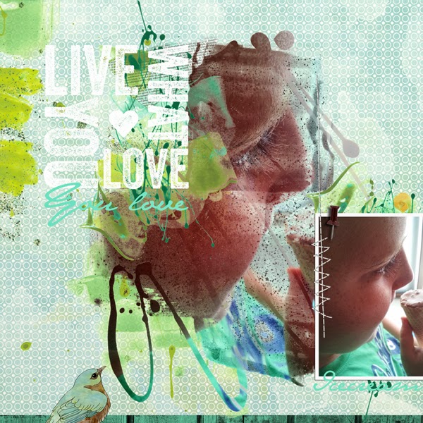
Anyway, I couldn't quite figure out where I wanted to use these, but the overlays recently on sale at Designer Digitals made me wonder if I could make my own, so I did, with the V3 brushes! Actually, it was easier in this case to use the .png files because I needed to do a lot of rotating (man, do I ever wish there were a shortcut for rotating brushes in Photoshop!). So, just on a blank layer, I used each png twice or three times, and made something that had fairly wide blanks (I hadn't figured out what I was going to use it for, though--besides coloring with bright colors).

Heather Taylor, Feelin' Swirly

Once I'd gotten it done, I decided to use more 2Peas stuff so I could enter it in next week's challenge (greedy, ain't I?), and so I used papers from 2 of Rhonna's kits (Color my World, freebie, and Flower Patch). To get the papers in the shapes, I followed several fiddly but easy steps.
1) You want to use the magic wand (tolerance = 1, contiguous) to get the exact shape, but a lot of times there were only dots on one end. So,
2) draw in lines wherever you need to to make sure the shape is closed
3) magic wand the shape
4) target your background layer (or any made-up layer with a uniform color to make it easy to see)
5) copy the shape
*****5.5) ctrl+z (undo) all your drawing marks until you're back to your original overlay!!!**********
6) open the paper you want to use
7) paste the shape on a new layer and drag that layer under the paper layer
8) ctrl+alt+g (or ctrl+g in PSE? Make a clipping path, in any case) so that the paper conforms to that shape
9) ctrl+e to merge layers
10) drag the shaped paper layer into the original document, under the overlay. I then moved the shape 5 nudges down and 5 left to make it a little more interesting. The key is: don't forget to undo everything before you proceed! I did the same copy-shape-thing with the photo, too. Also, make sure you don't save your papers in the wrong shape!

I then filled in a few of the smaller lines with light blue (distressed it a bit), then drew paths for the text on the curvy lines that were long enough and would let the text be visible. And there you go, swirly fun!

Then, today, I tackled the task of trying to scraplift Dagmar (lenasmommy) over at Designer Digitals. I chose her adorable "Little Witch" layout because I loved the combo of black and white photo with lots of bright colors, and the use of patterned papers in a way that I can emulate =), and the darling little illustrations. Mine isn't quite as designerish as hers, but I still think it's pretty cute (mostly because of Allen, however!).

Heather Taylor, Fire-Slicker

There's nothing too tricky here, but I did have fun picking up a couple of clip-art photos and turning them into stickers, primarily by using the photocopy filter (black foreground, white background--if you have other colors in your color picker, that's what it'll use, which could be fun to play around with also!). For the dalmatian the only thing I really had to do was complete the outline of the dog, select the exterior, reverse select, create a new layer, expand the selection by 10 pixels, then fill with white. For the fireman's helmet I actually had to redraw the thing because it had quite a bit of detail, but it was the same procedure. One little trick--put your fill colors on separate layers so you can go back and change them later with no problem...

And finally, just a little taste of Spring (everything from Katie Pertiet's "Little Red Bird" kit at Designer Digitals):

Heather Taylor, Spring

(PS -- I'm perplexed by the fact that this layout got a seemingly inordinate amount of feedback, since I liked it OK, but it wasn't one of those that leaves me with stomach clenched, knowing I've nailed it. I guess until I can figure out popularity indices, I'm not going to go too far!)

Saturday, January 12, 2008

Mapping Texture

Ok, I'm a little bit pleased, and a little frustrated too. Here's the culprit:

Heather Taylor, Free As A Bird
(Font: Birch Standard. Elements and background paper from Lynn Grieveson's Catalina kit @ Designer Digitals.)


The part I'm really pleased about is the background (check out how even the stitching actually follows the contours of the cloth!). How'd I do that? Sooooo glad you asked... ;)

I scanned a white t-shirt and made a desaturated image with it. Then, I overlaid Lynn Grieveson's beautiful paper on top and changed the paper layer to an overlay blend. Then I also did a displacement filter (distort-->displace using the t-shirt psd file) on the paper. What this does is actually warp the paper so that it's not only a flat illusion, but the displacement changes the paper so it looks like it goes "down" on the dark areas, and "up" on the light ones; by superimposing the distortion over the grayscale image you get much more of a sense of depth (props to Photoshop 7 Wow! for the technique). I did the same thing with the word art (clipped it to the grayscale background first, though). For the stitching, I only used the displace filter, but I had to go in and clean up with the smudge tool afterwards. The stitching is really cool, though--it "makes" the effect by being so zigzaggy directly on top of the fabric folds... Fun stuff!

The frustrating part is that I still need lots and lots more practice with that darned "curved photo" look. Still looks pretty amateurish to me...