Wow, I like my new computer! Apart from losing a few things (including my 2-week long initial back-up to
mozy.com, bleh), having this super-duper new computer has *seriously* lowered my stress level, and increased my productivity (no more having to reboot every hour! Yay!). So I've been able to scrap more! Here are a few layouts:

The small tip about this one is something I learned from Cassie Jones at
Designer Digitals during one of her chats: on the layer whose shape you want to copy, press ctrl then click on the *thumbnail* of that layer. Shazam! The marching ants go directly around the main figure! This is great when you have all those swirlies that you want to "cut" out of the photo, then scoot over a few nudges to offset them! Once you have your marching ants, then just go to the photo layer, press delete, and voilà, the shape is now cut out! I use this more times than I can remember, I think.
The following layout is pretty simple technically--but I did make a conscious effort to use the type as part of the design (here, the repetition of the word "blue" going on and on and up and out of the page, just like the waves in the poem). I love using words (if you couldn't tell ;) and they are often just as much a part of my layouts as any other embellishment. I do this with my cards, too--very often a calligraphy stamp is just the thing I want for "finishing" a card.

I'm going to be writing an article on "Digital Alphabet Soup" for
SN&R this month, too--all about how many ways you can incorporate type into your layouts!
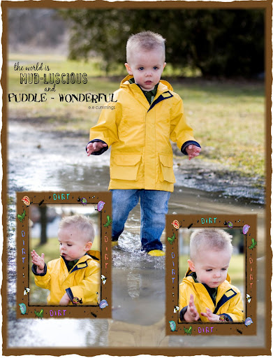
Nothing too special for this one:

Just a reminder that an easy way to get all those fiddly squares exactly the right size is easy if you set your crop tool to the dimension you want (here, .75"x.75"x300dpi). I also mixed in a couple of photos with all those swatches of patterned paper--the top one of wood, and the final product of the rose.
I was just reminded today that it's been a ways since my initial frustrations with the use of patterned paper--now, instead of trying for great big swathes of it, I really try to pare it down and group it around the photo. Seems to work for me!
And lastly, a layout I put together last night (also for an article in SN&R), all with Jofia Devoe's kit "In My Mommy's Dream" from
thedigichick.com:

I've never worked with such realistic elements before--it does take some fiddling to resize elements so they don't completely overpower the photo, and so that they're relatively the same size--though I did leave some incongruities, for example, the buttons versus the ribbon. Oh, and the ribbon has the under/over trick going on, so that it appears to be woven under the frame in one part. Just duplicate your ribbon layer, put one under the frame and one over the frame, then erase the little part of ribbon that's over the frame where you want it to look like it's going under (confused yet? *lol*), and there you go!
Oh, and
Aussie Scrapbooking is now live--you should go check them out (and get my freebie kit, too, heh ;)