Showing posts with label typography. Show all posts

Thursday, November 7, 2013

Overlapped Emotions & Dates

Was browsing through a typography book, and got inspired to make these:

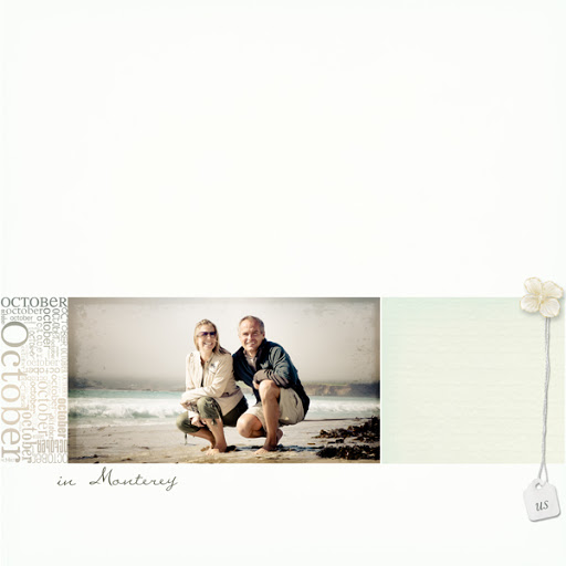
Overlapped Dates

http://www.mscraps.com/shop/HeatherT-Overlapped-Dates/

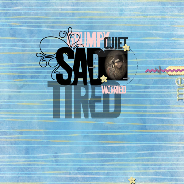
and then I inspired myself (*lol*) and came up with the Overlapped Emotions:

http://www.mscraps.com/shop/HeatherT-Overlapped-Emotions/

And the crew made some way fun pages, too!

By Astrid:

By Jo-Anne:


By Susanne:


 By Jenn:


 By Jenny:


By Sandrine:
So much fun to be had with these! Sure hope you have a great weekend... =)

Thursday, May 9, 2013

Commercial/Personal Grunge Brushes, & Off-Kilter Dates!

I thought I'd be designed-out for a while, but look what popped out! The CU/PU Brushes 5: Grunge are a set of 27 (!) brushes in .abr and .png files. Grunge brushes are so great for making papers, photomasks, distressed anythings... And as a scrapper, you can use them to fade your photos, or add interest behind a photo or element on your layout. I love grunge brushes! (These were all made from photos I took of things. Guess my habit of standing nose to wall or nose to floor is paying off! *giggles*)


Astrid made this really cool page with the Hi Energy kit and the Grunge Brushes:


And also out popped some funky typography in date form, with three versions: totally grunged, slightly grunged and offset 3D edge, and just slightly grunged. The three versions have 0-9, days of the week, and month names. Here are the Off-Kilter: Dates:


I have several layouts for these:

By Astrid, with Precious:


By Vera, with Small Things:


And by Jetje, with Wishes Come True:


Both products are of course 20% off through this Sunday. I hope you guys have a wonderful weekend!

Tuesday, March 1, 2011

Freebie to Celebrate!

As of March 1, I'm now an exclusive designer with MScraps (which will hopefully help save some part of my sanity *lol*), and to celebrate, I'd like to tempt you with my newest Alpha: AlphaNumeric! And it's free! You should be able to just click on the download link directly on that page, without even putting it in your cart. I think.

Alphanumeric contains the numbers 0-20, then tens up till 100, plus 1,000. I'm sure you can find a zillion fun ways to use them! Enjoy!

http://www.mscraps.com/shop/product.php?productid=2401

Thursday, February 10, 2011

New @ MScraps: AlphaDates!

I think AlphaDates might be the last in this series for a while, cuz this was LOADS of work! But I love the result--and check out the gorgeous CT pages!


 By Romy:


By Ulla-May:


By Julie:
By Veer:


By Karen:


 By Sandrine:


 Are these not swoonable?? 20% till Monday, @ MScraps!

Tuesday, February 8, 2011

Typography Freebies (MScraps Type Challenge)

Every month I have a typography challenge @ MScraps--this is this month's. It comes with access to a 4-pack of text containers that you can use in Photoshop Elements, too!

Feb. 1st - 28th: Typography Challenge 6 - Shaped Text Paths

This month I thought we could explore typing within containers--and to make it easy, I thought we should focus on custom shapes as our containers (though you can make your own container using the pen tool, if you have PS/CS). Your challenge, therefore, is to make a page that contains some text within a shaped container, other than a rectangle or square. Here are a few examples just to start you off:

By Alison Waken:


Another circle (by joscie):


Here's yet another circle (by nzingha), except here you don't even see the edges of the circle (you need smaller type to fill in the gaps with this technique):


And here's one I did in the shape of a star:


Now PSE doesn't play nicely on the path front, so I've made up a little downloadable folder with instructions, AND sample containers which you should be able to use in PSE (it works in PSE 7 is all I can say!). You can download the samples HERE.


What I've done is to make 4 sample shapes, filled with text, for PSE users to use, and I've included explanations for PS/CS users to work with custom shapes. I included a circle, a diamond, a heart, and an arrow.

Here's the skinny on the instructions (these are repeated in the download on the .pdf):

All Users:

Feel free to use the containers in the downloadable .psd file. In PSE, just open the file, double-click on the layer of the shape you want, and start typing! Adjust your type size, color, font, etc. as you wish, then drag the layer into the layout you’re working on.

PS/CS Users:

Select the Custom Shape Tool, and make sure the option is set to “Path” (see downloadable explanation picture 1 for what this looks like). Choose a custom shape. Place the cursor on the layout, then start dragging while holding the shift key (this will keep it proportional—don’t hold the shift key if you want different proportions). When you have your shape as you like it, switch to the type tool and hover over the shape until your cursor changes to an I with little dotted semi-circles on either side. Click inside the shape, and start typing!

You can resize these shapes with your move tool—just change the type back the way you want it after you’ve changed the size.

Enjoy, and feel free to drop me an e-mail @ hlmtaylor@gmail.com if you need any more help!

Remember, your challenge is to make a page that contains some journaling or other text inside of a container that is NOT a rectangle or square. Have fun!!

You can download the sample shapes and explanations HERE.

And I'd love it if you shared your experiments with us in the MScraps forum!

Thursday, January 13, 2011

AlphaFrames, and AlphaYou!

Ok, my typographical mania continues, culminating this week in frames (AlphaFrames), AND, the opportunity for YOU to request whatever your little heart desires, either as a frame, a strip, or a capital letter shape. Here are the pre-made frames:


And here are the personalized AlphaYou examples:


I'm so excited about being able to make something special *just for you*! Each one takes about 2 hours to make, so unless I'm totally flooded with orders, I should be able to get it to you within 3 business days (and, knowing me, probably a lot faster!). Wouldn't that make for an impressive present layout, though? Even a canvas!

Here are some samples with both the frames, and the personalized wordart:

By Guess Who:


By Ulla-May:


By Jean:


By Vera:


*sigh* I love my CT members... =)

Anyway, as usual, 20% till Monday, so snap 'em up! =)

Saturday, September 25, 2010

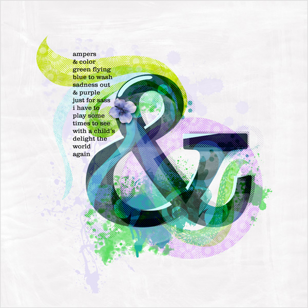
Ampersand

I don't know why I like those things so much. I'm such a type geek... =)

Everything mine. Font: Clarendon Light.

Sunday, September 19, 2010

Typography Challenge #3 @ MScraps

'Cuz I do blab on, even if it's with reason, here's the short version (rules are at the end of the post):

- Create a layout
- Have at least two typographical elements (letters, words, title/journaling, etc.)
- Make the typographical elements contrast with each other either in size, color, font, or some other way--or a combination!

Rules:

- This challenge will run from September 17 until September 24th, 2010.

- You must use some MScraps product. Retired products and quickpages do not count!

- You must upload your layouts to the weekly challenge gallery and you must post your layout + link in this thread.

- 1 winner will be picked shortly after the challenge has closed and will win a $5 coupon to Designs by Anita!

Now for the reasoning that led to the challenge, with examples:


You probably know this already, but one important principle of good design is to use contrast as a means to focus attention.

Most often a page will display a contrast in size, which is the thinking behind paragraph headers, or the layout on a newspaper front page. The bold type gets your attention, and then you settle down to read the smaller type. Here's an extreme version of that (a packaging designer advertising his skills):


However, it's not just size that is in contrast here. Color plays a large part, with the black standing out more, but the red shouting for attention. It's interesting to observe how clearly the two parts of the message stand out from each other, even though the type is exactly the same for the name and the service.

Besides size and color, the designer has also focused on two different styles of type: slab, sans-serif type for the message, and a modern serif type for the address (modern here refers to serif types that have extreme contrast between thick and thin--easy to see in the "5" and the "N" in this sample).

Now, just to show you that contrast has to be motivated (i.e., there's a reason for the contrast), here's a beautiful poster full of contrast that has nothing to do with the message:


In this loving, self-referential spoof of a woodblock Wanted poster, there are many contrasts. Size? Check. Color? Check. Typeface style? Check, check, and check--I count at least five different typefaces. However, if you look at the poster a little more critically, you'll notice that the contrasts have really done nothing for the design itself. Yes, there is a size contrast. But the largest word is "was"--probably not the most central message on the page. The color contrast is simply one of either end of the gradient, and does not necessarily highlight the difference between "hands" and "woodblock" (those don't seem to be at the extremes of any conceptual spectrum). And the typeface styles seem to be chosen because of how they will help maintain the very rectangular design--not to draw the viewer's attention to any particular part of the message.

This is still a very successful piece of design! But the contrasts are fairly incidental here.

Your challenge, therefore, is to create a page where the type elements (at least 2, title and journaling for example) focus on CONTRAST, trying to keep a goal in mind as in the first example, and not just "for pretty" as in the second. Not that there's anything wrong with that--I certainly love to play around with type-as-effect--but just because that's not the focus of the challenge. Try and see if there are any other ways of using type that will highlight a contrast, as well!

Here are a few more examples from the scrapping community:

By jakajer (contrast in color, size, and typeface):


Or, by Ellan, this super-creative example of typographical contrasts (I love the flowing script for thought/narration, the regular type for conversation reporting; the number size jumble, the funky type for the quote, etc):


And by Tracy. Although the contrast in size is fun, the number size doesn't seem to coincide with any kind of importance hierarchy. However, the size and the color contrast with the black really draws your attention to the fact that the layout is about numbers in some way. The next focus is on the little title with different fonts that highlights "NUMBERS" (also upper/lower case contrast, which we haven't mentioned before), and then the journaling over on the left, which interestingly enough DE-empasizes contrast, so that the attention remains on the photos.


Here are the Rules:

- This challenge will run from September 17 until September 24th, 2010.

- You must use some MScraps product. Retired products and quickpages do not count!

- You must upload your layouts to the weekly challenge gallery and you must post your layout + link in this thread.

- 1 winner will be picked shortly after the challenge has closed and will win a $5 coupon to Designs by Anita!

And here is my layout:


The whole series of pictures shows the contrast between the bright shiny red color of metal and the soft blue color of water. I wanted to get the hotrod flavor, so chose the Lobster 1.2 font for Big Red, in red of course. I couldn't use blue for the Big Blue or it would've faded into the water, so I chose white for contrast (adding a little flavor of red, white, & blue, not inappropriate for a hotrod car show), though I did sneak in the blue with "by the". I wanted a no-nonsense sans-serif to contrast with the serif & fluidity of "Big Red" and then I chose a much thinner font for the small caps in the tagline and date.

*phew*


Have fun, don't worry, it's all good! =)

Saturday, September 18, 2010

A Potion A Day

Ok, am I warped if I think this poster I just made is hilarious??


Not that I do that. For me, it's a book a day...

Thursday, April 1, 2010

Typography Challenge!

This month @ The DigiChick is all about “What’s new?” Although we’ve lived here on the coast for 3 years now, the beach and the ocean are still a very new thing to me, and continually astonish me.

For this first type challenge I’m going to focus on using VERY LARGE TYPE as the basis for the entire layout. When you use very large type, it’s really easy to use it as a clipping mask for photos, and it gives some interesting shapes to your page. To give this a twist, I’m also going to suggest that you use your photo’s central figure as part of the clipping mask. Don’t worry, this is easy to do!

First of all, here are some samples:

Subgrafix @ Deviant Art:


[image]

Dronograph @ Deviant Art:


[image]

See how the type blends in with what’s going on in the background?

Here’s how I’ve translated it into a layout:

[image]

And here’s how to do it:

1. Look for a photo you like, preferably with a strong visual component with clear outlines, such as a person or flower or building. You are going to ADD this outline over, under, in the middle of, or somewhere attached to the type.

2. Think about what the theme of the photo is. Do several words come to mind, or just one? Write it/them down on a piece of paper and play around with how they might stack or be squooshed. Write it out in all caps, and in lower case. Think about where the silhouette or outline of your central figure from the photo might fit (sides, top, bottom, middle).

In my case, I focused on the strong triangle formed by my son’s stepping from rock to rock, which suggested the A. And in the first example above, you can see the woman’s shape by the side of the letters.

3. Choose a strong typeface that will work with your theme. You want something pretty thick, but you also need it to be legible, so don’t pick anything with really fine lines that will get lost. Start your layout and put the type there.

Note that you don’t have to use a font that’s all caps, or one that’s super, super-black. For mine, I actually used Charlemagne, but I also like Zepp — or really, just about anything will work unless it’s too fancy. Heh. =)

4. Pull your photo into the layout, on the bottom layer. On a NEW layer a
bove the photo, take your marquee tool (lasso or straight edge lasso) and vaguely outline your central figure. It doesn’t have to be perfect, just ballpark. Fill the shape with black. Now hide your photo.

5. Continue arranging the type and the figure you just outlined until they all fit together in a pleasing fashion.

6. Highlight all the layers that have letters or words on them, and the outline layer (ctrl+click on the appropriate layers) then merge them (ctrl+e) [or go to Layer-->Merge Layers (down at the bottom of the menu), or right click and choose merge layers]. Now you should have just one layer with black shapes on it. This is what you’ll use as your clipping mask.

7. Make your original photo visible, and drag it above your mask layer. Press alt+ctrl+g if you’re using Photoshop CS+, or just ctrl+g if you’re using PSE, or whatever “Make Clipping Path” command your graphics program has.

8. Ta dah! Now your photo is showing up in just the shapes of the text and image. At this point you can start creating a collage of photos to fill in the blank spots, or you can add brushwork to the mask layer itself by using a grungy brush to include some of the background of the photo (that’s what I did in mine; I also used the Burn tool and a paintbrush on the photo layer itself to make some of the rocks darker where my letters were).

You can play around with using other doodle brushes to add or take away from the mask as in the examples, too. Just have fun with it!

Then, give it some dimension with a few elements, and add some journaling if you wish.

–>Remember that it’s supposed to be about what’s new for you! <–

Here are some more examples from the fabulous DigiChick crew:
Here’s another of mine:


By Jenn7:
 

By Heather B.:

By Vanessa:

Link me up either in the comments to this post, or in our challenge thread in the DigiChick forum. Of course you’ll get a little prize for participating!

Wednesday, March 31, 2010

Masked 2!

A new set of full page masks (or almost) to help you make some fun and unique layouts:


These are seriously a lot of fun to play with:


Those were both mine; here are some from my trusty CT crew:

(by Soleen)


By MaggieMae:


By justjen73:


And tomorrow, look for a related typography challenge!