Showing posts with label art neko. Show all posts

Thursday, March 31, 2011

Stamp Artist of the Month

The long-time stamping group of which I've been a part for many years, Oriental Stamp Art, has (once again!) honored me with the "Stamp Artist of the Month" nomination. There's a little interview there, and a discussion/presentation of the project I chose to make, a chunky book for Japan. It's also for the "Four Words of Wisdom" project for my Art Journal Caravan...

Here's a "reprint" of the project part (you'll have to go to the other site for the interview ;) :

April 2011, Heather T.
"Chunky Book For Japan "


chunkybook-cover

March 11, 2011, was the terrible earthquake and tsunami that devastated northeastern Japan. I have been so touched by this disaster--it was in part made very real by the fact that our family had to evacuate as well. We were able to return almost immediately to our home, much to the contrary of those affected in Japan, many of whom are homeless and with no chance of rebuilding in their lifetime. This little book, and my no doubt terribly-written haiku, are just my small attempt at expressing some very large feelings.

A "chunky book" is so-called because it's made from a children's book--the kind with the thick cardboard pages--and it's got "stuff" added to it. It's kind of a long process--it's taken me a little over a week--so I won't bore you with step-by-step photos for every page! There are a few photos from the beginning stages of the book, though, just to show you kind of what the process is like.

To begin with, find a used or new children's book with thick cardboard pages. I recommend lightly sanding all the pages, as well as the font, back, and spine, so that paint will stick more easily to it.

chunkybook1

I failed to do that, and found that I had to go over my paint more times than I'd wanted to.

The next step is to gesso all the pages. (Gesso is a white-pigmented paint that works well for base coats.)

chunkybook2

You'll notice that text and images are still quite visible. You can add more gesso once the first coat has dried, or you can use other acrylic paints like I did (mostly Making Memories Scrapbook Colors (which are just acrylic paint) as well as Lumiere paints.

chunkybook3

As you can see, the paint is applied very unevenly, without even knowing how the pages are going to be arranged. I chose more of a range of paints (yellow to pink) rather than specific colors in a specific place. This really adds to the handmade "charm", or art journaling feel of the piece.

The next step was to add some texture. You know all those little yuzen washi bits you have hanging around? PERFECT use for these. Just cut or tear them into pieces, and randomly glue them into the book. I used Matte Gel Medium, which I painted first on the blank page in the general place and shape of the piece of paper, then over top the piece of paper as well, so as to make sure it doesn't go anywhere. Again, this was more or less random, though I chose the washi based on the paint colors on each spread.

chunkybook4

Here's what the book looks like at this stage (note that it's upside down):

chunkybook5

Use your heat gun liberally, and use sheets of waxed paper between the pages while you're working on the next. I'm pretty sure this will dry in the next million years sometime, but even after a week the pages still tend to stick together. Every night I let it stand open fanned out like that to help the drying along.

After this stage, gather up some "ephemera." Buttons, charms, photos, other bits of paper (newspaper clippings, magazine photos, etc.)--just about anything will do. Start gluing these into the book in a more or less random fashion with the gel medium, paying attention to color and size as a guiding factor. (Sorry for the blurry picture!)

chunkybook6

For this book I had an over-arching design guide, which is that I knew I wanted to write haiku, and have stamping. I wrote all the haiku, then printed them out so I would have a guide as to how big of a space I needed. The first few that I did I stamped and wrote directly on the page. This didn't always work so well--the roughness of the various paint and paper levels meant that the stamps didn't quite fill in, and the ink didn't glide very smoothly over the gel.

chunkybook7

That yellow stamp hides a BIG chunk that failed to transfer to the paper! Note that you can use embossing powder quite easily on these pages--they're very durable and forgiving. After a couple of tries with this, I finally got smart and instead stamped and wrote on torn bits of thin decorative paper (such as mulberry), which I then glued down with the gel medium technique.

I also made a tag for the first page, since one of my ephemera was a little glassine envelope:

spreadinsidefront-1

This is the inside cover, with the envelope. The saying, "Keizoku wa chikara nari" means something like "Perseverance is its own reward", or "Perseverance is strength." I chose this as the guiding principle of the book (as well as "This too, shall pass") because Japan has so, so, so much work and grief and despair ahead of it; but I think they will work through it and be amazing as they always have been. The mizuhiki knot was of course made for this as well--with the "tails" up, so that the good luck remains! Oh, and on the cover (the photo at the top of this page) you can see a hand-carved stamp for "luck, fortune"--also included on the little charm that's tied onto the book closure.

The tag is an apology for not being anywhere near the artistic level that I would have wished for this book.

TagFront-Back

On each page I tried to make the stamps (all from AboutArtAccent's Art Neko line, by the way, and most of my design) work with the haiku, which I wrote first. I hope that in some measure I was successful in expressing my acknowledgment of the horrors of the event, but the faith I have in the Japanese to work with what they have to rebuild the beauty that rests in their souls.

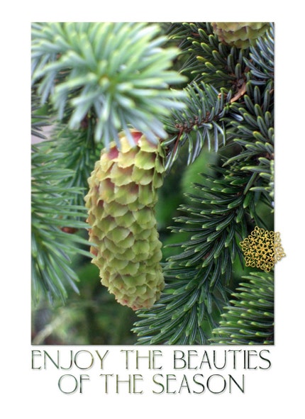
Just as a reminder, the haiku in English often contains 3 lines of 5-7-5 syllables. I tried to work with the Japanese tradition of including a seasonal reference (frogs, cherry blossoms, and haze are emblematic of Spring; the pine is Winter) as well as a break in the flow of the poem to reorient the reader to a different line of thought (I don't think I was quite successful in this always, alas).

A boiling Spring sea
Ate my land. The people grieve.
Still, blossoms will come.

spread2-3

So much work to do
Silted with old memories
Haze in the still air

spread4-5

The season says Spring
But Winter lingers in me
Peace next year, perhaps.

spread6-7

Returning, I find
There is a boat on my house.
At least I exist.

spread8-9

The mud is so deep
And houses float out to sea
Laughing, a child plays.

spread10-11

Above the waters
In the distance, Mt. Fuji,
Spirit flying high.

spread12-13

Nightmares drown my sleep
With sounds of the roaring sea
Still, I have a roof.

spread14-15

Land of hushed stillness
Uncertain now, and fearful--
Reach into your past.

spread16-17

Invisible fear
Blows in the wind; waters fields.
Even Tokyo quails.

spread18-19

My life washed away.
In the refuge, someone coughs.
Listen! A frog sings.

spread20-insideback

And that, is that. Thank you for the honor of being OSA's SAM for this month!

Back

Friday, October 8, 2010

4 Cards

More with Copics--and yuzen washi. *bliss* These are all stamps of my design from Art Neko.


I guess I can mostly color inside the lines these days--but forget about keeping things straight! Good grief! ;)

Friday, October 1, 2010

More Copics

While in Portland this week, I dropped by The Paper Zone, which I don't recommend to anyone who doesn't want to hear an enthusiastic sucking sound as the cash flies out your pocket.

I there found out that Neenah's Classic Crest (I picked the whitest, which was Solar Crest) was one of the best Copic papers. 1 ream. Kaching! Then, I just had to get some Kromekote (by SmartPapers) to do all the alcohol ink techniques on glossy paper that I learned at my workshops last week. 1 ream. Kachingggg! Plus, some Tsukineko Memento dye ink--used it tonight with the Copics, and everybody is right, it's awesome and smearless--and a Martha Stewart (yeah, I know) Scoring Board so I could recreate some of the awesome folded cards I learned about. KACHING!

So tonight, I got out my cardstock, the Copics, and the Memento, and made this:


The one thing that did smear when I painted the whole thing with a crayon watercolor wash at the end was their hair. I'm not sure if it was because it was a larger area of Memento ink, or if it was the Copic black marker that I used to darken the hair. Ah well, live and learn... =) The card is kind of cool, as you're seeing a scan of the *inside*. The card opens up like a double door cupboard, and is kept closed with some gold cord looped around two buttons attached to the side panels. The stamp is one of mine from Art Neko.

Monday, July 20, 2009

A couple of cards...

I was experimenting tonight with gold on black...

Heather T, Black & Gold Courtesan

Stamp by Art Neko

I found that embossing in black on black cardstock was way cool, and the best gold coverage I could find was using a credit card to spread Golden Acrylics over the embossed image. When I used a lightly corrugated black-striped cardstock, I got this cool ripple effect...

The other card I really liked was this one:

Heather Taylor, Pearl-Ex Woman

Stamp by Non Sequitur

Here I mixed Pearl-Ex powders with a dab of Golden Matte Gel, and just painted it on. I really liked seeing it go a bit free form...

Monday, December 15, 2008

Catching Up On Layouts & Stamps

I have recently just discovered K'Lynn of Black Dog Designs and her magnificent layouts through the Gallery Standouts. I'm mesmerized by her multi-layered artwork, the way she sees detail and the way she can extrapolate an item from a kit and make it really work in an entirely different context. I'm also a touch in awe of her technical skills, too. =)

Being the sponge that I am, of course echoes of her work are going to filter through my stuff for a while... certainly in this first layout. There's a bit of Vinnie Pearce in there too, of course, but man, I need to get some more skills into my tired fingers...

I've been sitting on a kit of mine, Rain, for some time now. I keep on vacillating between artsy and more child-oriented, so of course nothing's coming together real well, but I'm building bits of it here and there. I've used some of that stuff in the following layout, as well as 2 papers from Paired Paper Pack at Get Digi With It. Fonts: Typewrong and Soul Mission. Journaling reads: Sometimes the only place you won't get tossed about is inside your head."

Safe From The Storm, Heather Taylor

I also wanted to get some more CT work done before the rush of the holidays. I made one with some Vinnie Pearce stuff that's not coming out till January so I can't show it to you, but I made another with some of her awesome templates at CatScrap. A child's ability to brush away the cobwebs of adulthood is amazing and humbling:

Heather Taylor, You Can See

Credits: All Vinnie Pearce at CatScrap. Give Me Simple Template Pack No. 2. Papers from Moments of Special, New, and Typography Corner pack No. 1. Little red heart from I Live For, globe from Playing in the Snow, and pearls from Naturals. Font: Prestige Elite Std. Journaling reads: "you take things at face value -- your innocence sees so clearly."

I did some with 3 Pixel Chicks stuff:

Heather Taylor, What Happiness Looks Like

(Credits: Everything by 3 Pixel Chicks, Together Kit, with a little touch of Centure Gothic for the date.

I also did another for Sande Krieger at 2 Peas. She really has a huge selection, and since I got it all at once, it's all new and shiny for me. There is also rather little bundled as a kit--much of her work is in series (a whole bunch of frames, a whole bunch of tags, a whole bunch of papers, etc.), so you get to pick and choose a lot... Her little kit of houses called Home Is Where The Heart Is really inspired me on this one!

Heather Taylor, When You Are 5

I also did one with my own kit, Merry Christmas:

Heather Taylor, Merry Little Christmas

And finally, in other news, I've finished a new stamp plate for Art Neko. Unfortunately, Candice (the owner of the store) feels that business has been too slow to produce a new plate at this time, but I hope it will get out there eventually! Here's a little preview (just a bit from the center--you can't see everything!)...

Heather Taylor, Taylored Stamps for Art Neko

I hope you have a great week!

Sunday, October 26, 2008

Still Life With Beach

Had to make cards today, and do school (catching up for when Mom was here, though still, we're already done with November's classes!), and make a couple of new cards for my Etsy shop. So this was a quick layout (relatively), and I wasn't quite sure whether it was finished or not. It had a poem calling to me, but I wasn't able to dig it out...

Heather Taylor, Still Life With Beach

Credits: Everything mine except for the coin "frame" by Vinnie Pearce (Pixel Canvas, Naturals). Fonts: XBand Rough and Big Ruckus AOE. Though I added the frame and lighthouse picture, can you believe that this little collection of sea gifts I found exactly like this? Amazing.

And here's the card--the last one for ACE9 on my Oriental Stamp Art group:

Heather Taylor, Dancers

Credits: Stamp by Art Neko (not one of mine), and yuzen from Stone House Stamps, House of my (willing)financial demise... ;)

And finally, the new Etsy cards:

Heather Taylor, Nature's Gift Wrap

(Might make that word art into a freebie at some point!)

Heather Taylor, Season's Beauties

Hope you have a great week!

Sunday, July 20, 2008

Some Cards

More cards with my new stamp sheet--I'm really liking this one!

Heather Taylor, An Orchid Is Water Made Light
Stamp from Art Neko, colored with acrylics and inks on watercolor paper & acrylics.

Heather Taylor, Waterfall Sakura
Stamp from Art Neko, colored with watercolor crayons.

Heather Taylor, Peonies
Stamps from Art Neko

Wednesday, July 16, 2008

Japanese Birdie

From my newest plate of stamps at Art Neko:

Heather Taylor, Japanese Birdie

Stamped in Versacraft black and left unembossed on painted watercolor paper, over 3D japanese flower paper and handmade Thai paper.

Thursday, July 3, 2008

Whee! New Rubber!

P054 went off to the engraver's today for Art Neko:

Art Neko P054 Preview

Our first sheet in quarters, since everybody's purse is becoming smaller and smaller...

Sunday, June 29, 2008

New Rubber Preview

Since Estivalia was asking... One of the stamps from the new sheet, still in development -- inspired by a vintage sumi-e print. The new sheet is going to be mixed Chinese & Japanese...

Heather Taylor, Little Birdie Rubber Stamp

Friday, April 4, 2008

New Stamp Plate: Japanese Gardens 4

Here's a little preview of the new stamp sheet (at Art Neko by the beginning of next week?):

Heather Taylor, Japanese Gardens 4 (for Art Neko)

And heck, I might as well try my hand at a Japanese-themed mini-kit as well! So here's the first paper I've come up with (I'm tentatively calling the mini-kit "Asian Mists"):

Heather Taylor, Asian Mists Paper 1 (Preview)

Wednesday, April 2, 2008

Homeschool Silliness

Our newest venture: comic strips. Featuring Crocodile the Worm. Heh.

Heather Taylor: Crocodile, A New Job?

In more serious news, I'm working on another stamp plate, with a *gorgeous* plum blossom arrangement. Well, I think it is, anyway. =)

Saturday, March 29, 2008

And an Actual Post on Stamping (Don't All Faint, Now!)

Candice of Art Neko has recently acquired some designs from another designer/store who's decided to retire, and asked me to make some samples. There are some quite cute ones in there! Here are a couple with an Asian theme (a lot of these stamps are also non-Asian):

Heather Taylor, White Egrets

And the second:

Heather Taylor, Spring Is Still Cold

On both these I was trying out my new Moonglow Stains and Spritzes, which I got at the stamp show the other weekend, at a booth run by "Lindy's Stamp Gang". While the stains looked good on the samples, I've been really disappointed with them on my samples--the main color, when looked at straight on, is very washed out and actually not super-pleasant. The mica glow when you move the paper side to side is quite nice, but really, who does that except perhaps on a card, the first time you get it? Certainly if it's a piece that hangs on a wall, you're almost never going to benefit from that reflection.

The stains, on the other hand, are super-saturated with color and I adore them. =) They also have a nice little shimmer, too!

The background on the 2nd piece was made according to a technique I recently learned from Ruth C. on the OSA group, called Cheesecloth Backgrounds. I adapted it (not having any cheesecloth) by dabbing the stains over a small piece of burlap which I moved around on the semi-gloss paper until it was covered. Then I also experimented with brayering the saturated burlap, and it left a really nice pattern plus a lot of stray fibers which left cool marks (and which I brushed off when it was dry).

I love that little brazier stamp! You can't see it in the scan too well, but I carefully embossed the brazier itself in black, then the coals in red, and the steam in gold... Fun!

Wednesday, March 19, 2008

The Clone Tool

Probably one of the most useful Photoshop tools ever, the clone tool enables you to perform all kinds of magic on photographs. You can enhance skin tone, clone out that freak in the background of all your picnic pictures, or get rid of a color that clashes or a distracting element.

In the following layout, I used the clone tool (as well as some recoloring of the photo, and some different blending modes) to even out my nephew's skin around the eyes and the bridge of the nose, as well as get rid of all that teething drool. =) I find that the easiest way to work with the cloning tool for textured surfaces or non-detail work is to use the clone tool set to NON-aligned. Then, each time you pick up your pen, you go back to the same source point instead of picking up continuous pixels. This adds more randomness and avoids having the texture look fake. In addition, try reducing opacity and using soft, grungy brushes that will also introduce a non-repetitive factor, which is pretty easy for the eye to pick up on. Here's the layout, followed by the pic (please click on layout for materials source (all Designer Digitals):

Heather Taylor, The Gaze of a Child

Original photo:

Heather Taylor, Nephew

And here, just for fun, is a quick layout for a great picture of Candice (owner of Art Neko and Kathy (owner of Rubber Stamp Ave.) goofing around before dinner (the best crispy eggplant EVER at Fujin's, in Portland OR). Click on photo for details:

Heather Taylor, Truly Great Friends