Showing posts with label digital elements. Show all posts

Sunday, June 9, 2013

The MScraps June Memory Mix!

MScraps has begun a new event, the monthly "Memory Mix" where you get to mix and match elements & papers from a common color theme. I chose "Tea Party", and cooked up some super-romantic, vintage-y papers & elements:


and


The deal on these is that you receive a discount via coupon. Just spend $10 and get 20% off using the coupon code MM20OFF; $10-$15, and get 25% percent off (coupon code MM25OFF); and $15 or more, 30% off with the coupon code MM30OFF. These will be valid through June 14, 2013, for the Memory Mix products only.

Here are some awesome pages from the CT, just to show you what can be done:

By Julie:


By Lisa:


By Vera:


By Jo-Anne:


By Margje:


Enjoy!

Thursday, September 22, 2011

Strip Dates @ MScraps

These are some ultra-useful little things (well, not so little as they stretch 12" for the most part), and there are 2 different styles so you can use them on both your clean layouts (check out Sandrine's, below), and your grungy ones. Plus, 9 different pointers! On sale 20% off till Monday, of course!


Some great layouts from the crew:

By Sandrine:


By Jenny:


By Vera:


By Lisa:


By Julie:


By Romy:


And I got in on the action too:


Strip Dates! I hope you all have a wonderful weekend--mine is going to be super-busy getting ready for the art show!

Thursday, March 17, 2011

New Goodies: Fasteners & Frames!

Yup, 2 new elements packs this week @ MScraps, Refastened 1, and Reframed 1. 20% off until Monday, too!


Lots of fun to play with!! Here's a layout I made:


(that stuff is soooooooo good!)

And here are some CT layouts!

By Julie:


By Sandrine:


By Vera:


By Romy:


By Sonia (not my kit, just the fasteners are mine):


Have a great weekend, everyone!

Thursday, September 10, 2009

New at Pixel Canvas: A Pirate's Treasure!

Well, just the pearls, really. =) Ooh, Shiny! 1. Hehehehe.


I'll have more in this vein plus some jewels next week! (And hopefully, some more stitching, too!)

Thursday, June 25, 2009

New in the Shop!

Here's what's new for Pixel Canvas this week:

Heather T., 253 - More On Masks

This illustrated tutorial gives you an introduction to layer masks of all kinds, and includes tutorials on gradient layer blending, spot retouching, and easy recoloring!

The tutorial is intended for intermediate to advanced users.

11 pages, .pdf file, for Photoshop CS+ (sorry, this doesn't work in Photoshop Elements!).


And a couple of element packs:

Heather T., Growing Up Too Fast
Doesn't it seem to you that your children are either growing up too fast, or they're always in a hurry? Does to me!!

- 6 word art (one comes with both "mr." and "ms.")
- 2 papers
- 3 stickers


Heather T., Painted Corners & Dividers

A great set of thick and thin, solid, dashed, and dotted paint lines and corners to use around your photographs for an art journal feel. Includes brief instructions on how to make the paint appear thicker, and how to change the colors.

And some layouts for today:

Heather T., Pulled Close

This is actually TWO photos. =)

Everything @ Pixel Canvas. Most everything by Vinnie Pearce: Blended background paper is from Running & Jumping; birds are from Paint Splatters; pink moth is from My Drama Queen, and beige butterfly is from Young Beauty. Long ribbon is mine from the Country Dreams kit, and the dragonfly is from my Always Time. Font is butterbrotpapier.

Journaling reads:

"the tide
creeps its blue blood
in a subservient lapping
passive-aggressive
it curls ever further inwards
we retreat in cautious fascination
pulled close by some elemental likeness
salt and water, a pulsating heart,
and yet repelled in self-preservation
two inches of benign froth now
will be two feet of riptide current
in a couple of hours
i recognize those mood swings, these days "


Heather T., Incognito

For the 2nd type challenge: Kerning A Single Word

Credits: Font: Euphorigenic.

I think this is the fastest layout I have ever made! *lol* But I really couldn't think of anything to add to it... =) This is Allen wearing Grandmama's over-sized sunglasses! The flames behind his head are part of a painting, and I must have panned the shot, because he's still, but the background is blurred. Completely fortuitous!


Heather T., Mesmereyes

For the Friday lift @ Pixel Canvas, from a layout by vdannette (one of my new CT Team! But more on that later), Unforgotten

Everything at Pixel Canvas: Papers by ViVa Artistry, Nouveau Cirque, and Vinnie Pearce, Ecofabulous Collab. Paper on the side is by Ashley Kennedy Design from the Breakthrough Paper Pack. Tag for framing eye by Cheeky Monkey Design, Lovely kit. Mask is mine. Japanese character (yume) by Yoshiko Utsunomiya. Ivy from my Faery Lights, and flower from Fabricated; butterfly brush is mine as well. Font is Hogarth Script.


Hope you have a wonderful weekend!

Thursday, June 4, 2009

***New*** 3D Whites, and a Font!

New at Pixel Canvas!

These shapes are super fun to play with, and they're LARGE! I included the colored sun just to show you what could be done with them...

Heather T., 3D Whites

And, a font! This is just a scramble of "found" letters, and a lot of fun:

Heather T., Charabia

Saturday, May 17, 2008

Flourished (Full Kit) & A Kit Freebie

Whee! My first full kit... inspired by my peacock! *lol* I'm probably the only person dorky enough to be inspired by myself... =)

So without further ado, I present to you: Flourished Full Kit, in the Ooh la la, Artsy! Shop! If you don't want the whole thing you can buy the Element Pack, too.

Heather Taylor, Flourished Full Kit

And, there's a freebie to go with it, which you *can't* get in the kit: a set of 4 gold photo corners--something special to set off your beautiful images! Just click on the preview to download.

Heather Taylor, Flourished Freebie

Friday, May 2, 2008

Layout Catch-Up

Man, have I been *busy* this week. It was the end of the month, so all my websites had to be updated, and our adorable lunkhead of a black lab--the one featured in so many of my "boy and his dog" layouts--has been diagnosed with lymphoma, which is of course terminal. Just depends on how much money we can afford to spend on chemotherapy; we're taking him to Oregon State on Monday to be evaluated. And, I've been asked to design a freebie kit for Aussie Scrapbooking, a site that should be opening by May 12th! I'm totally thrilled, and totally nervous. =) My usual dithering self, wot...

So, first up: a layout using one of my overlays, and a painted frame edge. I just discovered the large brushes included with PS CS2. Heh.

Heather Taylor, Egg

I think I was probably channeling Vinnie Pearce. =)

And this one was using several different photos in Kellie Mize's freebie from last week at Designer Digitals--she had this constellation of frames. I knew I wanted to use at least some squares of patterned paper (I used three, in the end), but placing the various photos of the fire pokers was kind of a serendipitous playfulness. This "technique" was a follow-up from a previous post where I'd also placed several photos into what used to be journaling strips--I find this severe cropping to be really useful when you have a ton of photos surrounding one event.

Heather Taylor, Fire By The Sea

This last one took me crazy amounts of time because I made the peacock. But to make the peacock, I had to draw all the flourishes. As vectors. It's all good, because that way I can reuse them often, but man, the initial work is huge! The paisley is from Dover Clip Art, though--turned it into a stencil in Art Rage and painted it with metallic green and glitter. Oh, and I made the brads--those turned out ok--and the "bobby pin" which I think needs some serious attention, and the metallic stitching around the edges. =)

Heather Taylor, Peacockitude!

Next week's challenge at 2Peas is with art filters, so I'm looking forward to having fun with that!

Saturday, April 5, 2008

Extractions

No, not teeth. Though that may yet come.

For this one I used a dark brown linen bookbinder's thread stitched loosely into some light, white-coated chipboard with a large embroidering needle, then scanned it at 600 dpi. Because of all the little "hairs" coming off the thread, I decided to use the Extraction filter (up in the top portion under Filters).

This filter is pretty tricky, and I find it useful only in some very specific cases, such as when you have fine lines that are burned through with background color, which makes extraction with a selection marquee (either with a pen or the lasso) pretty useless, and very frustrating in its fiddly-ness. The Extraction Filter works by painting over the edges of what you want to retain, then filling the inside. You can even set the opacity in terms of what is retained, and that's where it comes in handy... For this one I used a 1 pixel brush to go over the contour of the thread and the "hairs"! On the image below you'll see the original scan, and the extracted thread used on my "Tangle" layout, which follows:

Heather Taylor, Stitching Extraction

Heather Taylor, Tangle
(click for credits and description)

Monday, March 17, 2008

Round 3 is up!

Ack, I don't know why, but I'm having a serious case of nerves on this one. I know I can still design without winning this, but I'm really finding use in the instruction, which is teaching me stuff that I never knew...

Anyway, here's the preview. I'm guessing the people to advance to the next round will be notified tomorrow evening, and the elements will be available for download on Thursday... [ETA: Dang, they removed it because we were cut. *sigh*]

And here's a link to the days 15 & 16 of the challenge, which I accomplished despite being gone this weekend.

Heather Taylor, 21-Day Challenge: Days 15 & 16

I had a great time hanging around with Candice, and really enjoyed interacting with the customers and fellow stampers! Here's a picture of Candice and her "booth"...

Candice Jordan of Art Neko Stamps and Art Neko Booth

Wednesday, March 12, 2008

Digital Scrapping Element Freebie

Here are my submissions for Round 2 of the Little Dreamer Designs Apprentice Contest, and I made it through this round... Again, they must be looking at number of downloads in terms of what they're scoring, I think. Click on the pic to get to the download...

Heather Taylor, Elemental My Dear - Element Freebie

Tuesday, February 26, 2008

Trying My Hand

Well, it's no big secret that I am pecuniously challenged, so I keep on hoping that if I work really hard and gain lots of skills, I'll get lucky and land a designing job where I can work from home and continue to homeschool Allen (yesterday he learned Roman numerals, and practiced counting with coins--fun!). It just so happens that I'm fortunate enough to practice by scrapbooking! *lol* I think I'm juuuuust beginning to get to the stage where I know enough to realize how much I don't know...

So, a couple of layouts with stuff I made:

A variegated polka dot paper pattern. That was way fun. And then making little dots with my frame, and inside an alpha I made up (the ONE thing I don't like about Designer Digital's site is that everything has to be so small! 500x500 at less than 100 Kb just eats all the detail. *sniff*). You can see it a little better here:

Heather Taylor, So Qt (cute)

Although even there you can't see the little dots in the letters--just imagine they're all like the "4"! And the interlocking circle tag thing also has "holes" running around the edge. The paper overlapping the green rectangles was also one that I made--I actually recolored the polka dot paper for this layout. Plus I made kind of a patchwork quilt paper with white lines running through the various colors going in different directions, but I ended up not using it. So, that's almost like a full kit!

I also really like what happened with this layout:

Heather Taylor, Nature

The stained glass effect was pretty easy after all (I'd had these nightmare visions of dodging and burning each square): I just used the background for one of the cards I'd made earlier this year. I desaturated it, duplicated it, turned one of the duplicates at a 90 degree angle, and set one to color burn, and the other to linear dodge. Terrific effect, I think! My little crow is from a walk a couple of weeks ago, and the tree I first drew free-hand, then redrew it in Illustrator.

The picture is from a walk we took this past weekend down near Coos Bay--just WAIT till you see the phenomenal pictures I took--and then my battery ran out. ARGH! My husband wondered if I could even take a walk without a camera in hand anymore... =)How'd I get so hooked?!?

Friday, February 22, 2008

(yellow bus still in hand)

This layout actually took me 2 days! I'm amazed I was able to go to sleep... *lol* I really loved the work of Matte Stephens that I found via drawn.ca, an illustration blog. The challenge this week @ 2Peas is "Art Inspiration", so I chose a cute little birdie of Matte's and closely copied him. =) I learned a lot doing it, too--made all kinds of different brushes to allow me to grunge up the flat digital drawing. Turned out pretty well, I think! Then I adapted the doodles to make a real tree, and I used broad shapes of flat color for the background.

Then, I had no clue what to do.

Eventually I found this cute photo of Allen's from 2005, I think--he was about 2 years old, and we were visiting San Francisco. I extracted him, repainted a shoe that was full of grass (even back then he had big feet, though!), and placed him in the birdie's line of sight.

Then, I had no clue what to do.

So I wrote a poem. *laugh*

Heather Taylor, (yellow bus still in hand)

your once small steps have led you
(yellow bus still in hand)
through countries of idea and color
and still, with curiosity, you
explore the land of words
chunga floudle marinkajay, you said
--in grand exclamatory style

I hope that the other side of reality
will never be less important
that you will pass through
like Alice,
a citizen of both worlds

Saturday, January 5, 2008

Making Your Own Stuff

There is so much beautiful stuff for digiscrapping out there, it's hard to know where to start. When I began last June, I Googled for freebies and challenges--I like challenges, because they force me to do stuff I wouldn't do on my own--and rapidly became rather overwhelmed with the profusion of papers, elements, and fonts out there (I got over myself on the fonts, though ;).


'Sides which, I don't much like to be beholden, so I began to explore how to make my own stuff. There were a couple of things that I really wanted: frames, and ribbons. I still haven't figured out the ribbon thing (mostly because I can't tie a nice knot, so it looks ridiculous when I scan something), but I quickly found a great source for all kinds of different frames: vintage photographs.


There are many places on the net where you can find photos that have wonderful, old-timey frames. There's even a Live Journal group called vintage-photos that posts all kinds of family stuff from way back when (and they give permission to use the pics, of course).


It's usually pretty easy to isolate the frame--I just make paths with the pen (working very close-up), convert them to selections by clicking on the little round dotted circle at the bottom of the paths window, then invert the selection, and delete. Do the same for the inside and the outside of the frame, and make sure you have it on its own layer, and there you go, instant frame! Make sure you go around the edges with your blur tool to soften them. Changing sizes slightly to fit your photo is pretty easy, because many of these frames are very worn. Simply drag the corner boxes to fit around your photo, and you may find it doesn't even affect the quality very much.


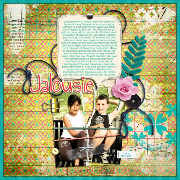
Here's one I used recently:


Fonts: You Are Loved and The King and the Queen for the word art; Baby Boston for the journaling. Background guitar picture by 'xenia' from the Morgue File, small metal guitar made from a guitar picture by 'messa' (also Morgue File). Everything else mine.


For this particular layout, I also incorporated a couple of images that I found on Morgue File, a free photo-sharing site. One of them (by "xenia") is blended into the background (which, by the way, is simply a scan of wallpaper used in exclusion mode over a simple fill--the texture is the same in the word art), and the other (by "messa") I extracted, then made into a little metallic pin (Johnny is an excellent guitar player and musician, and he's really keen for Erik to follow in his footsteps!) by using the bevel and emboss function, and filters for bas relief and chrome, then adjusting the hue/saturation sliders until it looked passable.

Of course, the scanner is your best friend, but it's amazing what you can do with old photos--yours, or others'!

Wednesday, December 26, 2007

Digital Realism (or lack thereof)

Here's a layout I've been fighting with for a couple of months now:


(Fonts: Chachie & Saginaw; ribbon by Lynn Grieveson at Designer Digitals)

There are a couple of issues going on here. One is that the focal point is not well-determined; the eye has a tendency to keep on bouncing onto the next element, over and over again. There's a lot to look at here! The other is that the level of realism varies from pretty realistic to obviously digital, so the mind has problems perceiving the layout as a functional whole.

The puzzle pieces are ok... except that you expect a continuous image, not one image per puzzle piece. The ribbon is great (one of the reasons I chose it--the other being that I can't tie a proper knot to save my life and so I've never gotten any good enough to where I'd be willing to spend time extracting it from a scan), the little tags with staples aren't too bad... but the cookie splats (yes, that's what those are!) are pretty unconvincing, even though I took them off another picture and blew them up; the "sticker" (Mmm -- cookies!) is kinda lame, and my torn edge is seriously lacking. And even if I'm kind of proud of my first pin, I don't really think the head looks very real... Annoying!

Here's a fun site for you: decide whether the photos are real, or digital. It's not that obvious! But it sure points out what a long way to go I have...

A few sites I've found useful for beginning efforts at realism:

- Janee's Photoshop Tutorials (she also covers Elements when there's a big difference)
- Planet Photoshop
- The Photoshop Guru's Handbook

And if you have anything to suggest for this layout, please do!