
Showing posts with label extraction. Show all posts
Showing posts with label extraction. Show all posts
Saturday, July 26, 2008
Little Guy
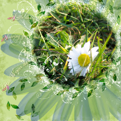
A belated scrap of a photo my friend Brenda Marks had given me of her doggie... isn't he delightfully cute? I also used it to fulfill a 2Peas Challenge (extracting an element--the dog tag--from a photo) and a Saturday Scraplift at Designer Digitals (of Erin's "So Young" layout). Other credits: Word art by Wordle.net with Kenyan Coffee font. My paper & sunflower sticker (Fall Splendor-not out yet), also my dog tag. Lynn Grieveson's heart brad (Designer Digitals, web challenge, june 15 08). Katie Pertiet's frame (DD, 3pm Layered Template freebie). Tape by Rhonna Farrer (2Peas, Celebration Kit). Journaling strip by Anna Aspnes (DD, Mama Page Set). Fonts: Eight Fifteen, Arial & Hearts. Click for the larger version, as usual...
Tuesday, July 15, 2008
Partial Extractions: What They're Good For
A partial extraction is when you only allow one portion of an image to remain intact, and cut out the background on the rest of the image. Photos that work well for this are ones where the main subject is extruding somehow--somebody waving a flag, waving hi, or even something like the head of your pet. This obviously really highlights the extruding part, so unless you're focussing your layout on your dog's wagging tail, the hind end might not be your best bet for a partial extraction. (Ha, ha ha ha. Badaboom.)
To do the one in the following layout about the awesome Arum dracunculus growing in front of our Post Office, I first used my rectangular lasso to choose the part of the photo I wanted to keep, as the part that I extracted had the sidewalk as a background, with a bit of litter--just not a great photo overall, background-wise. I copied that square, then pasted it on a different layer.
Next, I went back to the base layer and started extracting (my favorite tool is the pen, working very close up; complete your path, switch to the path palette, click on the "change path to selection" little circle of dots at the bottom, feather 2 pixels, invert the selection, and press delete to remove the background).
I chose to break my extraction about 1/3 of the way into the square, so that part of the extraction overlapped part of the original. When I added a very strong shadow to the square (100% using a dark color eyedrop-picked from the background paper), I duplicated that for the extraction. Of course, you'll get a shadown down the middle of your square that clearly delineates the extraction, so you have to fix that...
Right-click on the layer name for the extraction, and pick "create layer"--this will make your style effects into separate layers, 1 for each style you have. Here it was just the shadow, so I made all my changes to that one.
Working only on the newly-created shadow layer, I first erased the strong line that showed where the extraction began--but only the vertical part of the shadow. In fact, I extended the shadow under the spathe (the petal-like structure of the plant) further to the left, gradually fading it out, using both the blur and the smudge tools. This really helped the spathe pop out dimensionally against the background, but the effect was subtle enough that you wouldn't really notice it unless you knew, I think...
Please click on the image for credits and a little more info about this gorgeous Dragon, aka Stink Lily!
Saturday, April 5, 2008
Extractions
No, not teeth. Though that may yet come.
For this one I used a dark brown linen bookbinder's thread stitched loosely into some light, white-coated chipboard with a large embroidering needle, then scanned it at 600 dpi. Because of all the little "hairs" coming off the thread, I decided to use the Extraction filter (up in the top portion under Filters).
This filter is pretty tricky, and I find it useful only in some very specific cases, such as when you have fine lines that are burned through with background color, which makes extraction with a selection marquee (either with a pen or the lasso) pretty useless, and very frustrating in its fiddly-ness. The Extraction Filter works by painting over the edges of what you want to retain, then filling the inside. You can even set the opacity in terms of what is retained, and that's where it comes in handy... For this one I used a 1 pixel brush to go over the contour of the thread and the "hairs"! On the image below you'll see the original scan, and the extracted thread used on my "Tangle" layout, which follows:


(click for credits and description)
For this one I used a dark brown linen bookbinder's thread stitched loosely into some light, white-coated chipboard with a large embroidering needle, then scanned it at 600 dpi. Because of all the little "hairs" coming off the thread, I decided to use the Extraction filter (up in the top portion under Filters).
This filter is pretty tricky, and I find it useful only in some very specific cases, such as when you have fine lines that are burned through with background color, which makes extraction with a selection marquee (either with a pen or the lasso) pretty useless, and very frustrating in its fiddly-ness. The Extraction Filter works by painting over the edges of what you want to retain, then filling the inside. You can even set the opacity in terms of what is retained, and that's where it comes in handy... For this one I used a 1 pixel brush to go over the contour of the thread and the "hairs"! On the image below you'll see the original scan, and the extracted thread used on my "Tangle" layout, which follows:

(click for credits and description)
Friday, February 15, 2008
More Odds & Ends
Dagnab it, 2Peas is down again, so my blog is all patchy. Sorry 'bout that! Guess I'll have to upload these...
Ok, I'll go from oldest to newest:

(Click for credits and text)
It's funny that this started completely differently. I do like how it ended up, though. I especially like the interplay of the graphic element (the wavy line, which almost looks like it's actually drawn in the sand--pure serendipity!) and the title. Also, make sure you play around with the positioning of the elements before you decide it's over. The natural place to put the text was in the upper-hand right corner--but somehow it didn't quite feel right once I got it there. Just moving it lower really made the piece gel!
This next one pretty much came out of nowhere! I'd been trying to follow Cassie Jone's tutorial on making a photo into a sticker (which she handed out during her freebie Monday chat at Designer Digitals), and just couldn't make it work. So I fiddled around with it and got this vivid color that I really liked (I used the same extraction as for the San Francisco layout), and for some reason the vertical wavy lines and strong color came to me, then the path, then Dr. Suess... and boom, another Taylor Weirdo Layout (c)!

And this morning I threw together this quickie in response's to Designer Digitals's Wednesday "Just My Type" challenge:

Boy, did I have fun with this one! I just loooooove to play around with type. I think many people forget that you can make fonts rillyrillyrilly big... And by the way, check out the flowers: those were from that grocery store run. Pretty nifty, eh?
And finally, just finished this fun--but perhaps hard to read, from far away--layout that was also created in response to a challenge, this time the Ideabooks4U circle layout challenge:
I am just loving the close-ups that my cruddy little digital camera can take, though. Even though there's major lense curvature obvious near the edges, the close-ups are fabulous; and even though the macro lense doesn't allow for flash, it always seems to have super-exposure, even better than the regular lense. What's up with that? So much so that I really try to use it whenever possible... Of course, I had to go out and buy Rhonna Farrer's Swirly Frames. *sigh* I just never seem to have the time to design my own, plus, hers are just so wonderful! I did lots of different blending here as well, plus I made those little leaf thingies. Fun!
Hope you get plenty of time this weekend for artsy play... =)
Ok, I'll go from oldest to newest:
(Click for credits and text)
It's funny that this started completely differently. I do like how it ended up, though. I especially like the interplay of the graphic element (the wavy line, which almost looks like it's actually drawn in the sand--pure serendipity!) and the title. Also, make sure you play around with the positioning of the elements before you decide it's over. The natural place to put the text was in the upper-hand right corner--but somehow it didn't quite feel right once I got it there. Just moving it lower really made the piece gel!
This next one pretty much came out of nowhere! I'd been trying to follow Cassie Jone's tutorial on making a photo into a sticker (which she handed out during her freebie Monday chat at Designer Digitals), and just couldn't make it work. So I fiddled around with it and got this vivid color that I really liked (I used the same extraction as for the San Francisco layout), and for some reason the vertical wavy lines and strong color came to me, then the path, then Dr. Suess... and boom, another Taylor Weirdo Layout (c)!
And this morning I threw together this quickie in response's to Designer Digitals's Wednesday "Just My Type" challenge:
Boy, did I have fun with this one! I just loooooove to play around with type. I think many people forget that you can make fonts rillyrillyrilly big... And by the way, check out the flowers: those were from that grocery store run. Pretty nifty, eh?
And finally, just finished this fun--but perhaps hard to read, from far away--layout that was also created in response to a challenge, this time the Ideabooks4U circle layout challenge:
I am just loving the close-ups that my cruddy little digital camera can take, though. Even though there's major lense curvature obvious near the edges, the close-ups are fabulous; and even though the macro lense doesn't allow for flash, it always seems to have super-exposure, even better than the regular lense. What's up with that? So much so that I really try to use it whenever possible... Of course, I had to go out and buy Rhonna Farrer's Swirly Frames. *sigh* I just never seem to have the time to design my own, plus, hers are just so wonderful! I did lots of different blending here as well, plus I made those little leaf thingies. Fun!
Hope you get plenty of time this weekend for artsy play... =)
Saturday, February 2, 2008
More Extraction - And The Photocopy Filter
So, here's the layout I worked on today:

(The 2Peas site seems to have exceeded traffic capacity at the time I'm posting, so I'll have to come back to edit it and get the proper image url--sorry!)
So, lots of extraction, which I already talked about in an earlier post. The layout was for the Ad Inspiration challenge this week, and I focused on a Beefeater ad I found in WIRED magazine (June 2007), which had these cool old-timey background images that looked like fine etching prints, coupled with kinda random--on their part--extractions. You can see the original ad at the 2Peas link, too (click on the layout image above). This is so easily done in Photoshop, though of course it's not as fine and precise: just use the Filter --> Sketch --> Photocopy command. Make sure you've got the foreground color you'll want, and fiddle around with detail and stroke size until you like it. Easy peasy!
Friday, January 11, 2008
Extractions
Well, the challenge at 2Peas this week was to de-emphasize a background. It's actually a really good skill to practice on, because very often you have one great subject... but it's a cruddy background, cluttered, too loud, etc. This can really happen a lot if you have a lousy digital camera like I do, with no way of changing the depth of field (though occasionally I get lucky). One of the ways to do this is of course to cut the background out altogether, which is what I did in the layout below. But to do this, you have to isolate the subject... and that's the tricky part.
There are several ways you can do it. One is to use your pen tool, and working very up close, touch the pen down along the edge of the subject, dragging it lightly every time you touch down in the direction of the edge. Later you can go back and adjust your points so that the path matches the edges. In the Paths window, click on the little icon at the bottom that will change your path into a selection. Feather it one or two pixels if you think the line might be too harsh, then invert your selection, and delete the background.
You can use almost the same system by using the lasso tool, except here you're dragging continuously (a little harder on your fingers). Use the shift key to add to your selection, and the alt key to subtract from it.
In Photoshop CS2, there's also an Extraction *filter*, which is what I've used here. It's tricky to get the hang of it, I must say--today's attempt is the first one I've actually kept. To use that, work also very up close on the image in the pop-up window. The goal is to outline the subject (you don't have to worry about the photo edges--the selection automatically includes those as a line) using a marker of varying widths, then adjusting with another tool, then filling in so it keeps whatever is filled in. Preview it, adjust with the paintbrush tool that allows for varying levels of opacity (handy for hair), and when you click ok, it just strips all the rest.
I always use a fairly wide and soft blur brush around the edges. This allows the image to look less like it's just plastered on, and more that there's actually some perspective going on there...

And the second half-sheet:
Enjoy!
There are several ways you can do it. One is to use your pen tool, and working very up close, touch the pen down along the edge of the subject, dragging it lightly every time you touch down in the direction of the edge. Later you can go back and adjust your points so that the path matches the edges. In the Paths window, click on the little icon at the bottom that will change your path into a selection. Feather it one or two pixels if you think the line might be too harsh, then invert your selection, and delete the background.
You can use almost the same system by using the lasso tool, except here you're dragging continuously (a little harder on your fingers). Use the shift key to add to your selection, and the alt key to subtract from it.
In Photoshop CS2, there's also an Extraction *filter*, which is what I've used here. It's tricky to get the hang of it, I must say--today's attempt is the first one I've actually kept. To use that, work also very up close on the image in the pop-up window. The goal is to outline the subject (you don't have to worry about the photo edges--the selection automatically includes those as a line) using a marker of varying widths, then adjusting with another tool, then filling in so it keeps whatever is filled in. Preview it, adjust with the paintbrush tool that allows for varying levels of opacity (handy for hair), and when you click ok, it just strips all the rest.
I always use a fairly wide and soft blur brush around the edges. This allows the image to look less like it's just plastered on, and more that there's actually some perspective going on there...
Here's the original photo (notice that large white square of paper, which would really detract from the sweet little boy listening to a story):

Oh, and also, the newest sheets for Art Neko are out:
And the second half-sheet:
Enjoy!
Subscribe to:
Posts (Atom)