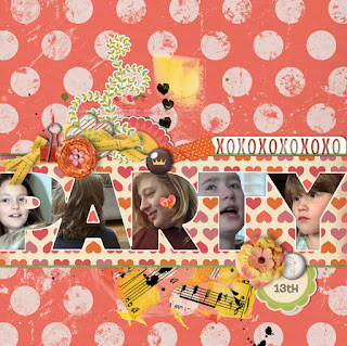
1. Clip a paper to them, then slide some photos underneath, and add some elements on top. This is what I did for the "Party" layout. I actually clipped several papers to bring focus onto the word.
2. Set the layer mode to "overlay" (or color burn, or screen) over a paper, then add the word in a different font over top.
3. Clip a photograph to the mask, then slide something under to make the words pop out (or, duplicate the photo, slide it underneath, and put a color overlay or gradient on it, and let the color difference shine through).
4. Reduce the mask in size and cut most of the black out to make a sign or stencil word art--use it like any other embellishment.
5. Leave the mask black, and place it over-top of your layout so the only color is in the words (personally, I'd erase bits of the mask around the letters so some very 3D elements could show through, but you could still read the word). And there you go!
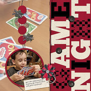
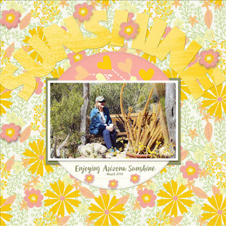
Just click on the layouts to see them full size...
 |
| Layout by Doralisa |
 |
| Layout by Julie |
 |
| Layout by Heather T. ;) |
Also, I have a "Monthly Mojo" challenge up at PickleBerryPop, about some word that was important to your family. Here's Allen waving his big vocabulary around...
And, I was feeling experimental, so I tried a tutorial by Jenny Le (2013) that was supposed to produce a watercolor effect. But I just played and played and produced a kinda dream-like effect, which I like just as much. Lots of layers, lots of masking, and lots of blending modes here!
Hopefully you're signed up for my newsletter--I just released two new freebies today! ♥


(One way links underneath wide open innovative house windows. https://imgur.com/a/V6KJvex https://imgur.com/a/OafFekb https://imgur.com/a/dRh1s3X https://imgur.com/a/k9vWylN https://imgur.com/a/ysr04ZY https://imgur.com/a/9sqwSch https://imgur.com/a/FVMDyfJ
ReplyDelete