'Cuz I do blab on, even if it's with reason, here's the short version (rules are at the end of the post):
- Create a layout
- Have at least two typographical elements (letters, words, title/journaling, etc.)
- Make the typographical elements contrast with each other either in size, color, font, or some other way--or a combination!
Rules:
- This challenge will run from September 17 until September 24th, 2010.
- You must use some MScraps product. Retired products and quickpages do not count!
- You must upload your layouts to the weekly challenge gallery and you must post your layout + link in this thread.
- 1 winner will be picked shortly after the challenge has closed and will win a $5 coupon to Designs by Anita!
Now for the reasoning that led to the challenge, with examples:
You probably know this already, but one important principle of good design is to use contrast as a means to focus attention.
Most often a page will display a contrast in size, which is the thinking behind paragraph headers, or the layout on a newspaper front page. The bold type gets your attention, and then you settle down to read the smaller type. Here's an extreme version of that (a packaging designer advertising his skills):
However, it's not just size that is in contrast here. Color plays a large part, with the black standing out more, but the red shouting for attention. It's interesting to observe how clearly the two parts of the message stand out from each other, even though the type is exactly the same for the name and the service.
Besides size and color, the designer has also focused on two different styles of type: slab,
sans-serif type for the message, and a modern
serif type for the address (modern here refers to serif types that have extreme contrast between thick and thin--easy to see in the "5" and the "N" in this sample).
Now, just to show you that contrast has to be motivated (i.e., there's a reason for the contrast), here's a beautiful poster full of contrast that has nothing to do with the message:

In this loving, self-referential spoof of a woodblock Wanted poster, there are many contrasts. Size? Check. Color? Check. Typeface style? Check, check, and check--I count at least five different typefaces. However, if you look at the poster a little more critically, you'll notice that the contrasts have really done nothing for the design itself. Yes, there is a size contrast. But the largest word is "was"--probably not the most central message on the page. The color contrast is simply one of either end of the gradient, and does not necessarily highlight the difference between "hands" and "woodblock" (those don't seem to be at the extremes of any conceptual spectrum). And the typeface styles seem to be chosen because of how they will help maintain the very rectangular design--not to draw the viewer's attention to any particular part of the message.
This is still a very successful piece of design! But the contrasts are fairly incidental here.
Your challenge, therefore, is to create a page where the type elements (at least 2, title and journaling for example) focus on CONTRAST, trying to keep a goal in mind as in the first example, and not just "for pretty" as in the second. Not that there's anything wrong with that--I certainly love to play around with type-as-effect--but just because that's not the focus of the challenge. Try and see if there are any other ways of using type that will highlight a contrast, as well!
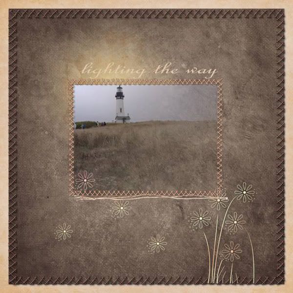
Here are a few more examples from the scrapping community:
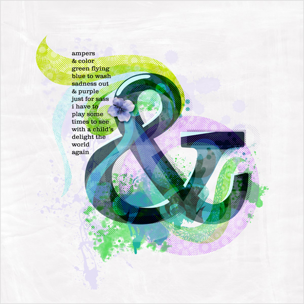
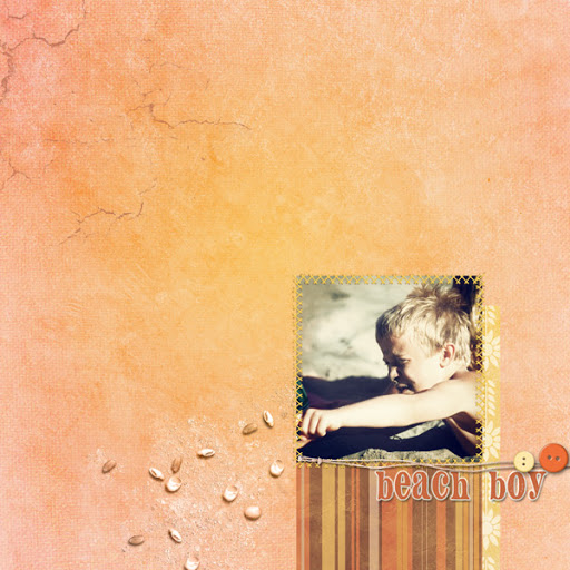
By jakajer (contrast in color, size, and typeface):
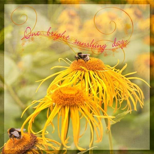
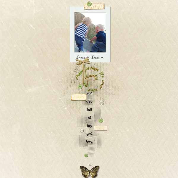
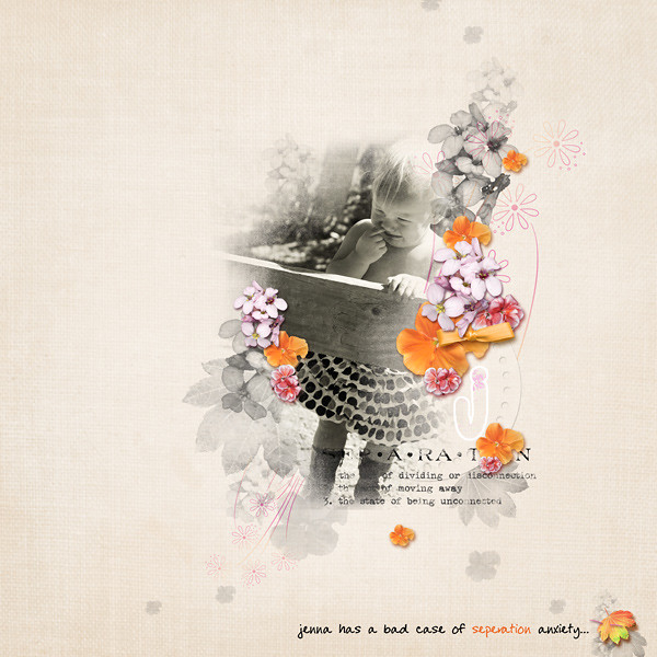
Or, by Ellan, this super-creative example of typographical contrasts (I love the flowing script for thought/narration, the regular type for conversation reporting; the number size jumble, the funky type for the quote, etc):
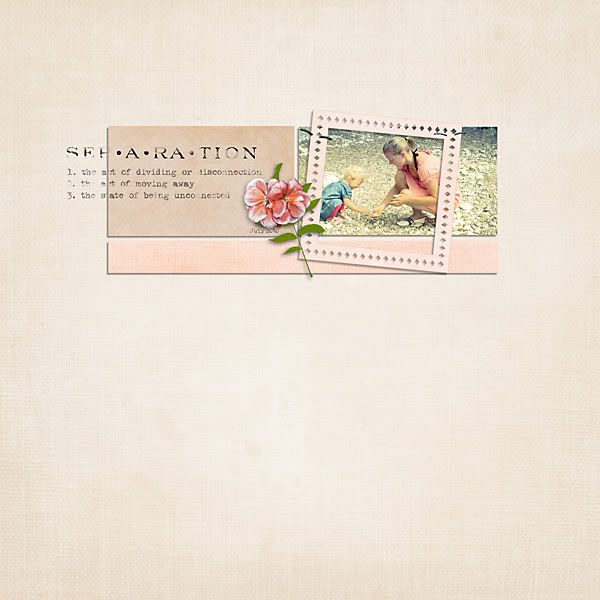
And by Tracy. Although the contrast in size is fun, the number size doesn't seem to coincide with any kind of importance hierarchy. However, the size and the color contrast with the black really draws your attention to the fact that the layout is about numbers in some way. The next focus is on the little title with different fonts that highlights "NUMBERS" (also upper/lower case contrast, which we haven't mentioned before), and then the journaling over on the left, which interestingly enough DE-empasizes contrast, so that the attention remains on the photos.
Here are the Rules:
- This challenge will run from September 17 until September 24th, 2010.
- You must use some MScraps product. Retired products and quickpages do not count!
- You must upload your layouts to
the weekly challenge gallery and you must post your layout + link
in this thread.
- 1 winner will be picked shortly after the challenge has closed and will win a $5 coupon to
Designs by Anita!
And here is my layout:
The whole series of pictures shows the contrast between the bright shiny red color of metal and the soft blue color of water. I wanted to get the hotrod flavor, so chose the Lobster 1.2 font for Big Red, in red of course. I couldn't use blue for the Big Blue or it would've faded into the water, so I chose white for contrast (adding a little flavor of red, white, & blue, not inappropriate for a hotrod car show), though I did sneak in the blue with "by the". I wanted a no-nonsense sans-serif to contrast with the serif & fluidity of "Big Red" and then I chose a much thinner font for the small caps in the tagline and date.
*phew*
Have fun, don't worry, it's all good! =)
![[image]](http://i648.photobucket.com/albums/uu207/pc-heathertdesign/HeatherT-Funkadoodle-Preview_LRG.jpg "[image]")
![[image]](http://i648.photobucket.com/albums/uu207/pc-heathertdesign/HeatherT-Funkadoodle-pp_LRG.jpg "[image]")
![[image]](http://i648.photobucket.com/albums/uu207/pc-heathertdesign/HeatherT-Funkadoodle-ep_LRG.jpg "[image]")
![[image]](http://i648.photobucket.com/albums/uu207/pc-heathertdesign/HeatherT-Funkadoodle-wp_LRG.jpg "[image]")
![[image]](http://i648.photobucket.com/albums/uu207/pc-heathertdesign/HeatherT-Funkadoodle-ap_LRG.jpg "[image]")
![[image]](http://i138.photobucket.com/albums/q257/zwyck/HT-032-copy.jpg "[image]")
![[image]](http://i138.photobucket.com/albums/q257/zwyck/HT-033-copy.jpg "[image]")
![[image]](http://i586.photobucket.com/albums/ss310/wombat146/8x8LANAIA-YOUMAKEMESMILE.jpg "[image]")
![[image]](http://i586.photobucket.com/albums/ss310/wombat146/8x8KEELEY-ONEBRIGHTDAY.jpg "[image]")
![[image]](http://i591.photobucket.com/albums/ss355/JeanH44/You-are-Beautiful.jpg "[image]")


![[image]](http://storage.canalblog.com/43/25/279289/57474083.jpg "[image]")
![[image]](http://i181.photobucket.com/albums/x267/MaggieMae1207/Ashlyns-1st-B-Day.jpg "[image]")

![[image]](http://lh3.ggpht.com/_e6e96fRH1No/TJoU0EmgvFI/AAAAAAAACkU/AXO9fy0fwNs/s576/Cowgirl%20Up.jpg "[image]")


![[image]](http://i741.photobucket.com/albums/xx51/memory_scraps/HeatherT/HeatherT-WordGems1-Preview-main.jpg "[image]")
![[image]](http://i741.photobucket.com/albums/xx51/memory_scraps/HeatherT/HeatherT-WordGems1-Preview-1.jpg "[image]")
![[image]](http://i741.photobucket.com/albums/xx51/memory_scraps/HeatherT/HeatherT-WordGems1-Preview-2.jpg "[image]")


![[image]](http://i741.photobucket.com/albums/xx51/memory_scraps/HeatherT/HeatherT-Parting-Preview.jpg "[image]")
![[image]](http://i741.photobucket.com/albums/xx51/memory_scraps/HeatherT/HeatherT-Parting-Papers.jpg "[image]")
![[image]](http://i741.photobucket.com/albums/xx51/memory_scraps/HeatherT/HeatherT-Parting-Elements.jpg "[image]")


