Showing posts with label masks. Show all posts

Thursday, November 21, 2013

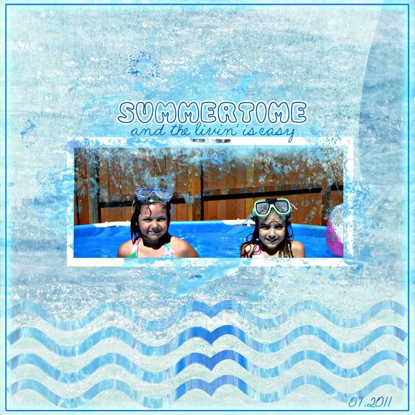
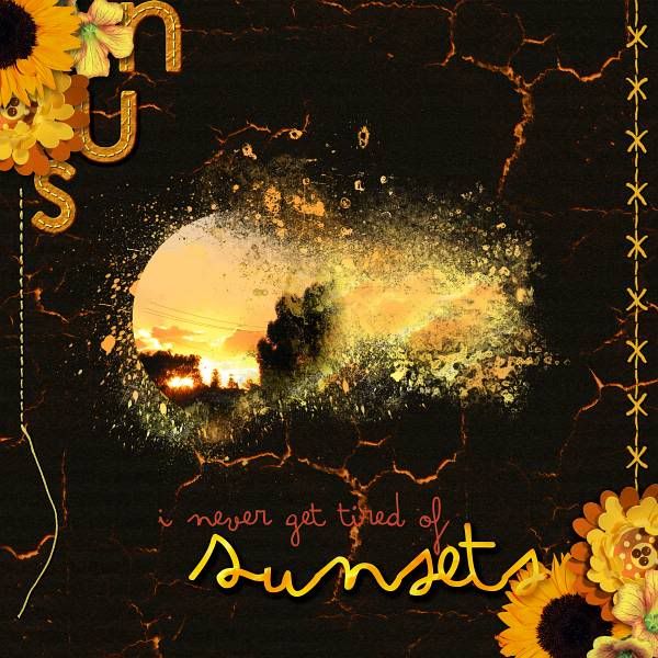
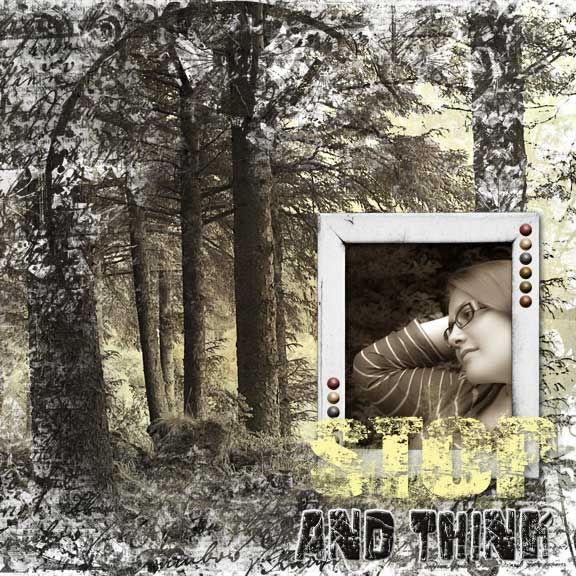
More Splishy Splashy Goodness: CU/PU Overlays & Masks 5!

Man, the CT went to town on this one! Here are my commercial/personal use Overlays & Masks 5:

http://www.mscraps.com/shop/HeatherT-CU-PU-Overlays-and-Masks-5/

Some awesome layouts:

By Astrid:


 By Fu:


 By Linda:


 By Ona:


By Jo-Anne:


Of course they come in color, and as grayscale, AND as .abr, and they're 20% off through Sunday. Tons of fun to play with!

Have a great weekend!

Thursday, March 28, 2013

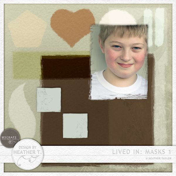
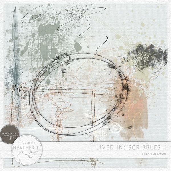
Lived In: Masks & Scribbles 1


I have some great new products out for you today--some grungy, paint-edged masks, and some lovely grunged up scribbles. Perfect for adding texture and depth to your layouts!


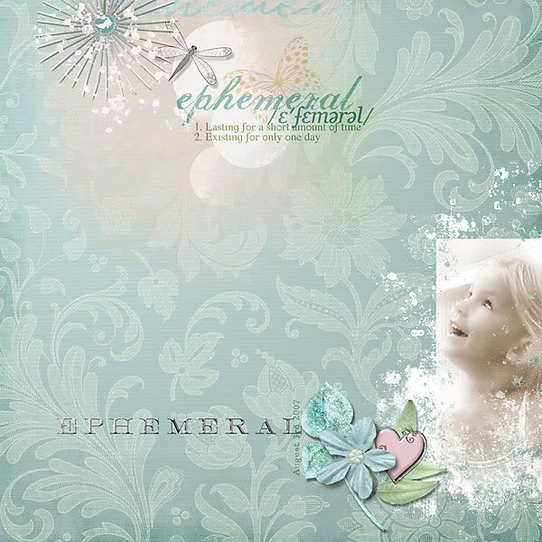
 photo Heather T., Lived In: Masks 1


 photo HeatherT-LivedIn-Scribbles1_zpscdf2022e.jpg

Here are some CT images:
By Romy:


By Jen:


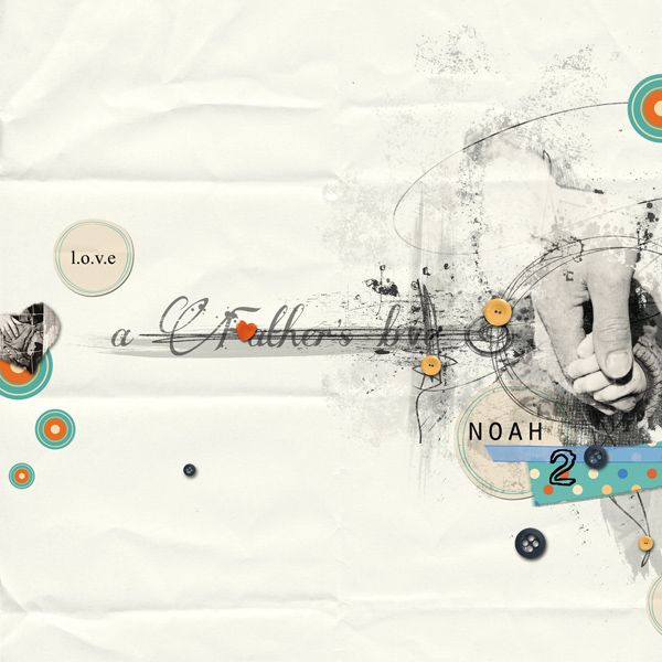
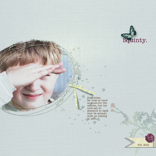
And one of mine:


Hope everybody has a great weekend!

Thursday, August 11, 2011

New Masks, With a Twist!

Hi everybody! I'm exhausted after sending out the MScraps newsletter and setting up the sale on the new products and everything (I'm helping out while Joyce is gone)--I'm not sure how she does this twice a week! *laugh*

But I also have a new product out this week called DoubleMasks (20% off till Monday, as usual). Sure enough, as the name suggests, there are two of them per "unit." But they're not the same: one is a photo mask that has at least one clear edge, then fades off in the other direction, and the other is grunge/splatter to be placed in the background.

This setup enables you to play with layering two photos, or one photo twice with the background one enlarged, for example; or layering a photo and a paper; or simply a photo with a plain color fill. Whatever way you choose to go with it, it's fun!

You get 10 unique masks in this kit:


And here is some of what has been done with them:

By Sandrine:


By Romy:


By Ulla-May:


By Jenny:


By Jean:


By Julie:


By France:


I hope to get a chance to scrap with these masks soon, too -- I've been cleaning the gutters on the house, and detailing the car. Something must be wrong with me! *giggles* Have a great weekend!

Wednesday, August 18, 2010

Some fun stuff @ The Digichick... More Masks!

Yup, Masked 3. And look at the gorgeousness that was made with them!!


This was made by Julie (MaggieMae) whom I just met here on the coast last week. We had a great (but short) time, and then she and her husband stayed a little longer drinking in the sights...


By Zoe:


By Jen (justjen):


And finally, by Ulla-May (zwyck):

Wednesday, March 31, 2010

Masked 2!

A new set of full page masks (or almost) to help you make some fun and unique layouts:


These are seriously a lot of fun to play with:


Those were both mine; here are some from my trusty CT crew:

(by Soleen)


By MaggieMae:


By justjen73:


And tomorrow, look for a related typography challenge!

Thursday, June 11, 2009

New In The Shop: A Bunch of Stuff

It's Thursday! Or Friday! Depends which side of the globe you're on... So:

Dollar Deal @ GDWI: Ocean Fun!

Heather T., Ocean Fun

This pretty little mini-kit gives you

-5 luscious papers
-1 quickpage
-1 frame
-3 buttons/flair
-1 seashell mask


And at Pixel Canvas, I have Fabricated, a little element pack with some textured, "fabric" flowers which took me forever and an age to make, as pretty much each PETAL on each flower has been extracted, covered with fabric, and individually shadowed (though you can put your own shadow on the flowers, too):

Heather T., Fabricated

And I have a new tutorial, A Quick (sorta) Introduction to Masks -- it covers primarily quick masks, their relationship to channel masks, and a way to use quick masks to make an extraction:

Heather T., A Quick Introduction to Masks

And while I'm at it, a couple of layouts today, finally:

Heather Taylor, What Lives Within

Everything @ Pixel Canvas. Background color made with a mask by Vinnie Pearce (Distressed Photo Masks - Set 03), using a paper from Cheeky Monkey Creative's What Lives Within kit. Everything else from that kit also.

And another one, Nature:

Heather Taylor, Nature

Everything by ViVa Artistry @ Pixel Canvas, from their Herbarium kit. Font is Handscript Upright.

Journaling reads: "I’m not sure I’ll ever understand myself, but whatever I can’t understand seems to disappear in Nature’s majesty."


Tomorrow... dentist. *sigh* BUT: Allen finished his first year of school today, YAY! And he zipped through Kindergarten, 1st grade, and 1/2 of 2nd grade. We *both* need a break!

Saturday, November 15, 2008

Tutorial: Fading Backgrounds

This is such an easy technique: take one paper, and fade it into the other. This gives you the chance to introduce some subtle variations into your background, without having to go full out into making something look realistic, and it's great for a soft touch of color if you want it. Here are a couple of examples:

Heather Taylor, Evening Flight

Credits: All Designer Digitals. Papers by Lynn Grieveson: Background from Essential Bases, and blended portion from Catalina (using Anna Aspnes's Fruehling mask). All frames by Katie Pertiet: From the bottom up: Carded Stacked Frames, Filmed Layered Template No. 10 (tape is from this as well), Photobooth Frame No. 2 Sampler, and Little One Layered Template. Fonts: Maszyna Plus and Sidewalk. Journaling reads: "i have seen / gravity / denied / and shadow / fade into / light / a simple act / forbidden / to me"

Heather Taylor, So Sweet

Oh, what I have to resort to to use these pretty feminine kits! *lol* Everything from Vinnie Pearce's new kit at Pixel Canvas, Shabby Baby.

So, how do you do this? First, you need a mask. A mask is simply a shape, which you will use as a "clipping path"--that is, the image will be mapped directly onto the shape, including it's opacity! It's way cool. =) I used Anna Aspnes's mask in the first layout, but they're really easy to make. Open up a blank canvas, and on a transparent layer, just start painting. You can use a big clunky brush for the middle, but the cooler effect will be given by the edges that fade into nothingness, so make the edges gradually lighter and lighter. I usually start by painting, and then erase a bunch, then paint again... Try using brushes that you've made from scans of some text (it doesn't matter what as it'll be illegible)--those make really nice fine texture.

Once you have your mask all set, place your background paper on a layer beneath it. Then, take a slightly contrasting paper, and place it on a layer *above* the mask. Now, do ctrl+alt+g (in PSE, I think it's just ctrl+g). The top paper will map itself onto the mask, and if you've faded your edges enough, it will gently settle over top the background and give you a nice color spot. Have fun!

Tuesday, April 8, 2008

Masks & Overlays

Did a couple of fun things today. One was creating some masks to clip paper to so it would look like torn, hand-made paper, and another was creating some brushes from overlays to use as grungers.

The masks are pretty easy--on a separate layer of the paper document, or in a new document, draw a basic shape. You can either use these as accents (like I did with the faded purple paper in the first layout and the flower paper in the second), or as photo mats, like the bigger-sized one in the first layout, so make the shape according to the use. Then, fill it with black, or a grunged, fairly dense, texture. I used various brushes (chalk in one case, and the queen anne's lace brush of mine in another) to "feather" the edges of the mask--you can be kinda crazy, or keep it subtle, as you please. Once you have this shape down (save it!) place it in a layer beneath the paper you're trying to use, and ctrl+alt+g/clip it the top layer to the bottom one. Ctrl+e/merge the top layer to the mask, and now you have the shape ready to be dragged into your other document. Easy! As you'll see, I used this method twice in the first layout, once for the striped paper, and once for the faded purple paper.

Heather Taylor, In This Picture (click for larger image, credits, and journaling).

In this second layout, I had fun trying to replicate Kate Teague's scratched wood texture which was present on her alphabet. I created the little circles from some paper in her same kit (the April Freebie on 2Peas), then made a layer beneath all that for the "border". Then, I used an overlay from Denise Liemert at Digital Scrapbook Pages (a site I just found last night while looking for elements--I have the hardest time finding stuff because I don't really know how to use it, I suppose! I did get those wildflowers in the first layout there, though). I just cut out a circle from the overlay and pasted it in a new layer, then hiked the contrast to have an uneven brush with some white and pure black in it. I hid the bottom layer with the complete overlay on it, selected the part I wanted to work with, and then clicked on "Create New Brush" under the Edit menu (if you don't select just the area you want to work with, it's likely that at 300 dpi that particular menu option won't even be available, since Photoshop has an upper size limit with which it can make brushes). Then, I just selected that as my brush, went in and grunged up my border layer, and was pretty pleased! I also used the same brush on an overlay that I created for the photo, which lent it some nice texture, as well as reduced the brightness to match that of the kit elements.

At some point, you'll need to actually save your new brush. Don't forget to go to Preset Manager (also in the Edit menu, a bit lower). In the new window, select all the brushes you'd like in one set (I have a Textures set, for example, so I load those before saving the new one and just add it to them), and save your set--I have my own folder of brushes, or you can save it in the regular Photoshop folder. Make sure you credit the designer each time you use the brush, though! I actually added the designer's name in the brush label so I wouldn't forget whose it was...

Heather Taylor, cute

Monday, February 18, 2008

More Challenges

A couple more challenges for Designer Digitals, one for the Ad Challenge (using Lynn Grieveson's Template), and the other for the Quote Challenge (with Katie Pertiet's wordart).

The quote challenge was really a challenge for me--not for using the quote, but because I ended up adding all this stuff and couldn't decide where to put it, whether it fit together or not, and whether I really liked it! I basically gave up on it, not knowing where it was going. Lots of blending work, and layer masks, and a little creative starring. It all began with that fantastic (well, I think so *lol*) photo I happened to catch yesterday, with, serendipitously, the moon high up:

Heather Taylor, Shoot For The Moon

The fun part for the template challenge ended up being those little suns descending on the lower third of the page--really easy to make! Use a new layer, and with a large black brush with lots of spacing, stroke a descending arc path. Then select them with the magic wand, and start distressing them--change the color, dodge & burn, add some highlights. Give them a very broad shadow--and now you have an extra little motif that was way easy to do! Remember to click on the photos to get the credits:

Heather Taylor, Fire In The Sky

Thursday, February 7, 2008

More, Ever More on Blending: The Wind

Sometimes layouts take shape based on a photograph; sometimes on an item or goodie you want to display; this one was all about the words. When that wind started howling last night, I just had to drag out Notepad and start typing away my nerves...

I had no idea what the layout would look like. The colored pictures were just totally detracting from the text. Furthermore, I couldn't figure out what relationship the photos could have between each other -besides- the text--and the viewer/reader would have to read the whole thing before being able to figure out what those photos were doing there. But if you don't hook the viewer visually, their eyes will just slide on over to the next layout...

I hunted through my photos until I finally found this poor barren tree from up on Cape Perpetua. The winds up there, at 800 feet, are easily one and a half times what they are down near the shore, and the winds really rip these guys to shreds. But that photo didn't work in color either. So then began the game of finding the right saturation, hue, etc. Once I found that, I could apply it to the two smaller photos. I finally clued in to using blending after trying to find some way to tie the smaller pictures together--and then it all fell into place. I really like the slight transparency of those smaller pictures--without any drop shadows anywhere, the page still has some feeling of depth because of it. Remember, the blending is achieved by giving the images a mask in the layers palette, then filling with a gradient. Black will let the photo show through, white will hide it. Gray will give you varying degrees of transparency.

Doesn't look like the wind left us any gifts last night, thank goodness... (click on the photo to get the full journaling, if you can't read it here).

Heather Taylor, The Wind