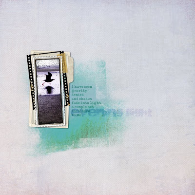
Credits: All Designer Digitals. Papers by Lynn Grieveson: Background from Essential Bases, and blended portion from Catalina (using Anna Aspnes's Fruehling mask). All frames by Katie Pertiet: From the bottom up: Carded Stacked Frames, Filmed Layered Template No. 10 (tape is from this as well), Photobooth Frame No. 2 Sampler, and Little One Layered Template. Fonts: Maszyna Plus and Sidewalk. Journaling reads: "i have seen / gravity / denied / and shadow / fade into / light / a simple act / forbidden / to me"

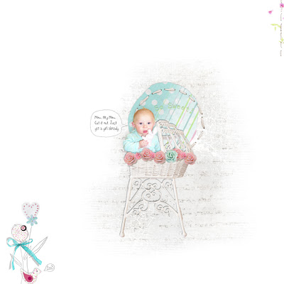
Oh, what I have to resort to to use these pretty feminine kits! *lol* Everything from Vinnie Pearce's new kit at Pixel Canvas, Shabby Baby.
So, how do you do this? First, you need a mask. A mask is simply a shape, which you will use as a "clipping path"--that is, the image will be mapped directly onto the shape, including it's opacity! It's way cool. =) I used Anna Aspnes's mask in the first layout, but they're really easy to make. Open up a blank canvas, and on a transparent layer, just start painting. You can use a big clunky brush for the middle, but the cooler effect will be given by the edges that fade into nothingness, so make the edges gradually lighter and lighter. I usually start by painting, and then erase a bunch, then paint again... Try using brushes that you've made from scans of some text (it doesn't matter what as it'll be illegible)--those make really nice fine texture.
Once you have your mask all set, place your background paper on a layer beneath it. Then, take a slightly contrasting paper, and place it on a layer *above* the mask. Now, do ctrl+alt+g (in PSE, I think it's just ctrl+g). The top paper will map itself onto the mask, and if you've faded your edges enough, it will gently settle over top the background and give you a nice color spot. Have fun!
ces deux à sont terribles. j'adore la photo et le "fading" de la 1ere, et l'humour naif de la seconde !
ReplyDeleteBon dimanche Heather
OK -- yeah-- sounds super easy. My non-digi self got lost on paragraph two. Then I come to comment and even the previous comment is in another language.
ReplyDeleteheading back to color with my markers!
omg, Jenny just cracked me up!!!!! what a great comment. Thanks for the tut, you are a fountain of wisdom. Another CT job? Girl, you are spreading yourself too thin. I don't know how Sandrine does it all, she cranks out one after another. I can't do that much that fast! See why I haven't been around....
ReplyDeleteThanks for sharing your knowledge! If you need girly pictures I might have one or two I could share ;)
ReplyDeleteThanks so much for the easy-to-follow tutorial! I'm new to Photoshop and EVERYTHING feels like a foreign language to me! Anyway - I created a page using this tecnique and a photo of my baby girl: http://apprenticescrap.blogspot.com/
ReplyDeleteI had fun - thanks!
I blended two papers to create a new one before. I need to use this tutorial to figure out how to the paint.net to do the same thing.
ReplyDelete