Showing posts with label blending modes. Show all posts

Wednesday, November 26, 2008

Beach Layouts

Even in the winter, we spend most of our sun-time at the beach...

Ocean Of Light: I really use up lots of time going through the different permutations when it comes to layer blending modes, but boy does it pay off. This paper on the bottom ended up perfectly conveying the swirling depths of the ocean, and I blended it easily with the top photo layer by using a layer mask on the photo and a fat, sheer brush to ease the transition from the dark sand into the paper.

Heather Taylor, Ocean Of Light

Credits: All Designer Digitals, Katie Pertiet: Stacked Photo Clusters No. 2 for the frame, and a beautiful paper blended into the bottom from the Surf Shak Paper Pack. Do you see the giant Japanese crab lurking in there? Those things are impressive--photo is from a trip to the Oregon Coast Aquarium. Font: Last Words. Journaling reads:


"There is the ocean of light
Shimmering sunset paths of lilac and gold,
Foam green curls and jolt of white;
Even in a storm there are still
Twenty shades of gray scattered across
That moment where sky and water meet.


And there is the ocean of the deep.
I had nightmares when we first moved here.
I dreamt of inky depths and deaf blindness;
Of monsters half tooth, half hunger;
I sensed lurkers in every puddle and pool.
You cringed at the constant growl of waves;
I protected us cautiously, wary of the tide.


Now, I have learned to hear its echoes
Rushing in long waves through my blood;
Still, at night when I hear that startling
Crack of a wave collapsing at high tide,
I fear I have conjured up some vast creature
Scuttling in from the cold black waters
Headed straight for me."


Thought At Work: The color in this photo is really vivid and lovely, but wasn't quite congruent with the reflective look on his face, so I opted to desaturate it, then change the Hue/Saturation back to "colorize" and picked a color that didn't make him look sickly or alien. =) I've also really gotten into the softened black and white: duplicate the image, and use a fairly heavy gaussian blur on the lower image (I used about 4.5). Then, either use overlay, soft light, or screen on the upper layer and watch the image lighten and soften!

Heather Taylor, Thought At Work

Credits: All Designer Digitals. Lynn Grieveson's Essentials paper for the background; everything else by Katie Pertiet. Patterned paper and stitching from the Botanical Fusion kit, tag from Lil Bit Tags, flower from Crumpled Flowers (and from the 30 minute chat), twill from Shell Collectors No 4 kit, leafy branch from From My Porch Brushes, tiny birdie from the Little One Layered Template, and title alpha from Grimey Alpha. Font: butterbrotpapier. Journaling reads: "Whether you're speculating about the life path of a star or what might happen if two black holes were to collide, or you're pondering how to construct your latest architectural invention--usually involving trains in some fashion--you get this look: a completely intent yet faraway stare that only tangentially comes near to conveying to us what neuronal storms are firing away in that precious little head of yours."

Sand Golf: I love this transparent alpha by Erica Hernandez at 2Peas--you can really add dimension and meaning to your layout without sacrificing real estate. The stitching leading the eye around the spiral of images is hopefully suggestive, without being over-powering...

Heather Taylor, Sand Golf

Credits: All 2Peas. Background paper by Kate Teague (Paint It), and stitching linking the photos also by here (Worn Out kit). Alpha by Erica Hernandez (Vibe freebie). Font: butterbrotpapier (what would I do without that font, sheesh!).


Journaling reads: "We went for a lovely hike around Cape Perpetua, and you decided the beach needed a channel connecting all the little puddles -- a "sewer system." But I swear it looked like you were playing golf -- especially with Daddy's cap on!"


Scale: Uh, this took a while. =) Lots of blending, clipping...

Heather Taylor, Scale

Credits: All Designer Digitals. Background paper by Katie Pertiet (Naturally Krafty). Splotches are combinations of Anna Aspnes's Floral Art No. 2 or Foto Blendz Clipping Masks No. 10 clipped to papers by Lynn Grieveson (Essential Bases, Kiwiana) or Anna Aspnes (Something Springy). Also by Anna Aspnes are a page border (Something Springy) and a corner swirl (Hipster Plumes Korners N Edges No 2). Katie Pertiet also provided an overlay shell design (Beachy Clusters), as well as stitching holes (Stitching Hole Borders) and stitches (Once Upon A Time kit). Bottom edge border graphic by Mary Ann Wise (Natural Borders), and finally, the page edges are by Lynn Grieveson (Worn Page Edges). Fonts: Monika Italic and 1942 Report. Journaling reads:


"We stand on one side of the bay,
looking into the deep horizon,
lost in the sky, anchored unsteadily
to the side of the cliff. We feel so
small.
And we look down
and witness this amazing snail,
snuggled under a crevasse,
busy foraging in his own, tiny world.
The snail, the lighthouse, the waves:
all sublime, no matter their
relative size."


PS: Just looking over my post to make sure everything came through all right, I was struck in the last layout at the similarity between the capital S of "scale", and the foam on the wave above it. I just LOVE these subconscious synchronicities!!!

Sunday, June 8, 2008

Experimental Digiscrapping

I just happened to read a post on 2Peas the other day referring to a RAD set of actions by a guy named Boutwell (Totally Rad). They give away a set of 3 actions as a demo, too, so of course I wrote off for them. Although the actions themselves are probably nothing I'll ever use, I did have fun breaking them down and trying to analyze just how Boutwell accomplished certain of his steps.

A lot of it seems really complicated and lock-step dependent (i.e., if you just do 1 or 2 of the things, you'll end up with something unrecognizable as a photo--you really need to do all of them to get somewhere). But, I did some fooling around, and came up with a pretty nifty way to jazz up a totally unremarkable bedroom background, as seen in the Flying Sitflop layout. One of the main concepts I finally grasped was the idea of doubling up layers, with one being blurred, and the other still crisp, and using varying degrees of opacity or layer modes to blend the two. In this particular layout I first extracted Allen, and duplicated that layer into a new document (for safe-keeping purposes). Then I desaturated the original photo, hiked up the contrast, duplicated it, blurred the bottom-most layer, then lowered the opacity on the top one to produce this kind of blurry crisp background that really gives the picture a neat dreamy effect. I think I did the same thing with the extraction of Allen as well, though what I was going after there was just the slightest halo effect--there's no opacity change for the figure, or else it wouldn't pop as it does... (click for credits and larger version).

Heather Taylor, Flying Sitflop

The second layout I had a great deal of fun with tonight was inspired by the wonderful ad challenge freebie by Kellie Mize over at Designer Digitals. She offered up a grunged up, be-splattered background clipped to a blue gradient, with blue text in a very cool tilted cross pattern. She suggested completing all the typography work, then merging the layers together before clipping to a photograph (I think that's what she was suggesting!), but the photograph I chose really didn't work for that--there wasn't enough detail left and it was totally confusing. So I kind of changed the layers around a bit...

The photo ended up looking really cool as well: I desaturated it, hiked the contrast, then did a "Find Edges" filter on it. I ended up with a very neat-looking line drawing; unfortunately, the photo was from my old camera and just WAYYYYY too small to do anything cool with it. So, I brought it into Illustrator, live-traced it on the "detailed illustration" setting, then brought it back as vector art into Photoshop. Now I was able to enlarge it as much as I needed and wanted to without losing resolution. Here's an image of the 2 versions of the photo, and the original look of Kellie Mize's template:

Heather Taylor, Line Drawing Filters

And here's my layout, Another Beautiful Day (click for credits and larger version):

Heather Taylor, Another Beautiful Day

To get this effect, I put the gradient at the bottom of the layer stack, then just the splotches from Kellie's template, set to overlay. On the layer above that I put the line drawing of my photo, also set to overlay. Above that I put the text in multiply blending mode. To make the second portion of the journaling stand out better, I duplicated that part of the layer and put it on its own layer at the very top, then filled it with a much lighter gradient, gave it a slight outer glow with a dark color, and set the whole layer to Linear Dodge. I'm really in love with the way it turned out, if I do say so myself! *lol*

Wednesday, March 12, 2008

Wibble. Wobble.

I've really been having fun playing with layer blending modes. Each of these photos (shot in dim conditions, so they turned out dark and orangey) has a base layer with the auto level adjustment, a copy of that turned to screen with the opacity around 50%, then a copy of that turned to vivid light. The text was rasterized, colored, then the base copy was set to color burn, and a top copy to vivid light. Fun to play around with, and gives it a funky grunge look too...

Click on the photo to read my own wibbling!

Heather Taylor, Wibble. Wobble.

Also, I made it to round 3 of the apprenticeship contest, 19th out of 30. *sigh* This round is doodling, which should be way fun!

And, this is my 21-Day Challenge, Day 11 entry from yesterday...

Heather Taylor, 21-Day Challenge: Day 11

Tuesday, February 26, 2008

Trying My Hand

Well, it's no big secret that I am pecuniously challenged, so I keep on hoping that if I work really hard and gain lots of skills, I'll get lucky and land a designing job where I can work from home and continue to homeschool Allen (yesterday he learned Roman numerals, and practiced counting with coins--fun!). It just so happens that I'm fortunate enough to practice by scrapbooking! *lol* I think I'm juuuuust beginning to get to the stage where I know enough to realize how much I don't know...

So, a couple of layouts with stuff I made:

A variegated polka dot paper pattern. That was way fun. And then making little dots with my frame, and inside an alpha I made up (the ONE thing I don't like about Designer Digital's site is that everything has to be so small! 500x500 at less than 100 Kb just eats all the detail. *sniff*). You can see it a little better here:

Heather Taylor, So Qt (cute)

Although even there you can't see the little dots in the letters--just imagine they're all like the "4"! And the interlocking circle tag thing also has "holes" running around the edge. The paper overlapping the green rectangles was also one that I made--I actually recolored the polka dot paper for this layout. Plus I made kind of a patchwork quilt paper with white lines running through the various colors going in different directions, but I ended up not using it. So, that's almost like a full kit!

I also really like what happened with this layout:

Heather Taylor, Nature

The stained glass effect was pretty easy after all (I'd had these nightmare visions of dodging and burning each square): I just used the background for one of the cards I'd made earlier this year. I desaturated it, duplicated it, turned one of the duplicates at a 90 degree angle, and set one to color burn, and the other to linear dodge. Terrific effect, I think! My little crow is from a walk a couple of weeks ago, and the tree I first drew free-hand, then redrew it in Illustrator.

The picture is from a walk we took this past weekend down near Coos Bay--just WAIT till you see the phenomenal pictures I took--and then my battery ran out. ARGH! My husband wondered if I could even take a walk without a camera in hand anymore... =)How'd I get so hooked?!?

Monday, February 18, 2008

More Challenges

A couple more challenges for Designer Digitals, one for the Ad Challenge (using Lynn Grieveson's Template), and the other for the Quote Challenge (with Katie Pertiet's wordart).

The quote challenge was really a challenge for me--not for using the quote, but because I ended up adding all this stuff and couldn't decide where to put it, whether it fit together or not, and whether I really liked it! I basically gave up on it, not knowing where it was going. Lots of blending work, and layer masks, and a little creative starring. It all began with that fantastic (well, I think so *lol*) photo I happened to catch yesterday, with, serendipitously, the moon high up:

Heather Taylor, Shoot For The Moon

The fun part for the template challenge ended up being those little suns descending on the lower third of the page--really easy to make! Use a new layer, and with a large black brush with lots of spacing, stroke a descending arc path. Then select them with the magic wand, and start distressing them--change the color, dodge & burn, add some highlights. Give them a very broad shadow--and now you have an extra little motif that was way easy to do! Remember to click on the photos to get the credits:

Heather Taylor, Fire In The Sky

Friday, February 15, 2008

More Odds & Ends

Dagnab it, 2Peas is down again, so my blog is all patchy. Sorry 'bout that! Guess I'll have to upload these...

Ok, I'll go from oldest to newest:

Heather Taylor, Repeated Motion
(Click for credits and text)

It's funny that this started completely differently. I do like how it ended up, though. I especially like the interplay of the graphic element (the wavy line, which almost looks like it's actually drawn in the sand--pure serendipity!) and the title. Also, make sure you play around with the positioning of the elements before you decide it's over. The natural place to put the text was in the upper-hand right corner--but somehow it didn't quite feel right once I got it there. Just moving it lower really made the piece gel!

This next one pretty much came out of nowhere! I'd been trying to follow Cassie Jone's tutorial on making a photo into a sticker (which she handed out during her freebie Monday chat at Designer Digitals), and just couldn't make it work. So I fiddled around with it and got this vivid color that I really liked (I used the same extraction as for the San Francisco layout), and for some reason the vertical wavy lines and strong color came to me, then the path, then Dr. Suess... and boom, another Taylor Weirdo Layout (c)!

Heather Taylor, Oh the Places You'll Go!

And this morning I threw together this quickie in response's to Designer Digitals's Wednesday "Just My Type" challenge:

Heather Taylor, Easy Street Alt EPS

Boy, did I have fun with this one! I just loooooove to play around with type. I think many people forget that you can make fonts rillyrillyrilly big... And by the way, check out the flowers: those were from that grocery store run. Pretty nifty, eh?

And finally, just finished this fun--but perhaps hard to read, from far away--layout that was also created in response to a challenge, this time the Ideabooks4U circle layout challenge:

Heather Taylor, Paquerette

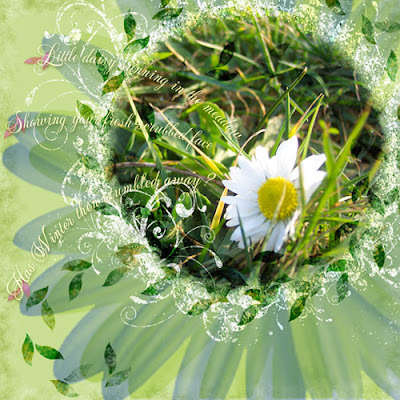
I am just loving the close-ups that my cruddy little digital camera can take, though. Even though there's major lense curvature obvious near the edges, the close-ups are fabulous; and even though the macro lense doesn't allow for flash, it always seems to have super-exposure, even better than the regular lense. What's up with that? So much so that I really try to use it whenever possible... Of course, I had to go out and buy Rhonna Farrer's Swirly Frames. *sigh* I just never seem to have the time to design my own, plus, hers are just so wonderful! I did lots of different blending here as well, plus I made those little leaf thingies. Fun!

Hope you get plenty of time this weekend for artsy play... =)

Monday, February 11, 2008

Crossword of my mind

Just finished the Ad Challenge for Kellie Mize's template at Designer Digitals this week:

Heather Taylor, Crossword of my mind

The original template is just a bunch of rectangles--it looks almost exactly like what I have here, minus the photos. Almost every single picture has a different blending mode to allow me to get as close to the original color of the template as possible. I didn't like the colors much--pretty flat, not my style color combo--but with the photos even I think it came out nicely. It's amazing how blending modes can utterly change a photo--I went through ALL of them for EACH photo, and picked the best. Sure learned a lot!

Happy new week to everybody!