Ok, I'll go from oldest to newest:

(Click for credits and text)
It's funny that this started completely differently. I do like how it ended up, though. I especially like the interplay of the graphic element (the wavy line, which almost looks like it's actually drawn in the sand--pure serendipity!) and the title. Also, make sure you play around with the positioning of the elements before you decide it's over. The natural place to put the text was in the upper-hand right corner--but somehow it didn't quite feel right once I got it there. Just moving it lower really made the piece gel!
This next one pretty much came out of nowhere! I'd been trying to follow Cassie Jone's tutorial on making a photo into a sticker (which she handed out during her freebie Monday chat at Designer Digitals), and just couldn't make it work. So I fiddled around with it and got this vivid color that I really liked (I used the same extraction as for the San Francisco layout), and for some reason the vertical wavy lines and strong color came to me, then the path, then Dr. Suess... and boom, another Taylor Weirdo Layout (c)!

And this morning I threw together this quickie in response's to Designer Digitals's Wednesday "Just My Type" challenge:

Boy, did I have fun with this one! I just loooooove to play around with type. I think many people forget that you can make fonts rillyrillyrilly big... And by the way, check out the flowers: those were from that grocery store run. Pretty nifty, eh?
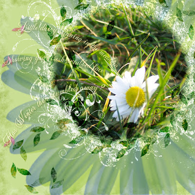
And finally, just finished this fun--but perhaps hard to read, from far away--layout that was also created in response to a challenge, this time the Ideabooks4U circle layout challenge:

I am just loving the close-ups that my cruddy little digital camera can take, though. Even though there's major lense curvature obvious near the edges, the close-ups are fabulous; and even though the macro lense doesn't allow for flash, it always seems to have super-exposure, even better than the regular lense. What's up with that? So much so that I really try to use it whenever possible... Of course, I had to go out and buy Rhonna Farrer's Swirly Frames. *sigh* I just never seem to have the time to design my own, plus, hers are just so wonderful! I did lots of different blending here as well, plus I made those little leaf thingies. Fun!
Hope you get plenty of time this weekend for artsy play... =)
aaaw... 2peas seems to be down a lot lately. But I love your layouts, specially the first one <3
ReplyDeleteGreat layouts, loving the Dr. Seuss one. Not much artsy time for me this weekend, but it appears that I am returning to the land of the living. Finally!
ReplyDeleteThat daisy one is GORGEOUS.... you have really nailed crapbooking!!! :) (sorry, Scrapbooking! LOL!)
ReplyDeleteWhat a lucky boy to have mum do all this gorgeous stuff for him to remember his childhood!