Friday, January 11, 2013
Comfort Zone, and more Paper Textures
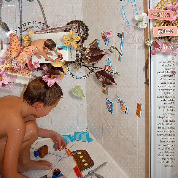
And this week, for your scrapping pleasure, I have Comfort Zone:
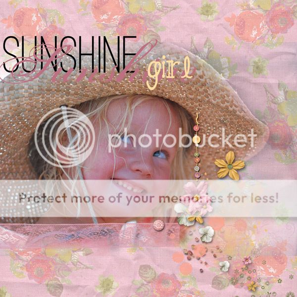
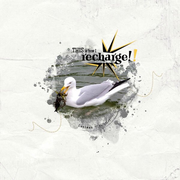
The CT have made amazing pages with this, too:
By Jen:
By Julie:
By Sandrine:
By Dita:
By Lisa:
And by Romy:
I must say that I really love the mellow colors in this... 20% off through Sunday! =)
Have a lovely end of the week!
Thursday, May 10, 2012
More Textures, and Some Stitching!
And here are some very fun uses of the stitches:
By Petra:
By Lisa:
By Romy:
And by Jen:
Good layouts for noticing the textures, too!
I hope you have a lovely end of the week... =)
Thursday, May 3, 2012
New Stuff, New, New, New!
Also, I have a Free-With-Purchase deal going on: buy more than $4.00 (anything in my shop!), and get this set of stitching for FREE (don't forget to add it to your cart, and it will zero out at check-out time):
And to top it all off, I have a gorgeous set of 7 templates (perfect for the Project 365/52/12 you have going on) from the "A Year of Hope" collection coming out, in the clean and simple style (which makes scrapping go really, really fast!):
And the CT have made some lovely pages:
By Romy:
By Lisa:
By Jen:
So, hope you all have a great weekend--and tomorrow, look for the MScraps train blog!! We have a ton of challenges planned for Fri/Sat, too--it's going to be so much fun!
Saturday, March 8, 2008
Guess I've Been Busy...
Here's the layout I finished this morning -- I dithered about a lot of things on it. A little snapshot of Allen's body language as he reads... The book is written in large print, and there are only 2 or 3 paragraphs on each page, but still--it was 42 or so pages! Font: Pooh, of course (with glints by Stephanie Shimerdla with her glitter brush - www.brushes.obsidiandawn.com, though I did the shading). And Century Old Style. I did all the little drawings... =)

Shading the type was fun! Use your magic wand set at 1 tolerance, non-continuance on the type layer, click on the type, then make a new layer and with a very low opacity, low fill, wide brush, start highlighting (or shadowing, which is what I did on the lighter "Pooh" word). I added some glints at the very top of the letters -- all quite easy and painless!
Moving right along, the 21-Day Challenge, Days 7 & 6:


Continuing to sketch, and giving myself permission to just play instead of trying to be perfect, has been really fun. Hopefully I can keep it up!
And a couple of layouts. First, this one:

By the way, want to know a cool little trick for getting your images to be the same width (or size)? When you go to crop your images, you can put the measurements up in the tool bar, and even the dpi (since my camera only takes up to 230 dpi, I work at 12x12, 150 dpi)! The only thing to remember is that there's a "clear" button -- in case you're wondering why your crop tool will only do a rectangle next time. =)
And finally, a touch of Spring fever:

Both these layouts were done with Designer Digitals items only (please click for specific credits). Although I'm getting a sinking feeling, because so many of the people who post there are just awesome layout artists. I just love going over there to look!
I've learned a lot from the tutorials for the Little Dreamer Designs apprentice program, too -- much sinking feeling there as well, but oh well. Maybe I can pick up a mentor somewhere... I went and took a look at EyeCandy, but was not super-impressed with the metal capabilities, though the chrome feature is pretty cool (and you can do chrome in other colors, so I guess that kinda works). The demos are good only for 30 days, but I can't afford the program at this point. A very cool place to go for textures: CG textures. The next day, when we went to the Port, I took pictures of all kinds of stuff I might not normally look at!!
Sunday, January 27, 2008
Challenge Day
The first one I did was the template. Boy did I become familiar with ctrl+e, merge layers -- if only one layer is highlighted, it just merges with the one beneath it. Beware: if you have any layer styles, make sure you move them to the top layer before merging, as it will discard all but the top ones. Another shortcut that was hugely useful was ctrl+g: group together (but not into one smart object, just into one folder together). Actually, first I used ctrl+click to highlight the squares I wanted, then ctrl+g to put them into a separate folder together. I highlighted all those layers, then used ctrl+e to merge them. Then I imported the paper (can you believe, *gasp*, I actually laid out cash to buy Anne Langpap's beautiful Sunflower Field paper pack? It was just so perfect...) into a layer above the merged squares, then used the handy dandy clipping shortcut of ctrl+alt+g, which takes the top layer, and maps it into the confines of the bottom layer. I did that for about 5 papers, I think. Then I had to color all the letters of that adorable font (Abcdaire enfantin), which took a while too. Compared to that, the extraction was nothing! Though I do have to remember: don't feather before you inverse the selection, feather after. I'm not so pleased with the graying halo around Allen, even though I did try to erase as much of it as possible...

The second challenge (I see I'm still channeling VShalini Pearce, however ;) was a tad more straightforward, though that extraction did take some time. Funnily enough, the background I stuck in there kinda looks like that horrid brown shag rug that actually was there! I re-used some of the texture brushes that I worked on before, and made up some new ones. I used some Dover clip art (background strip, white decoration to left of frames, swirls, and trefoil dingy) -- those things are really great. I also used a handy dandy trick: stamp your brush in black in a new transparent file, upsize it, then make that into a brush. If you're just using it for texture, that works just fine! I played a lot with saturation and blending levels on this one, as well.
Saturday, January 26, 2008
Pensive

You would not *believe* how much time I spent on this sucker. =) The background has an immense amount of layering (the more layers, the more I was convinced that it looked awful). Those brown blocks behind the paper (which is based on a scan of wallpaper) are a whole separate texture file that took me at least an hour to feel comfortable with.
At least I finally discovered the difference between setting your opacity lower, and setting your flow (or fill, in the layer palette) lower. If you're trying to make marks in white on a black background, for example, setting the opacity lower means you get varying shades of gray. Adjusting the flow, however, means it's still white, just variations on faint--so if you "scrub" with your pen/mouse you'll eventually get a fat white line instead of just a faint one.
I'm also pretty pleased with my colombine stamp, too.
Ok, off to play with my little pensive boy... isn't he gorgeous?
Saturday, January 12, 2008
Mapping Texture

(Font: Birch Standard. Elements and background paper from Lynn Grieveson's Catalina kit @ Designer Digitals.)
The part I'm really pleased about is the background (check out how even the stitching actually follows the contours of the cloth!). How'd I do that? Sooooo glad you asked... ;)
I scanned a white t-shirt and made a desaturated image with it. Then, I overlaid Lynn Grieveson's beautiful paper on top and changed the paper layer to an overlay blend. Then I also did a displacement filter (distort-->displace using the t-shirt psd file) on the paper. What this does is actually warp the paper so that it's not only a flat illusion, but the displacement changes the paper so it looks like it goes "down" on the dark areas, and "up" on the light ones; by superimposing the distortion over the grayscale image you get much more of a sense of depth (props to Photoshop 7 Wow! for the technique). I did the same thing with the word art (clipped it to the grayscale background first, though). For the stitching, I only used the displace filter, but I had to go in and clean up with the smudge tool afterwards. The stitching is really cool, though--it "makes" the effect by being so zigzaggy directly on top of the fabric folds... Fun stuff!
The frustrating part is that I still need lots and lots more practice with that darned "curved photo" look. Still looks pretty amateurish to me...
Thursday, January 10, 2008
More on Combining Efforts
But (I was going somewhere with all this, I promise), I can combine techniques, and reuse what I make for stamping with what I do in digiscrapping. Who knows--eventually maybe I'll be able to make stuff commercially, too! In this case, I'm referring to this card, which I made for the OSA ACE9 round for January (ACE=Asian Card Exchange; you send 3 cards a month rotating down a list until you get back to your own name):
(Pine Bough by Stampendous, Winter kanji by Art Neko, punched branch by McGill)
The background is a piece of 8.5" x 8.5" white column cardstock that I distressed with sanding paper, an embroidery needle, and the sharp point of my X-acto knife, then covered with blue dye ink and silver pigment ink. I added the darker inked edges after I cut up the paper (I made 4 cards of this style), but I'll have to do another like it--love the effect, and it would work great for a photo frame in digiscrapping. I scanned the larger square piece. Now (with a bit of fiddling in the contrast area) I have a great grunged overlay that I can use!
I can foresee a lot more of these stamping/digiscrapping combos coming down the line... ;)
Monday, December 24, 2007
Combining Rubber Stamping & Digiscrapping
So, here it is Christmas, and I'm finally getting around to scrapping Thanksgiving... actually, that's not quite true. I started on this layout right after, but it sat and sat, not feeling finished. Last night I finally had the first bright moment I'd had all day (I've been sick, ick) and just repeated the background stamp, much larger. Fiddling about with the blending modes (Vivid Light) is what produced the orange focal point that my friend and critic, Julie K. in Taiwan, had suggested was lacking.
The background, and the focal maple leaf, are the same that I referenced in my first post. In fact, the background is that same stamped background, just desaturated then recolored. I've found that many of my backgrounds (which is really what I've delighted in, when it comes to stamping--the stamp over top is usually just frosting on the cake) are wonderfully suited to digiscrapping, as you can use them for texture on almost anything. Or even, by themselves!
Here is an example using a swatch of textured wallpaper with alcohol inks over top:
And here is an overlay with a very dark Marvy Markers background (spritz glossy black cardstock with water, dab on Marvy Markers--here, I used silver, blue, and teal--very heavily, tilt the paper from side to side to allow it to run somewhat, then let dry, or dry carefully with a heat gun).
In the above layout, that same scan of the markers was used three times: once as the overlay for the main image, once as a different overlay for a sort of background paper (ended up being difficult to see, as it blended with the main image so well, but it's that small strip to the left of the image), and once as a texture file for the flat blue paper (go to Filter-->Artistic (?)-->Texturiser, then click on the little triangle to load a .psd file as texture, and it will sort of emboss your image).
You can also create wonderful background papers by repeating a desaturated image of your background several times, rotating it differently on each layer, then reducing the opacity on the uppermost ones and playing with the blending modes. Then, just add a final layer underneat it all in your chosen color, and you've got a nice, subtle paper like this green one:
So there you go! I hope you enjoy recycling your work as much as I do... and Happy Holidays!