Thursday, February 28, 2008

Warning: Curves Ahead!

Wow, I've been lucky to have the time to jam on some layouts recently. I've been getting a couple of comments on my photography lately (good ones!), so I thought I'd divulge a secret: really, my photos aren't so good--it's the post-processing that makes them pop. Take this one for example:

Heather Taylor, Mabel Close-Up

The white is kinda meh (it was mostly overcast while we were there), the anchor is too dark, there are some distracting things over there to the right. The first thing I always do to my photos is Image, Curves. There's a big long complicated tutorial over at Digital Scrapbooking Magazine, I think, about adding threshhold adjustment layers, etc., and her method does indeed work pretty well. However (being the lazy hurried person that I am), I've found that the most important part is the gray adjustment, and you just don't really need to be *that* precise in your white and black values.

If you open up your Curves dialog, you'll see a series of three eyedroppers down on the right. One is for white, the middle is for gray, and the left is for black. Here's how I do it: eyeball your photo (make sure you can see the whole entire image on the screen before you start working on this) and find the lightest point. Click on it with the white eyedropper. This will be your white point* (* there's an exception to this, I'll cover it at the end). Next, find the darkest point, and click on it with the black eyedropper. This will set the light and dark range for your photo--usually it's a little too dark, but don't worry, we'll adjust that later.

Now examine your photo. If it has a color cast to it -- too orangey, greeny, bluey -- you can get rid of that by choosing as the gray value a gray in the photo that's a little on the opposite side of the color wheel. I find that my camera tends to produce stuff that's a little too orange, so I always look for a gray that's a little on the warm side, click on that with the middle eyedropper, and look for improvement in color. As always, I suggest playing around--you'll quickly find what kinds of funky shifts you can give to your photo.

Once you've got the color balance the way you want it, it's time to lighten up the photo. Go to the diagonal line in the chart up there on the left. Click right above and to the right (I mean, *right* above and to the right) of the center point, and drag it to the right and down a little, until you have the proper lighting in your image. You can further refine it by clicking on the mid points of the lines above and below the center point, and dragging them slightly left (both of them). Play around with this too--you'll see some interesting shifts!

* The caveat I mentioned about your white point: Sometimes you have a photo with no white in it, and setting a white point totally washes it out. In that case, I suggest just playing with the gray levels. Same for the lack of a dark point... Also, if you have a photo that has a lot of white in the background already, but your subject is in shadow, just set the white point to the lightest point of your subject and crop out the background. This doesn't always work, but it's worth a shot!

Anyway, once you've done that, you usually have a much crisper, pop-pier photo!

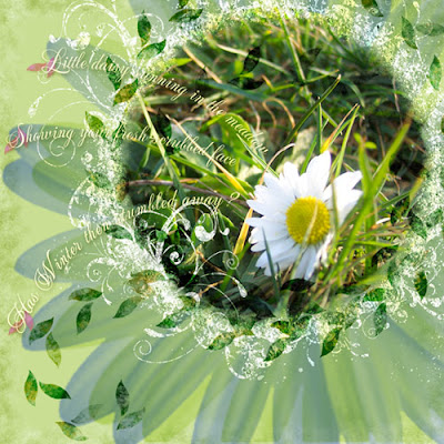
Here are some layouts that mostly concentrate on photos where I did this for each image (remember to click on these to see a better resolution, and find the credits, if there are any):

Heather Taylor, Charleston

The following one had to be adjusted because it was so dark (we went here after our little trip through the Charleston harbor, and it was still overcast):

Heather Taylor, Stone Drunk

And here's the last one (we were blessed with a surprise beautiful afternoon, but these shots were almost all taken indoors in front of the tanks, so were murky because of glass interference):

Heather Taylor, Colors of the Sea

Hope this was useful--I'm sure I gained some more curves just sitting here for so long! =)

Tuesday, February 26, 2008

Trying My Hand

Well, it's no big secret that I am pecuniously challenged, so I keep on hoping that if I work really hard and gain lots of skills, I'll get lucky and land a designing job where I can work from home and continue to homeschool Allen (yesterday he learned Roman numerals, and practiced counting with coins--fun!). It just so happens that I'm fortunate enough to practice by scrapbooking! *lol* I think I'm juuuuust beginning to get to the stage where I know enough to realize how much I don't know...

So, a couple of layouts with stuff I made:

A variegated polka dot paper pattern. That was way fun. And then making little dots with my frame, and inside an alpha I made up (the ONE thing I don't like about Designer Digital's site is that everything has to be so small! 500x500 at less than 100 Kb just eats all the detail. *sniff*). You can see it a little better here:

Heather Taylor, So Qt (cute)

Although even there you can't see the little dots in the letters--just imagine they're all like the "4"! And the interlocking circle tag thing also has "holes" running around the edge. The paper overlapping the green rectangles was also one that I made--I actually recolored the polka dot paper for this layout. Plus I made kind of a patchwork quilt paper with white lines running through the various colors going in different directions, but I ended up not using it. So, that's almost like a full kit!

I also really like what happened with this layout:

Heather Taylor, Nature

The stained glass effect was pretty easy after all (I'd had these nightmare visions of dodging and burning each square): I just used the background for one of the cards I'd made earlier this year. I desaturated it, duplicated it, turned one of the duplicates at a 90 degree angle, and set one to color burn, and the other to linear dodge. Terrific effect, I think! My little crow is from a walk a couple of weeks ago, and the tree I first drew free-hand, then redrew it in Illustrator.

The picture is from a walk we took this past weekend down near Coos Bay--just WAIT till you see the phenomenal pictures I took--and then my battery ran out. ARGH! My husband wondered if I could even take a walk without a camera in hand anymore... =)How'd I get so hooked?!?

Sunday, February 24, 2008

Bluegills

I had fun teaching a "class" on OSA today--actually, just channeling Fred B. Mullett's wonderful approach and stamps. Here's the result:

Heather Taylor, Bluegills

The class can be found here:
Faux Watercolor

Friday, February 22, 2008

(yellow bus still in hand)

This layout actually took me 2 days! I'm amazed I was able to go to sleep... *lol* I really loved the work of Matte Stephens that I found via drawn.ca, an illustration blog. The challenge this week @ 2Peas is "Art Inspiration", so I chose a cute little birdie of Matte's and closely copied him. =) I learned a lot doing it, too--made all kinds of different brushes to allow me to grunge up the flat digital drawing. Turned out pretty well, I think! Then I adapted the doodles to make a real tree, and I used broad shapes of flat color for the background.

Then, I had no clue what to do.

Eventually I found this cute photo of Allen's from 2005, I think--he was about 2 years old, and we were visiting San Francisco. I extracted him, repainted a shoe that was full of grass (even back then he had big feet, though!), and placed him in the birdie's line of sight.

Then, I had no clue what to do.

So I wrote a poem. *laugh*

Heather Taylor, (yellow bus still in hand)

your once small steps have led you
(yellow bus still in hand)
through countries of idea and color
and still, with curiosity, you
explore the land of words
chunga floudle marinkajay, you said
--in grand exclamatory style

I hope that the other side of reality
will never be less important
that you will pass through
like Alice,
a citizen of both worlds

Thursday, February 21, 2008

A Bit of Fun: Overlays & Stickers

I was delighted to win the random $5 that 2Peas awards if you participate in their "Use mostly 2Peas Stuff" challenge, or the Garden Girl's Weekly digital challenge, and I won it twice in a row so I had big bucks to spend! I finally broke down and got Rhonna's gorgeous swirl brushes (V3 & V4) -- I keep on hoping that I'll create my own, but then I get bitten by the actual scrapbooking bug and use up all my time making layouts instead of supplies!

Anyway, I couldn't quite figure out where I wanted to use these, but the overlays recently on sale at Designer Digitals made me wonder if I could make my own, so I did, with the V3 brushes! Actually, it was easier in this case to use the .png files because I needed to do a lot of rotating (man, do I ever wish there were a shortcut for rotating brushes in Photoshop!). So, just on a blank layer, I used each png twice or three times, and made something that had fairly wide blanks (I hadn't figured out what I was going to use it for, though--besides coloring with bright colors).

Heather Taylor, Feelin' Swirly

Once I'd gotten it done, I decided to use more 2Peas stuff so I could enter it in next week's challenge (greedy, ain't I?), and so I used papers from 2 of Rhonna's kits (Color my World, freebie, and Flower Patch). To get the papers in the shapes, I followed several fiddly but easy steps.
1) You want to use the magic wand (tolerance = 1, contiguous) to get the exact shape, but a lot of times there were only dots on one end. So,
2) draw in lines wherever you need to to make sure the shape is closed
3) magic wand the shape
4) target your background layer (or any made-up layer with a uniform color to make it easy to see)
5) copy the shape
*****5.5) ctrl+z (undo) all your drawing marks until you're back to your original overlay!!!**********
6) open the paper you want to use
7) paste the shape on a new layer and drag that layer under the paper layer
8) ctrl+alt+g (or ctrl+g in PSE? Make a clipping path, in any case) so that the paper conforms to that shape
9) ctrl+e to merge layers
10) drag the shaped paper layer into the original document, under the overlay. I then moved the shape 5 nudges down and 5 left to make it a little more interesting. The key is: don't forget to undo everything before you proceed! I did the same copy-shape-thing with the photo, too. Also, make sure you don't save your papers in the wrong shape!

I then filled in a few of the smaller lines with light blue (distressed it a bit), then drew paths for the text on the curvy lines that were long enough and would let the text be visible. And there you go, swirly fun!

Then, today, I tackled the task of trying to scraplift Dagmar (lenasmommy) over at Designer Digitals. I chose her adorable "Little Witch" layout because I loved the combo of black and white photo with lots of bright colors, and the use of patterned papers in a way that I can emulate =), and the darling little illustrations. Mine isn't quite as designerish as hers, but I still think it's pretty cute (mostly because of Allen, however!).

Heather Taylor, Fire-Slicker

There's nothing too tricky here, but I did have fun picking up a couple of clip-art photos and turning them into stickers, primarily by using the photocopy filter (black foreground, white background--if you have other colors in your color picker, that's what it'll use, which could be fun to play around with also!). For the dalmatian the only thing I really had to do was complete the outline of the dog, select the exterior, reverse select, create a new layer, expand the selection by 10 pixels, then fill with white. For the fireman's helmet I actually had to redraw the thing because it had quite a bit of detail, but it was the same procedure. One little trick--put your fill colors on separate layers so you can go back and change them later with no problem...

And finally, just a little taste of Spring (everything from Katie Pertiet's "Little Red Bird" kit at Designer Digitals):

Heather Taylor, Spring

(PS -- I'm perplexed by the fact that this layout got a seemingly inordinate amount of feedback, since I liked it OK, but it wasn't one of those that leaves me with stomach clenched, knowing I've nailed it. I guess until I can figure out popularity indices, I'm not going to go too far!)

Monday, February 18, 2008

More Challenges

A couple more challenges for Designer Digitals, one for the Ad Challenge (using Lynn Grieveson's Template), and the other for the Quote Challenge (with Katie Pertiet's wordart).

The quote challenge was really a challenge for me--not for using the quote, but because I ended up adding all this stuff and couldn't decide where to put it, whether it fit together or not, and whether I really liked it! I basically gave up on it, not knowing where it was going. Lots of blending work, and layer masks, and a little creative starring. It all began with that fantastic (well, I think so *lol*) photo I happened to catch yesterday, with, serendipitously, the moon high up:

Heather Taylor, Shoot For The Moon

The fun part for the template challenge ended up being those little suns descending on the lower third of the page--really easy to make! Use a new layer, and with a large black brush with lots of spacing, stroke a descending arc path. Then select them with the magic wand, and start distressing them--change the color, dodge & burn, add some highlights. Give them a very broad shadow--and now you have an extra little motif that was way easy to do! Remember to click on the photos to get the credits:

Heather Taylor, Fire In The Sky

The New Botanicals Sheet

From Art Neko (though I don't even know if they're up yet!), my first chance to play around with the rubber--a magnolia branch. I stamped it first with Colorbox Chalk ink, then again with Ancient Page dye ink, and sponged some of the dye ink, diluted, around the whole thing. Then I stamped the word in pigment ink -- all this on damp rice paper.

Heather Taylor, Tranquility

Saturday, February 16, 2008

Another Experiment in Blending

I loved this frame by Jesse Edwards for the web challenge at Designer Digitals this week, and I also love Lynn Grieveson's Kiwiana papers (I used two of them here)--perfect combo! Fonts: Sidewalk & Bangkok Bold. Color Burn really seeemed to be my friend, here...

Heather Taylor, The Gulls at Nye Beach

Clarifications on Pâquerette

Anke, over at Designer Digitals, asked a few questions about the Pâquerette layout (by the way, "pâquerette" simply means meadow daisy; I assume it derives its name from Pâques, Easter, because it starts growing again around that time of year. I have very fond memories of these from my childhood!):

Heather Taylor, Paquerette

There are a couple of fun things going on: the little leaves going around and around and out of the photo, and the "journaling sprigs" as Anke called them. It's all fairly easy:

For the leaves, I drew a path with a double loop and a little tail: double loop with tail I also drew a little leaf shape (helps if you draw it very large, then drastically reduce the size--gets rid of all those little jaggedies for you): little leaf I duplicated the leaf, flipped it, repositioned it to look like a typical leaf pair on a plant, then made it into a brush (I played around with the spacing in the brush palette, as well as the first set of options--make sure to set the middle one to "direction" so that the leaves flow nicely). Then, I went back to my loop path, and stroked the path with the little leaf brush. I grunged them up by erasing, dodging, adding some color here and there, and then set the layer to color burn, I think.

For the journaling, I just drew a simple arc path and typed on it--that part's really easy. The petals in the background are from a brush I made of one of my own daisy pictures. It's doubled up, and each is a different color and blending mode. I usually just play with all the options until I happen to find one that works--I rarely know just what I have to do to achieve a specific effect, it's mostly happenchance!

Thanks for asking, Anke!

Friday, February 15, 2008

More Odds & Ends

Dagnab it, 2Peas is down again, so my blog is all patchy. Sorry 'bout that! Guess I'll have to upload these...

Ok, I'll go from oldest to newest:

Heather Taylor, Repeated Motion
(Click for credits and text)

It's funny that this started completely differently. I do like how it ended up, though. I especially like the interplay of the graphic element (the wavy line, which almost looks like it's actually drawn in the sand--pure serendipity!) and the title. Also, make sure you play around with the positioning of the elements before you decide it's over. The natural place to put the text was in the upper-hand right corner--but somehow it didn't quite feel right once I got it there. Just moving it lower really made the piece gel!

This next one pretty much came out of nowhere! I'd been trying to follow Cassie Jone's tutorial on making a photo into a sticker (which she handed out during her freebie Monday chat at Designer Digitals), and just couldn't make it work. So I fiddled around with it and got this vivid color that I really liked (I used the same extraction as for the San Francisco layout), and for some reason the vertical wavy lines and strong color came to me, then the path, then Dr. Suess... and boom, another Taylor Weirdo Layout (c)!

Heather Taylor, Oh the Places You'll Go!

And this morning I threw together this quickie in response's to Designer Digitals's Wednesday "Just My Type" challenge:

Heather Taylor, Easy Street Alt EPS

Boy, did I have fun with this one! I just loooooove to play around with type. I think many people forget that you can make fonts rillyrillyrilly big... And by the way, check out the flowers: those were from that grocery store run. Pretty nifty, eh?

And finally, just finished this fun--but perhaps hard to read, from far away--layout that was also created in response to a challenge, this time the Ideabooks4U circle layout challenge:

Heather Taylor, Paquerette

I am just loving the close-ups that my cruddy little digital camera can take, though. Even though there's major lense curvature obvious near the edges, the close-ups are fabulous; and even though the macro lense doesn't allow for flash, it always seems to have super-exposure, even better than the regular lense. What's up with that? So much so that I really try to use it whenever possible... Of course, I had to go out and buy Rhonna Farrer's Swirly Frames. *sigh* I just never seem to have the time to design my own, plus, hers are just so wonderful! I did lots of different blending here as well, plus I made those little leaf thingies. Fun!

Hope you get plenty of time this weekend for artsy play... =)

Tuesday, February 12, 2008

A New Discovery: Sketches

So, somebody over on a site that shall remain nameless (by request, however!) let me work with a sketch of theirs today--something I'd never done before. I had two reactions about it: 1) It's fast! You can whip out a layout in no time by ctrl-alt-g'ing many of the layers, and substituting a few things here and there, etc. 2) It's more stultifying than I might have imagined (being from Switzerland and all, if there are lines on the paper, I stay inside them!), so that I find that some of my creativity just falls with a thunk and stays passed out for the rest of the exercise. I imagine these are much like what you might follow for a card (I think they're called card maps or something). I'd love to read some comments on how you use sketches or maps!

HOWEVER, I was working with another of those darn brown/red/pink combos. I am so heartily sick of those colors!! So I made a fresh and breezy ocean layout:

Heather Taylor, We Live Here

I think I'll just stick with this kind for a while. Plus, I got some fabulous shots of Allen!

Oh, and I wanted to share with you my latest discovery: taking pictures at the grocery store! It all started because there was a rare sun day yesterday, and there were these gorgeous tulips in front of the store, so I grabbed my camera and got a couple of shots of those. I was putting it away when we walked in, but they continued the Valentine's floral display, and I just kept on shooting and shooting, through the floral department, into the fruits and vegetables... hehehehe. It was great! I got some wonderful flower shots, and of stuff that would never grow in a million years in my back yard... Whee! So, take your camera and see what you can nab with it during your next shopping expedition!

Monday, February 11, 2008

Crossword of my mind

Just finished the Ad Challenge for Kellie Mize's template at Designer Digitals this week:

Heather Taylor, Crossword of my mind

The original template is just a bunch of rectangles--it looks almost exactly like what I have here, minus the photos. Almost every single picture has a different blending mode to allow me to get as close to the original color of the template as possible. I didn't like the colors much--pretty flat, not my style color combo--but with the photos even I think it came out nicely. It's amazing how blending modes can utterly change a photo--I went through ALL of them for EACH photo, and picked the best. Sure learned a lot!

Happy new week to everybody!

Sunday, February 10, 2008

The Right Gear

Just got good news from Candice--it's a go on the new sheet! Yay! I'm excited to use these myself, actually. A long time ago (erm, 4 years?), when I first started stamping, I discovered (for myself, I'm sure others already knew about it) that you can produce some pretty cool effects when you paint ink on a rubber stamp that has a large surface area, and then vary the ink with water. This is what you get (look at the pears in particular):

Heather Taylor, Pear & Dragonfly

But it's difficult to find rubber stamps that have such a large area to cover. The one's we'll be coming out with are not quite as broad an area, but they are pretty flat, and I bet there will be all kinds of playing going on!

In the meantime, I've been cruising along with the digiscrapping, which is improving my Photoshop skills immensely. Always a good thing, when you're entirely self-taught! I've been aided along the way by a couple of pointers from a blog I discovered scrounging around for something, I forget what: Mindtracks. I like this blog because it combines some different interests: "Web design, network literacy, digital culture and the visual arts [... and in particular,] how the web may be used by visual artists and how it might enhance their practice." A couple of cool and useful links I got off there were from 3DTotal for 100 Photoshop Tutorials, and a link to Brusheezy.com for some very cool Photoshop brushes. Somewhere along the line I also discovered Mel Rodicq's brushes and Obsidian Dawn's brushes, which really rock (I keep on blocking Stephanie's last name [Shimerdla, it just came back to me] because it sounds awful from a French-speaking perspective *lol*). So, I've been messing around with their brushes, but also, by doing so, learning how to make my own. Pretty cool stuff!

Also, I've done a couple of scraplifts, and have learned more tricks by copying what I see. I'm not entirely sure the designers are thrilled with this, but I do credit them, so hopefully it'll be ok... The following layout involved a profusion of elements that I tried to recreate, in particular:

Heather Taylor, The Right Gear

This is a scraplift of Kim (SAHMom) of Designer Digitals (I <3 My Boots). Tools used: Grid overlay, Erica Hernandez (2Peas), Vibe kit freebie; Various Simple Fabric and Highlight Glitter Brushes, Obsidian Dawn; Hand-drawn flourishes and alphabets inspired by Katie Pertiet (Designer Digitals); Fonts: Madness, Tully's Hand, Times New Roman, Stamp, and Switzerland Inserat.

So, I had fun creating those little wash swooshes (with one of those brushes I made myself)--it's hard for me to do (i.e., to be happy with) freeform stuff, but I was ok with this here. Much room left for improvement, but it was ok... Learned how to make a felt texture (basically, just add noise), and serendipitously discovered a neat way to make the stitching indent: add the stitching to the same layer as the felt, make your layer styles (drop shadow, emboss), then select the stitching, remove it, and put it on a new layer in the same spot. Removing the stitching allows those holes to take on the style effects, so it looks like the stitching is pulling the material down...

I'm still stymied on how to get a square-edged selection that's proportionately larger than the photo for a white border. Everytime I transform the selection, it doesn't leave equal borders; but if I use the Expand function, it rounds off the corners. Annoying! However, align horizontal/vertical midpoints is your friend! Just highlight the photo layer, and the background layer, and click on those funny looking boxes up top with a line running through them. Easy!

I need to make a couple of grid brushes for myself--it would be pretty easy. I enjoyed the look of that in the background. I also liked the watery brush style over top and underneath--added at low opacity/flow (around 10% or so) it's nice to be able to build up color until you like it. Additionally, it really adds a lot of luminosity to the background, having that white show through...

I really had fun doing those alphabets, too. Although I created only those letters for this layout, it would be easy to just make the whole alpha... I think I'd change the color on the "right", though--the black is a little stark. Plus, I'd like to add some thin eraser marks to the background.

And the glitter was made in ArtRage, a new cheap program I got precisely because it could do that. I'm still trying to figure out how to combine brushes in Photoshop so that it'll choose from them randomly... if you know how, I'd love to learn!

Friday, February 8, 2008

Botanical Silhouettes

Just got my February Newsletter from MyFonts.com, and what do you know, one of their featured fonts is a botanical silhouette font. Funny, because that's what I've been working on for my new sheet of rubber. It hasn't been approved by Candice of Art Neko yet, but hopefully she'll like it...

Lessee, what do I have on there: a group of thistles, and a single; a rosebud (had to be a little classic); a magnolia spray; columbine; money flowers, and some word art. Here's a tiny preview:

Heather Taylor, Taylored Stamps Sheet 52

Wah, no time for digiscrapping today...

Thursday, February 7, 2008

More, Ever More on Blending: The Wind

Sometimes layouts take shape based on a photograph; sometimes on an item or goodie you want to display; this one was all about the words. When that wind started howling last night, I just had to drag out Notepad and start typing away my nerves...

I had no idea what the layout would look like. The colored pictures were just totally detracting from the text. Furthermore, I couldn't figure out what relationship the photos could have between each other -besides- the text--and the viewer/reader would have to read the whole thing before being able to figure out what those photos were doing there. But if you don't hook the viewer visually, their eyes will just slide on over to the next layout...

I hunted through my photos until I finally found this poor barren tree from up on Cape Perpetua. The winds up there, at 800 feet, are easily one and a half times what they are down near the shore, and the winds really rip these guys to shreds. But that photo didn't work in color either. So then began the game of finding the right saturation, hue, etc. Once I found that, I could apply it to the two smaller photos. I finally clued in to using blending after trying to find some way to tie the smaller pictures together--and then it all fell into place. I really like the slight transparency of those smaller pictures--without any drop shadows anywhere, the page still has some feeling of depth because of it. Remember, the blending is achieved by giving the images a mask in the layers palette, then filling with a gradient. Black will let the photo show through, white will hide it. Gray will give you varying degrees of transparency.

Doesn't look like the wind left us any gifts last night, thank goodness... (click on the photo to get the full journaling, if you can't read it here).

Heather Taylor, The Wind

Manipulating Layer Effects As Pixels

Recently it seems that I barely have time to squeak out a layout before my son wanders in, so I never have time to blog about them...

This one is a rather quick one that I did to commemorate his newest haircut, which actually shows his ears. His longer hair was cute too, but he was starting to look like a hood'--and I'm sure I'll have enough of that during his teen years!

When I finally found a photo I liked, his eyes were looking a little bruised, and dodging (using the dodge tool, that little lollipop-looking thing that makes pixels a shade or so lighter) didn't really take care of the problem satisfactorily, so I performed a Filter-->Distort-->Diffuse Glow on it. Now he looks like an angel. =)

The title work came together rather quickly in terms of placement, but I felt it needed something, so I did end up using a 3-pixel stroke of light blue around it. Then I didn't like how that cut the words apart, so I created layers for all the effects. To do that, use the "hide/show all others" by right-clicking on the eye next to the layer in question. All the others will disappear. Then, right-click on the layer effect symbol on the left-hand side of that layer, and choose "create layer". Actually, if you have all the layers where you're trying to do this highlighted at once, it'll create a separate layer for all of them. In fact, it creates a separate layer for *each* effect, such as one for the drop shadow, one for the outline stroke, one for the emboss, etc.

I only had the stroke effect on the title, so it created three layers, one for each of my words. I then nudged each of the stroke layers down and over a couple of pixels, leaving the upper connection between the words until I liked what I got. I did a little selective erasing where the connection was being cut off between the words by the stroke, too.

This creation of layers for the effects is quite handy; I've used it in a couple of different situations. One is to manipulate drop shadows so they look a touch more realistic--it's pretty easy to lasso the portion you want to work with, go to Edit-->Transform-->Warp and do what you need to to the shadow, and click on an another tool to get the apply dialogue, say yes--and now your shadow is not quite so even, and more as if real light were falling on the object.

You can also manipulate the drop shadow when you're trying to get a vellum effect. To make vellum, select a shape, fill it with white at 30-40%, then give it a drop shadow. Whoops! The whole thing fills with grey--what's up with that? Never fear: create a layer for your effect. Then go to the original vellum layer and select your shape, then move to the shadow layer and *delete* that portion of the drop shadow. Ahhh, much better! Now your vellum is still pristine white, but you can get a drop shadow too...

Oh, the layout! I really got side-tracked on this one. =) By the way, the swirly white things? Eraser.

Heather Taylor, New Haircut

Tuesday, February 5, 2008

Monday, February 4, 2008

Invis ble To The Eye

Is it indicative of our increasingly electronic culture that no one commented on the missing i? I kinda was playing a joke in the layout, substituting the frame of the sliding door for the "i" in "invisible", and rearranging Andrea Victoria's quote to align "eye" right beneath.

There's more of a subtext, too, in that I was really depressed in that house, and in fact, during that first Christmas after Allen was born, suffering from heavy post-partum depression, which everybody had failed to diagnose yet. So my "I" was pretty much gone as well, even though what I journalled is true; and I truly did feel invisible, having been thrust from a highly professional teaching career into stay-at-home mother. It's amazing the difference in how people treat you when you're just a mom--despite the protestations that it's "quite a job."

Heather Taylor, 'Invis ble To The Eye'
(As usual, click on the photo to see a larger version and read credits)

Sunday, February 3, 2008

A Lonely Roar

Yeesh. I know the digiscrapping has helped my stamp designing immensely, but I'm not sure what it's done to the actual stamping!!! I had the worst time making samples this weekend--only the last one was I pleased with:

Heather Taylor, 'A Lonely Roar'

I stamped just black and embossed in clear over a panel of alcohol inks on copper glossy (or was it gold? Now I'm having a doubt...), then painted the moon with Pearl alcohol ink, and added highlights to the tiger by "painting" with blending liquid, which actually "eats" the pigment and leaves the underlying, lighter color--kind of a neat trick I discovered a while ago. Edged it with Krylon gold pen, mounted it on Stardream (would have preferred the brown, but this dark red didn't look so awful and I'm out of the brown, apparently). Phew! The new sheet should be on sale sometime this week at Art Neko.

By The Way...

If you (oh you, my few and far between beloved readers) ever have any questions about how I did anything, please ask! I'm not always sure I'm not just repeating myself...

I did want to quickly post a small preview of Shannon's kit, so you can see how differently it comes out (I'm referring to the Spring Awakens layout in the previous post):

Shannon Freeman, 'Back To School'

As you can see, there's a whole lot you can do with a kit--the entire flavor has changed (well, I think so anyway). I used the pinked paper a couple of ways: as a shape, to cut out the frame for the layout; as an overlay for both the flower pictures, and as the central mat. The parchment paper is what the frame is made of (changed to purple), and it's overlaid on my picture frames, too. The clouds paper is overlaid on the kraft paper--that's what's giving it some texture; I reduced the opacity wayyyyy down so you couldn't really recognize the clouds. I changed the colors on the ribbons by using the selective color slider, which allows you the freedom of only changing a certain range of colors at a time, instead of colorizing the whole thing (though it'll allow you to do that, too). What else... Oh, used selective coloring on the button, too.

I don't download many kits, because once you have a certain kind of something, you can change it in so many different ways as to produce entirely different effects--no use clogging up your storage space with a bunch of similar things!

Spring Awakens

Just goofin' around today and trying to use 2Peas stuff for the kit challenge (ended up using Shannon Freeman's Back To School kit, though you'd never be able to tell), and also as an excuse for developing some rubber stamping word art. So this will be a stamp on the next plate... They're my own words, so that's why no attribution. =)

Heather Taylor, 'Spring Awakens

Saturday, February 2, 2008

More Extraction - And The Photocopy Filter

So, here's the layout I worked on today:

Heather Taylor, 'San Francisco'
(The 2Peas site seems to have exceeded traffic capacity at the time I'm posting, so I'll have to come back to edit it and get the proper image url--sorry!)

So, lots of extraction, which I already talked about in an earlier post. The layout was for the Ad Inspiration challenge this week, and I focused on a Beefeater ad I found in WIRED magazine (June 2007), which had these cool old-timey background images that looked like fine etching prints, coupled with kinda random--on their part--extractions. You can see the original ad at the 2Peas link, too (click on the layout image above). This is so easily done in Photoshop, though of course it's not as fine and precise: just use the Filter --> Sketch --> Photocopy command. Make sure you've got the foreground color you'll want, and fiddle around with detail and stroke size until you like it. Easy peasy!