As long as there's rain here, I might as well give you some too--except mine's a bit cuddlier. =) I've finally finished a quite large kit that includes an alpha (caps, numbers, punctuation), 10 papers, and 42 elements ranging from frames to critters. It's pretty gender-adaptable, too--I know I'm always looking for kits like that! Here are the previews. First, the elements:
And the papers:
And the alpha (also available separately):
And here's a quick little layout:
Credits: Everything from the Rain kit (Heather T., Get Digi With It). Fonts: You Are Loved and Helena's Hand. Journaling reads: "There is nothing quite so freeing as a PUDDLE (although, personally, the Subaru and I could have done without the mud bath)!"
Saturday, December 27, 2008
Thursday, December 25, 2008
Getting There
For a challenge by Black Dog Designs, at her new Out Of The Box challenge blog. I did, and did labor over this one, and there's a lot I'm not pleased with, but I certainly went well out of my box (and fell into the drink, I think)!
Credits: Love card by Katie Pertiet (Designer Digitals, Simple Spots). Metal heart by Creashens (Catscrap, Bye Bye Birdie). Letter paper by Jesse Edwards, Journaling Challenge 12-21-08. Composition book by 3 Pixel Chicks (3 Pixel Chicks, Chick Your Grade). Shelf by Jofia Devoe (Digichick, In My Mommy's Dream). Chalk by M. Paige (Oscraps, To The Blackboard). Hanging frame, bolts, and rope frame by Natali Designs (StudioGirls, Countryside Kit). Dried roses by Monica Larsen (DSPB, Floralis). Other elements mine, aided by stock photography from StockExchange or Morgue Files, or my own. Fonts: Tahoma and 1942 Report. Journaling reads:
Getting there
I'm not sure where there is.
It used to be that all I wanted
Was to get married
And have kids.
And it didn't happen.
And after the third time,
I said to myself that perhaps
It wasn't supposed to happen
And threw all of me into other things
My Ph.D., my teaching, my deviant self.
And then, of course, it happened.
And really, once you get there, it's
Almost the end of everything, because
The child is a black hole of love and attention.
Inside of me, inside an older, more temperate
More attentive me, there are other aspects
Waiting to be birthed:
The artist, the poet, the lonely
Watcher, overwhelmed with beauty.
I love where I am now
But I still see a path
Running ahead like moon on the water
And I pray for clear skies.
Tuesday, December 23, 2008
Fantastic Freebie!
Well, ok, the freebie is named "Fantastic." =) I came up with it while I was doing this layout:
So I'm giving away the background, with stitching, the heart/sun, and the flower/butterfly cluster. I hope you can enjoy them! And do have a wonderful and safe holiday break... (Click on the preview to go to the download section. Comments -most- appreciated, thank you!)
Sunday, December 21, 2008
New In The Shop: Ginkgos & Wordart
(I'm never sure whether wordart is word art or wordart. Ah, the things I stress over... ;)
But, I do have a nifty new kit out, full of beautiful ginkgo leaves based on one of my stamp designs:
And I think I'm going to do a series of "You Are My..." wordart pieces, the first of which is up:
So of course, I couldn't find anything better to do than think up a new one for the layout I made with the ginkgo kit:
Hope you find these new items tasty!
Monday, December 15, 2008
Catching Up On Layouts & Stamps
I have recently just discovered K'Lynn of Black Dog Designs and her magnificent layouts through the Gallery Standouts. I'm mesmerized by her multi-layered artwork, the way she sees detail and the way she can extrapolate an item from a kit and make it really work in an entirely different context. I'm also a touch in awe of her technical skills, too. =)
Being the sponge that I am, of course echoes of her work are going to filter through my stuff for a while... certainly in this first layout. There's a bit of Vinnie Pearce in there too, of course, but man, I need to get some more skills into my tired fingers...
I've been sitting on a kit of mine, Rain, for some time now. I keep on vacillating between artsy and more child-oriented, so of course nothing's coming together real well, but I'm building bits of it here and there. I've used some of that stuff in the following layout, as well as 2 papers from Paired Paper Pack at Get Digi With It. Fonts: Typewrong and Soul Mission. Journaling reads: Sometimes the only place you won't get tossed about is inside your head."
I also wanted to get some more CT work done before the rush of the holidays. I made one with some Vinnie Pearce stuff that's not coming out till January so I can't show it to you, but I made another with some of her awesome templates at CatScrap. A child's ability to brush away the cobwebs of adulthood is amazing and humbling:
Credits: All Vinnie Pearce at CatScrap. Give Me Simple Template Pack No. 2. Papers from Moments of Special, New, and Typography Corner pack No. 1. Little red heart from I Live For, globe from Playing in the Snow, and pearls from Naturals. Font: Prestige Elite Std. Journaling reads: "you take things at face value -- your innocence sees so clearly."
I did some with 3 Pixel Chicks stuff:
(Credits: Everything by 3 Pixel Chicks, Together Kit, with a little touch of Centure Gothic for the date.
I also did another for Sande Krieger at 2 Peas. She really has a huge selection, and since I got it all at once, it's all new and shiny for me. There is also rather little bundled as a kit--much of her work is in series (a whole bunch of frames, a whole bunch of tags, a whole bunch of papers, etc.), so you get to pick and choose a lot... Her little kit of houses called Home Is Where The Heart Is really inspired me on this one!
I also did one with my own kit, Merry Christmas:
And finally, in other news, I've finished a new stamp plate for Art Neko. Unfortunately, Candice (the owner of the store) feels that business has been too slow to produce a new plate at this time, but I hope it will get out there eventually! Here's a little preview (just a bit from the center--you can't see everything!)...
I hope you have a great week!
Friday, December 12, 2008
New In The Shop!
To continue in the Christmas vein, I have this cute kit that re-uses some of the CATW elements, but in more traditional colors. In addition, there are some nicely grunged papers, and some great ornament frames!
And remember that little chick from a while back? Here's the full mini-kit!
And finally, a really nice assortment of grungy/distressed papers that come in pairs, one with swirls and flourishes, the other softly textured. They all look super-nice together, and you can use them most anywhere.
Ta Dah! *lol* I'm soooooo enjoying this. =)
Big News: My Shop!
I'm so pleased to be selling at Get Digi With It -- a dream come true, to have my own shop! Now go buy something! *lol*
Thursday, December 11, 2008
Bloghop Freebie: Christmas Around The World
A massive endeavor by Kimberly (Fishin' Mom Designs), this mega-megakit features designers from many different parts! Go check 'em all out at the Christmas Around The World site--but not before you snag my little bit of it! Just click on the image to be taken to the download site. I'd sure appreciate any comments you'd care to make--you'll have to leave them on the blog, though, as 4shared no longer allows them! Joyeux Noël... =) (No longer available, sorry)
And Yet Another CT...
...for Sande Krieger! I was so very pleased--Sande is another of those Class A-Quadrillion-Plus designers. Here's my first layout with only her stuff, available at 2Peas:
Saturday, December 6, 2008
SN&R Bloghop: Winter Projects
A special welcome to those of you hopping over here from Scrapbook News & Review!
Here are a couple of winter projects for you starring the fabulous goods of Vinnie Pearce, currently selling at Catscrap. These layouts feature her newest kit Playing In The Snow, full of glittery goodness! Vinnie is an amazing artist and digital designer. She always comes up with the most imaginative elements--I find her incredibly inspiring.
Winter Wonderland uses most everything from Vinnie Pearce's Playing In The Snow kit (Catscrap), but also a paper from My Pet Elephant, a brush from New, a star from My First Bike. Font: Mea Culpa. Journaling reads: "Winter’s wonderland will always, always, always be magical to me."
This one is a picture of pine cones that I took just this last Saturday... with fake snow! *lol*
Credits: All Vinnie Pearce (Catscrap). Template from Give Me Simple Template Pack No. 1. Most papers and elements from Playing in the Snow, but also with a paper from Give Me Simple and one from My Pet Elephant. Stitching from Us kit. Swirl from Grunge Swirls. Star from My Pet Elephant. Fonts: Ink'd God and F25 Executive.
Wednesday, December 3, 2008
Chance Discovery: Tinting
You can change the color of a photograph in several ways, notably with the hue/shift sliders, or the selective color sliders. If you want the whole photo to be in shades and tints of the same color, you first desaturate it (make it black and white, but keep the RGB mode--instead of turning it into a grayscale image), then fiddle with the hue/shift sliders. But that doesn't quite get it, as all your blacks shift color--if you want a really light color the blacks become really light too.
HowEVER, if you keep your color photograph and add an adjustment layer (the little half black, half white icon at the bottom of the layers palette) of "Solid Color", pick your color, then set that layer's blending mode to "Color" as well... ta dah!! Now you've got a tinted photo, versus a colorized black and white. The contrast values are still really sharp, *and* you've got color everywhere you want! KEWL!
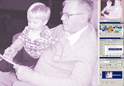
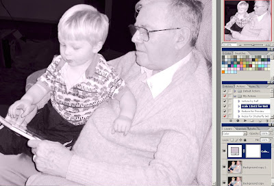
Here are two screen shots:
Desaturated, then recolored (click the "colorize" box) with Image-->Adjust-->Hue/Saturation (click on image to see more fully):
And now with the Color adjustment layer set to color blending mode:
The difference is really noticeable in Allen's pants, for example. I remember being bummed last year when Stef talked about being able to do this easily in CS3--in CS2 there's no explicit option for this. So, yay!
Saturday, November 29, 2008
Layouts: The Winter Coast
A couple of layouts with pictures from beach walks. The sunsets seem so much more colorful in the winter, I'm not sure why. And today was fraught with fog, and the waves were crashing really far out, creating old man dreads rippling towards shore...
I've done nothing to the photo except crop it (then invert it and take a bit out of the lower part), and only used some brushwork on the background to get it to blend... Font: King.
All 2Peas: 3 papers in the background by Veronica Ponce (Venice Beach kit) with different directions of layer masks overtop, and 2 swirls by Rhonna Farrer (V14 and V4 Swirls). Fonts: 1913 Underwood and You Are Loved. No journaling--'nuff said!
Illustration Friday: Balloon
Word of the week: balloon
I always dread the post-prandial stupors of the holidays, and the way I seem to balloon...
Wednesday, November 26, 2008
Beach Layouts
Even in the winter, we spend most of our sun-time at the beach...
Ocean Of Light: I really use up lots of time going through the different permutations when it comes to layer blending modes, but boy does it pay off. This paper on the bottom ended up perfectly conveying the swirling depths of the ocean, and I blended it easily with the top photo layer by using a layer mask on the photo and a fat, sheer brush to ease the transition from the dark sand into the paper.
Credits: All Designer Digitals, Katie Pertiet: Stacked Photo Clusters No. 2 for the frame, and a beautiful paper blended into the bottom from the Surf Shak Paper Pack. Do you see the giant Japanese crab lurking in there? Those things are impressive--photo is from a trip to the Oregon Coast Aquarium. Font: Last Words. Journaling reads:
"There is the ocean of light
Shimmering sunset paths of lilac and gold,
Foam green curls and jolt of white;
Even in a storm there are still
Twenty shades of gray scattered across
That moment where sky and water meet.
And there is the ocean of the deep.
I had nightmares when we first moved here.
I dreamt of inky depths and deaf blindness;
Of monsters half tooth, half hunger;
I sensed lurkers in every puddle and pool.
You cringed at the constant growl of waves;
I protected us cautiously, wary of the tide.
Now, I have learned to hear its echoes
Rushing in long waves through my blood;
Still, at night when I hear that startling
Crack of a wave collapsing at high tide,
I fear I have conjured up some vast creature
Scuttling in from the cold black waters
Headed straight for me."
Thought At Work: The color in this photo is really vivid and lovely, but wasn't quite congruent with the reflective look on his face, so I opted to desaturate it, then change the Hue/Saturation back to "colorize" and picked a color that didn't make him look sickly or alien. =) I've also really gotten into the softened black and white: duplicate the image, and use a fairly heavy gaussian blur on the lower image (I used about 4.5). Then, either use overlay, soft light, or screen on the upper layer and watch the image lighten and soften!
Credits: All Designer Digitals. Lynn Grieveson's Essentials paper for the background; everything else by Katie Pertiet. Patterned paper and stitching from the Botanical Fusion kit, tag from Lil Bit Tags, flower from Crumpled Flowers (and from the 30 minute chat), twill from Shell Collectors No 4 kit, leafy branch from From My Porch Brushes, tiny birdie from the Little One Layered Template, and title alpha from Grimey Alpha. Font: butterbrotpapier. Journaling reads: "Whether you're speculating about the life path of a star or what might happen if two black holes were to collide, or you're pondering how to construct your latest architectural invention--usually involving trains in some fashion--you get this look: a completely intent yet faraway stare that only tangentially comes near to conveying to us what neuronal storms are firing away in that precious little head of yours."
Sand Golf: I love this transparent alpha by Erica Hernandez at 2Peas--you can really add dimension and meaning to your layout without sacrificing real estate. The stitching leading the eye around the spiral of images is hopefully suggestive, without being over-powering...
Credits: All 2Peas. Background paper by Kate Teague (Paint It), and stitching linking the photos also by here (Worn Out kit). Alpha by Erica Hernandez (Vibe freebie). Font: butterbrotpapier (what would I do without that font, sheesh!).
Journaling reads: "We went for a lovely hike around Cape Perpetua, and you decided the beach needed a channel connecting all the little puddles -- a "sewer system." But I swear it looked like you were playing golf -- especially with Daddy's cap on!"
Scale: Uh, this took a while. =) Lots of blending, clipping...
Credits: All Designer Digitals. Background paper by Katie Pertiet (Naturally Krafty). Splotches are combinations of Anna Aspnes's Floral Art No. 2 or Foto Blendz Clipping Masks No. 10 clipped to papers by Lynn Grieveson (Essential Bases, Kiwiana) or Anna Aspnes (Something Springy). Also by Anna Aspnes are a page border (Something Springy) and a corner swirl (Hipster Plumes Korners N Edges No 2). Katie Pertiet also provided an overlay shell design (Beachy Clusters), as well as stitching holes (Stitching Hole Borders) and stitches (Once Upon A Time kit). Bottom edge border graphic by Mary Ann Wise (Natural Borders), and finally, the page edges are by Lynn Grieveson (Worn Page Edges). Fonts: Monika Italic and 1942 Report. Journaling reads:
"We stand on one side of the bay,
looking into the deep horizon,
lost in the sky, anchored unsteadily
to the side of the cliff. We feel so
small.
And we look down
and witness this amazing snail,
snuggled under a crevasse,
busy foraging in his own, tiny world.
The snail, the lighthouse, the waves:
all sublime, no matter their
relative size."
PS: Just looking over my post to make sure everything came through all right, I was struck in the last layout at the similarity between the capital S of "scale", and the foam on the wave above it. I just LOVE these subconscious synchronicities!!!
Monday, November 24, 2008
Font Freebie: Tall Drink
Sunday, November 23, 2008
Illustration Friday: Opinion
Word of the week: "opinion" -- I hope writing can be part of the illustration... (Click for larger, (mostly) legible version)
opinion
once
i saw a little scene
a father screaming at his son
hitting him on the shoulders
right where he knew the child
had a terrible sunburn
my opinion of this man
was not the most flattering
another time
i spoke with a man and his wife
about churches (this was in the South)
and listened to their reasons
for attending at least every two weeks
which was the minimum a man
of his standing
could afford to go they told me
my opinion of these reasons
greatly informs my skepticism
i have heard white people
scoff at the possibility of parity
between themselves and a black person
i have heard black people
scream hatred at 200 year old oppressors
who happened to be born 20 years ago
i have felt the spit of apoplexy
from women burned by men
and i've shrivelled under the scorn
of men whose mindscape includes no females
opinions
the grip of emotion
the shadowscreen of our lives
opinion is not often
reason
Saturday, November 22, 2008
Bohème Sophistiquée Freebie
Not sure why I made such a huge kit, but there ya go. It's two separate uploads: 1 is the paper pack, and the other are the elements and quickpage. Here's the layout I made with the kit and turned into the quickpage:
The preview image is linked to the element pack, so be sure you come back for the paper pack! Please remember that 4shared is being really difficult with comments, so do leave some on the blog. It's my only pay! =)
Element Pack
Paper Pack
The preview image is linked to the element pack, so be sure you come back for the paper pack! Please remember that 4shared is being really difficult with comments, so do leave some on the blog. It's my only pay! =)
Element Pack
Paper Pack
Monday, November 17, 2008
Angel Hartline Designs
Joined a new Creative Team, Angel Hartline Designs--a somewhat different direction, but I think it'll be fun!
Credits: Everything from Angel Hartline Designs. All papers and flower from "It's A Good Life" kit, except for the two whitish ones that I scribbled on myself (I also made that little curled bit up there). Swirly bit from Music Flourishes 2. Wordart and ribbon-washer-thingie from Tranquillité kit. Frame from Blessed Part 1. Font: butterbrotpapier. Journaling reads:
"a boy
a stick
sand and water
nature's sketchpad"
Saturday, November 15, 2008
Tutorial: Fading Backgrounds
This is such an easy technique: take one paper, and fade it into the other. This gives you the chance to introduce some subtle variations into your background, without having to go full out into making something look realistic, and it's great for a soft touch of color if you want it. Here are a couple of examples:
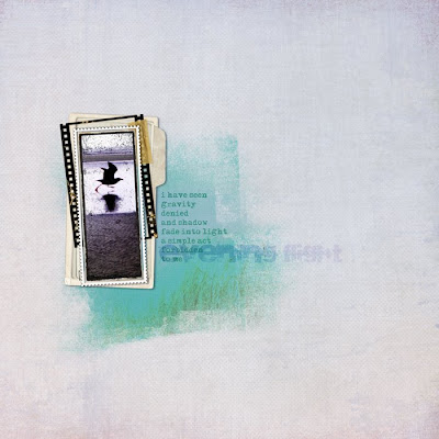
Credits: All Designer Digitals. Papers by Lynn Grieveson: Background from Essential Bases, and blended portion from Catalina (using Anna Aspnes's Fruehling mask). All frames by Katie Pertiet: From the bottom up: Carded Stacked Frames, Filmed Layered Template No. 10 (tape is from this as well), Photobooth Frame No. 2 Sampler, and Little One Layered Template. Fonts: Maszyna Plus and Sidewalk. Journaling reads: "i have seen / gravity / denied / and shadow / fade into / light / a simple act / forbidden / to me"
Oh, what I have to resort to to use these pretty feminine kits! *lol* Everything from Vinnie Pearce's new kit at Pixel Canvas, Shabby Baby.
So, how do you do this? First, you need a mask. A mask is simply a shape, which you will use as a "clipping path"--that is, the image will be mapped directly onto the shape, including it's opacity! It's way cool. =) I used Anna Aspnes's mask in the first layout, but they're really easy to make. Open up a blank canvas, and on a transparent layer, just start painting. You can use a big clunky brush for the middle, but the cooler effect will be given by the edges that fade into nothingness, so make the edges gradually lighter and lighter. I usually start by painting, and then erase a bunch, then paint again... Try using brushes that you've made from scans of some text (it doesn't matter what as it'll be illegible)--those make really nice fine texture.
Once you have your mask all set, place your background paper on a layer beneath it. Then, take a slightly contrasting paper, and place it on a layer *above* the mask. Now, do ctrl+alt+g (in PSE, I think it's just ctrl+g). The top paper will map itself onto the mask, and if you've faded your edges enough, it will gently settle over top the background and give you a nice color spot. Have fun!
Friday, November 14, 2008
Thursday, November 13, 2008
Wednesday, November 12, 2008
Card, and Layout Catch-Up (no fries, though)
Ha, ha ha ha.
Ok, here's the card. I made the background for this at the same time as I was making one for my art journal, and I'm pretty pleased with how it turned out:
Supplies: Paints: Gesso, Fresco reinkers, Torn Asian-language newspaper, Mizuhiki Stamps: Art Neko (ginkgo branch), Hanko (single sakura blossom), Asian Image (umbrella), Hampton Art Stamps (women's faces) & Stone House Stamps (calligraphy). Inks: Versacraft black, Colorbox Fluid Chalk green, lavendar, orange, Brilliance coral and purple. Embossing powders: Ranger clear. 2nd layer: red & yellow acrylic paints. Cardstock: shimmering lavender.
And now, the layouts:
Today's:
Credits: Shell: Katie Pertiet (Designer Digitals, Shell PNG's). Button: Vinnie Pearce (Pixel Canvas, My Pet Elephant Kit). Pebble: Vinnie Pearce (Glass Pebbles). Sea star charm: Vinnie Pearce (Paradiso Kit). Tag: Katie Pertiet (Lil Bit Tags). Font: Hobbes. Journaling reads: "Here, you don't see the dog who has just used her awesome and terrible hunting powers to shoo a mass of seagulls into flight. Here, you don't see a small boy forever drawn by whatever insignificant empty shell or puddle running in the most circuitous fashion as far from the return path as possible. Here, you don't see the mother whose soul has spread itself wide open to the sky and salty wind, while her heavy body traipses ageingly across the beach and her camera catches memories in its digital skeins. Here, all you see is simply a moment endlessly repeated striding across time, briefly frozen."
Yesterday's: I was inspired by a color palette of Kris's, at Kris's Color Stripes.
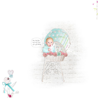
Credits: All Designer Digitals. Background paper by Kellie Mize (Winter Surf Kit), with overlays by Anna Aspnes (top: Hipster Plumes Korners N Edges No. 2, bottom: Floral ART No. 2). Frame by Katie Pertiet (In A Strip) with papers by Lynn Grieveson (Chat Freebie 09-13-08) and Mindy Terasawa (Sunday Morning Papers). Gold accent paper by Anna Aspnes (Ad Challenge 07-27-08). Tree and buttons by Katie Pertiet (Love Grows No. 1, and Once Upon A Time Kit). Font: 1550. Journaling reads: "Nothing better than a Grandma cuddle on a windy day."
Oh wow, I just realized I have *lots* of layouts I haven't posted, so ok, just a couple more...
On this day, I was glad I'd brought my camera along when we went to change our oil, because we ended up sitting there for almost 20 minutes. So I amused myself by taking surreptitious pictures of the back seat in the rearview mirror, until he caught me out =).
Credits: Almost everything from Vinnie Pearce's Engines kit (Pixel Canvas). Alpha for "back there?" is by Rob and Bob (Designer Digitals, Sanctuary Alpha). Fonts: Splurge and tweed. . I had fun with the perspective tool... ;)
And finally, a scraplift of Denise at Designer Digitals, for the Saturday Scraplift a while ago. We don't do Halloween--after all, Allen doesn't like candy, and he doesn't like costumes. But we did drop by Daddy's office, only to find a couple of gruesome witches, and a Hulk (which he'd never heard of before--we don't have TV). But he could handle the cowgirl, and even consented to model her hat!
Credits: Stuff by me. Fonts: Digs My Hart and 3rd Man.
I guess I'd better get to the Friday Illustration before the next one comes, too--I've had a punnish idea for it, as usual...
Monday, November 10, 2008
Sweet Quickpage Freebie!
Ok, I just spent a weekend putting a kit together, which if I ever grow up to be a real designer, I'll offer in a store (probably with some more stuff in it). Here's a preview of what's in it now:
But I do love to share stuff too (and wow, when you leave me a comment it SO makes my day--thank you to those of you who do so!) so I made a quickpage, which I hope you'll like. Obviously the quickpage has a hole where Allen's pic is right now! =) It's a .png file, which I *think* everybody can open--let me know if you can't, ok?--and all you have to do is create another layer *underneath* the quickpage, drag your photo into there and resize it, and you're good to go. Anyway, hope you enjoy this freebie! (Just click on the image to be taken to the download area)
Wednesday, November 5, 2008
Cherry Blossoms Paper Freebie
Sunday, November 2, 2008
A Wintery Mood...
Been feeling blue, I guess...
Music To My Soul
The annual seagull pilgrimage to Yachats River Beach has begun, except this year they are joined by pelicans.
Credits: Everything Designer Digitals. Background paper and paper edges by Lynn Grieveson (Little Hampton and Worn Paper Edges). Masks by Anna Aspnes (Floral Art 2 and 4) and me. Some coloring provided by Katie Pertiet's paper from the color challenge of 10/28/08. Music frame by Kellie Mize (Journaling challenge, 11/2/08). Font: DB Poetic and Times New Roman.
Colors Of Winter
I know it's not winter yet, but once the rains start, well, it might as well be. It only gets slightly colder when actual winter arrives, and there's a little more hail. Heh.
Credits: All Vinnie Pearce, Pixel Canvas. Papers from Pieces of Me and Weathered greens. Freebie Template Challenge #5. Font: Oregon LDO (heh!). Journaling reads: "We take our walks along the 804 trail and discover what the increasing rains and winds are doing to the shoreline and the tenacious grasses along the dunes. You jump and run and throw rocks and dig holes -- and pay no attention to our tut-tutting -- just as alive as the roar of the waves, the waves shouldering against the dark rock, spraying their very vitality to the gloomy skies." Very simple!
Memories Of The Sea
The pattern in the long strip is taken from a kimono, of all things. I've turned it into a rubber stamp, but also used it as an overlay for the paper (I'm feelin' a blog freebie coming on soonish!). I'm thinking forward to the time when Allen will have to carry the ocean with him...
Credits: Background paper and strip of paper mine, though the strip has been "worn" with Lynn Grieveson's Worn Page Edges (Designer Digitals, slightly modified to fit my shape). Frame by Katie Pertiet (DD, Stitched Up Frames). Stitched frame by Anna Aspnes (DD, Stitched by Anna No. 1 White). Flowers by Monica Larsen, Floralis. Fonts: Boris Black Bloxx and Luna. Journaling reads: this is our ocean and this is you by the ocean and this is me taking a picture of you by the ocean and here is my gift to you a memory of this day and our beautiful beloved ocean"
Subscribe to:
Posts (Atom)