
Saturday, July 26, 2008
Little Guy
A belated scrap of a photo my friend Brenda Marks had given me of her doggie... isn't he delightfully cute? I also used it to fulfill a 2Peas Challenge (extracting an element--the dog tag--from a photo) and a Saturday Scraplift at Designer Digitals (of Erin's "So Young" layout). Other credits: Word art by Wordle.net with Kenyan Coffee font. My paper & sunflower sticker (Fall Splendor-not out yet), also my dog tag. Lynn Grieveson's heart brad (Designer Digitals, web challenge, june 15 08). Katie Pertiet's frame (DD, 3pm Layered Template freebie). Tape by Rhonna Farrer (2Peas, Celebration Kit). Journaling strip by Anna Aspnes (DD, Mama Page Set). Fonts: Eight Fifteen, Arial & Hearts. Click for the larger version, as usual...
Friday, July 25, 2008
Font Freebie: Sea Dreams
I made this layout the other day (click to see credits and journaling):

So I thought I'd make a font freebie! (Click on the image below to go to the download area)

This is my first "released" font, and it's not entirely perfect, but it works pretty well, it has both upper and lower case and most of the important punctuation (no foreign letters, though--sorry!), and should do great for creating your own alphas.
This font is free for personal and commercial use (credits appreciated), but it may NOT be resold as part of a compilation or fee-for-download, and MUST be accompanied by the TOU. Thanks for looking, and I hope you enjoy it! (I'd love to hear feedback on it, since I'm a novice at font-making...)
So I thought I'd make a font freebie! (Click on the image below to go to the download area)
This is my first "released" font, and it's not entirely perfect, but it works pretty well, it has both upper and lower case and most of the important punctuation (no foreign letters, though--sorry!), and should do great for creating your own alphas.
This font is free for personal and commercial use (credits appreciated), but it may NOT be resold as part of a compilation or fee-for-download, and MUST be accompanied by the TOU. Thanks for looking, and I hope you enjoy it! (I'd love to hear feedback on it, since I'm a novice at font-making...)
Tuesday, July 22, 2008
Fun Word Art Generator
Esther at 2Peas turned me onto this: wordle.net. It's a fun little Java applet that allows you to turn text into word art, and it gives you several different options for layout, font, and color. Cool, huh?
Poor little Allen, though...

Credits: Word art generated by wordle.net (thanks for the pointer, Esther!). Ribbon by Anne Langpap, recolored (2Peas, May Freebie). Arrow mine from DSO-Graffito kit. All the rest of the grunge and scribbles by Veronica Ponce (2Peas, Venice Beach). For the 2Peas kit challenge.
PS: I couldn't find a way to save the image to my computer without making it available on the public gallery, though. It does have a "print" option, however, so I printed it to my .pdf printer, then opened the .pdf in Photoshop at 300 dpi--total breeze!
Sunday, July 20, 2008
Simple Beauty: 1 Hour Digi-Challenge
For the 1 hour digi challenge by MamaKoala on 2Peas... It took me 1 hour and 6 minutes, with the longest tergiversation over which picture to use, and which fonts!

Credits: Paper: Kellie Mize (Designer Digitals, Web Challenge 7/20/08); ribbon by Lynn Grieveson (DD, Nanyang Kit); distressed numbers on right by Katie Pertiet (DD, Messy Numbers N Extras); button mine from the Cowboy 2 Kit; Fonts: Andes & Kolker Brush. My "quote".

Credits: Paper: Kellie Mize (Designer Digitals, Web Challenge 7/20/08); ribbon by Lynn Grieveson (DD, Nanyang Kit); distressed numbers on right by Katie Pertiet (DD, Messy Numbers N Extras); button mine from the Cowboy 2 Kit; Fonts: Andes & Kolker Brush. My "quote".
Some Cards


Friday, July 18, 2008
I'm Not So Good With The Month Thing
For some reason, I can never get the Spring or Fall months to follow each other properly, which is why I thought I was pressed for time to get this little mini-kit ready for a blog-hopping party started by Kristine at WenchdGrafix. Which is due... October 1. Heh. So, here's the preview, and I just hope I can remember to put it up that day, because who knows, I'll probably think it's April by then... =)


Thursday, July 17, 2008
Freebie Graffito Mini-Kit: DSO July 08 Color Challenge
ETA: Here's the layout I just made from the mini-kit:

(Central Oregon Coast, USA) Credits: Everything from my DSO-Graffito Freebie Mini-Kit. Fonts: 3rd Man and 1550. Journaling reads: "The lighthouse was one of our first experiences on the coast -- it is so evident that beauty here must be created by some mix of growth, and weathering. For me, the growth is internal; but the body suffers, time mars my surfaces as surely as it does those of the lighthouse.")
Just made this up on a whim from the lovely color swatch for this month at Digital-Scrapbooking.org. It's got some cool photomasks and fun papers and some other stuff:

Sure hope you like it! And don't worry, I just wrote the thing about the house for sample purposes! No longer available, sorry!
(Central Oregon Coast, USA) Credits: Everything from my DSO-Graffito Freebie Mini-Kit. Fonts: 3rd Man and 1550. Journaling reads: "The lighthouse was one of our first experiences on the coast -- it is so evident that beauty here must be created by some mix of growth, and weathering. For me, the growth is internal; but the body suffers, time mars my surfaces as surely as it does those of the lighthouse.")
Just made this up on a whim from the lovely color swatch for this month at Digital-Scrapbooking.org. It's got some cool photomasks and fun papers and some other stuff:
Sure hope you like it! And don't worry, I just wrote the thing about the house for sample purposes! No longer available, sorry!
Wednesday, July 16, 2008
Japanese Birdie
From my newest plate of stamps at Art Neko:

Stamped in Versacraft black and left unembossed on painted watercolor paper, over 3D japanese flower paper and handmade Thai paper.

Stamped in Versacraft black and left unembossed on painted watercolor paper, over 3D japanese flower paper and handmade Thai paper.
Tuesday, July 15, 2008
Partial Extractions: What They're Good For
A partial extraction is when you only allow one portion of an image to remain intact, and cut out the background on the rest of the image. Photos that work well for this are ones where the main subject is extruding somehow--somebody waving a flag, waving hi, or even something like the head of your pet. This obviously really highlights the extruding part, so unless you're focussing your layout on your dog's wagging tail, the hind end might not be your best bet for a partial extraction. (Ha, ha ha ha. Badaboom.)
To do the one in the following layout about the awesome Arum dracunculus growing in front of our Post Office, I first used my rectangular lasso to choose the part of the photo I wanted to keep, as the part that I extracted had the sidewalk as a background, with a bit of litter--just not a great photo overall, background-wise. I copied that square, then pasted it on a different layer.
Next, I went back to the base layer and started extracting (my favorite tool is the pen, working very close up; complete your path, switch to the path palette, click on the "change path to selection" little circle of dots at the bottom, feather 2 pixels, invert the selection, and press delete to remove the background).
I chose to break my extraction about 1/3 of the way into the square, so that part of the extraction overlapped part of the original. When I added a very strong shadow to the square (100% using a dark color eyedrop-picked from the background paper), I duplicated that for the extraction. Of course, you'll get a shadown down the middle of your square that clearly delineates the extraction, so you have to fix that...
Right-click on the layer name for the extraction, and pick "create layer"--this will make your style effects into separate layers, 1 for each style you have. Here it was just the shadow, so I made all my changes to that one.
Working only on the newly-created shadow layer, I first erased the strong line that showed where the extraction began--but only the vertical part of the shadow. In fact, I extended the shadow under the spathe (the petal-like structure of the plant) further to the left, gradually fading it out, using both the blur and the smudge tools. This really helped the spathe pop out dimensionally against the background, but the effect was subtle enough that you wouldn't really notice it unless you knew, I think...
Please click on the image for credits and a little more info about this gorgeous Dragon, aka Stink Lily!
Monday, July 14, 2008
Digitricks: Gradient Maps
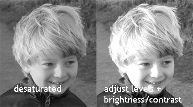
I don't know if you noticed that Allen's picture, in the previous layout (You Brighten My Life, the quilt template freebie), was not in fact a colorized grayscale. Instead, it contains 4 separate colors, ranging from a darkish slate blue to a pale pastel turquoise. How do you do that? In a nutshell: Image-->Adjustments-->Gradient Map.
Here's the technique for translating a desaturated, contrast-boosted image to a 4-color image:
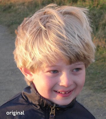

Let me explain the process a little more in detail, though really, it's quite simple: Desaturate your original photo, then do a quick auto levels adjustment, or fiddle around with the curves if you're picky (a lot of fine tuning will be washed out anyway in the process, so I wouldn't worry overly much about it). Next, do a brightness/contrast adjustment, making sure that there are some strong details and contrasts, and that it's not a close gray everywhere.
Finally, do the gradient map, and choose your colors:
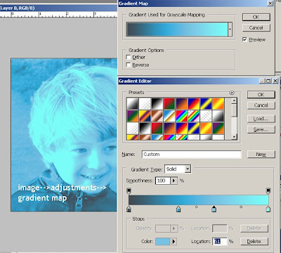
Note: When you first open up the dialog, you'll see only a gray-white slider. Just click on it, and a color option box will open. Click the little square directly beneath the left end of the slider and choose your darkest color (this may be reversed for you, so just pay attention to which side is the darker and choose accordingly). If you want to add more colors--remember, I used 4--just click directly beneath the slider--not on the diamond, but in an empty space. Your color box will open beneath, then click on that one to choose the color. Choose as many colors as you like, and have fun experimenting--you can get some really groovy psychedelics going, too! I just picked my colors because I liked them, and then picked the patterned papers to go with that!
Here's my latest layout, as well:
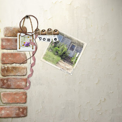
(Credits: All elements from Natali Designs at ScrapbookGraphics (Countryside Kit), except for the mask over the photo, which is from Katie Pertiet (Designer Digitals, Dirty Frames 3). Font: heathert.)
I made this layout for the next Scrapbook New & Review Issue -- speaking of which, July's is up! I have an article about "The Elements Of A Card" and a quick explanation about Layer Blending Modes...
Here's the technique for translating a desaturated, contrast-boosted image to a 4-color image:


Let me explain the process a little more in detail, though really, it's quite simple: Desaturate your original photo, then do a quick auto levels adjustment, or fiddle around with the curves if you're picky (a lot of fine tuning will be washed out anyway in the process, so I wouldn't worry overly much about it). Next, do a brightness/contrast adjustment, making sure that there are some strong details and contrasts, and that it's not a close gray everywhere.

Finally, do the gradient map, and choose your colors:

Note: When you first open up the dialog, you'll see only a gray-white slider. Just click on it, and a color option box will open. Click the little square directly beneath the left end of the slider and choose your darkest color (this may be reversed for you, so just pay attention to which side is the darker and choose accordingly). If you want to add more colors--remember, I used 4--just click directly beneath the slider--not on the diamond, but in an empty space. Your color box will open beneath, then click on that one to choose the color. Choose as many colors as you like, and have fun experimenting--you can get some really groovy psychedelics going, too! I just picked my colors because I liked them, and then picked the patterned papers to go with that!
Here's my latest layout, as well:

(Credits: All elements from Natali Designs at ScrapbookGraphics (Countryside Kit), except for the mask over the photo, which is from Katie Pertiet (Designer Digitals, Dirty Frames 3). Font: heathert.)
I made this layout for the next Scrapbook New & Review Issue -- speaking of which, July's is up! I have an article about "The Elements Of A Card" and a quick explanation about Layer Blending Modes...
Saturday, July 12, 2008
Quilt Template Freebie
Here's a fun, BRIGHT little layout I made today, for the 2Peas kit challenge:

(Credits: Papers & tag: Anne Langpap (2Peas, May and July 2006 Freebies). Alpha from my Flourished Alpha. My stitching, and my little bitty flower on the tag. Font: Pea Jordan.)
It was so graphic, I thought I'd make a little layered template from it. It's got a layered .psd file, a full-size .png file where you can use your magic wand to select the different colors and paste a paper into it, a separate stamp tag, and the "YOU" word art. Hope you like it!
ETA: Look at these darling layouts that were made with this:


Friday, July 11, 2008
Altered Chipboard Houses
For a swap in the Stamp Art Friends Yahoo Group... can't wait to see what the others have done! I'm such a dunce at altering, though I think scrapping helped me feel just slightly more comfortable with the process. Sure was a good way to use up stash, though!


Tuesday, July 8, 2008
Birthday Freebie!
It's my birthday, so here's my present to you: a little snail graphic that I haven't made into a stamp yet. I used it in this layout in its original form (click to read journaling), then made it into a stamp...

(Credits: Papers by me, with a little bit of shape overlay from Mindy Terasawa's Green Tea (Designer Digitals). Snail and birdie by me. String frames by Natali Design (Country Spring). Fonts: Goudy Old Style and CAC Shishoni Brush.)
And here's the little snail:

(Credits: Papers by me, with a little bit of shape overlay from Mindy Terasawa's Green Tea (Designer Digitals). Snail and birdie by me. String frames by Natali Design (Country Spring). Fonts: Goudy Old Style and CAC Shishoni Brush.)
And here's the little snail:
Sunday, July 6, 2008
ButtonSpeak: Freebie and New in the Shop
Ok! New little element kit in the shop with these cool funky wordart buttons, inspired by a bunch of metal buttons I found in this great little antique store up the road. I've had to "retire" some of my stuff from the store, as sales didn't warrant paying yet more for storage space, but if you want some of the retired stuff, just send me an e-mail and we'll work it out. The new kit has 10 papers, all different but similar, 8 matching labels, and 7 buttons (plus a brush set for those who can use that):

And here's the freebie: 2 papers, 1 label, and a button that says "Puppy Love" on it!

And here's the freebie: 2 papers, 1 label, and a button that says "Puppy Love" on it!
Friday, July 4, 2008
Happy 4th, Y'all...
From our parade, today:

"La de da" is what you say when you want to imply that somebody is acting all fancy (and you're kinda making fun of them); "whoop de do" is a similarly gently sarcastic comment. =)
"La de da" is what you say when you want to imply that somebody is acting all fancy (and you're kinda making fun of them); "whoop de do" is a similarly gently sarcastic comment. =)
Thursday, July 3, 2008
Whee! New Rubber!
P054 went off to the engraver's today for Art Neko:

Our first sheet in quarters, since everybody's purse is becoming smaller and smaller...

Our first sheet in quarters, since everybody's purse is becoming smaller and smaller...
Wednesday, July 2, 2008
Freebie: Tire Track brush and .png file
For Mandalee, if she still needs it (click to get the zipped file):

Subscribe to:
Posts (Atom)