Sunday, January 13, 2008

Challenges

I really love challenges. For some reason I can always come up with stuff I'd never think up on my own in a million years! I've done lots of card-making challenges (I guess you could consider a swap somewhat of a challenge too), where somebody sends you a pre-stamped image and you have to make a card with it, or a background that you have to incorporate into one of your own designs.

In digital scrapbooking it's even more fun--not only do you get to create fun and unexpected pages, but on top of it, you get some remarkable loot!

Here's the result of Kellie Mize's Ad Challenge at Designer Digitals, with her great template:

Heather Taylor, Never Turn Your Back On The Waves


(Font: New Gothic Standard. Template by Kellie Mize. Japanese kamon.)


The frame I made the other night by smooshing some white acrylic paint on a piece of black cardstock with a scrunched-up paper towel (yes, those are the technical terms!)--then inverting it for this layout.

Saturday, January 12, 2008

Mapping Texture

Ok, I'm a little bit pleased, and a little frustrated too. Here's the culprit:

Heather Taylor, Free As A Bird
(Font: Birch Standard. Elements and background paper from Lynn Grieveson's Catalina kit @ Designer Digitals.)


The part I'm really pleased about is the background (check out how even the stitching actually follows the contours of the cloth!). How'd I do that? Sooooo glad you asked... ;)

I scanned a white t-shirt and made a desaturated image with it. Then, I overlaid Lynn Grieveson's beautiful paper on top and changed the paper layer to an overlay blend. Then I also did a displacement filter (distort-->displace using the t-shirt psd file) on the paper. What this does is actually warp the paper so that it's not only a flat illusion, but the displacement changes the paper so it looks like it goes "down" on the dark areas, and "up" on the light ones; by superimposing the distortion over the grayscale image you get much more of a sense of depth (props to Photoshop 7 Wow! for the technique). I did the same thing with the word art (clipped it to the grayscale background first, though). For the stitching, I only used the displace filter, but I had to go in and clean up with the smudge tool afterwards. The stitching is really cool, though--it "makes" the effect by being so zigzaggy directly on top of the fabric folds... Fun stuff!

The frustrating part is that I still need lots and lots more practice with that darned "curved photo" look. Still looks pretty amateurish to me...

Friday, January 11, 2008

Extractions

Well, the challenge at 2Peas this week was to de-emphasize a background. It's actually a really good skill to practice on, because very often you have one great subject... but it's a cruddy background, cluttered, too loud, etc. This can really happen a lot if you have a lousy digital camera like I do, with no way of changing the depth of field (though occasionally I get lucky). One of the ways to do this is of course to cut the background out altogether, which is what I did in the layout below. But to do this, you have to isolate the subject... and that's the tricky part.

There are several ways you can do it. One is to use your pen tool, and working very up close, touch the pen down along the edge of the subject, dragging it lightly every time you touch down in the direction of the edge. Later you can go back and adjust your points so that the path matches the edges. In the Paths window, click on the little icon at the bottom that will change your path into a selection. Feather it one or two pixels if you think the line might be too harsh, then invert your selection, and delete the background.

You can use almost the same system by using the lasso tool, except here you're dragging continuously (a little harder on your fingers). Use the shift key to add to your selection, and the alt key to subtract from it.

In Photoshop CS2, there's also an Extraction *filter*, which is what I've used here. It's tricky to get the hang of it, I must say--today's attempt is the first one I've actually kept. To use that, work also very up close on the image in the pop-up window. The goal is to outline the subject (you don't have to worry about the photo edges--the selection automatically includes those as a line) using a marker of varying widths, then adjusting with another tool, then filling in so it keeps whatever is filled in. Preview it, adjust with the paintbrush tool that allows for varying levels of opacity (handy for hair), and when you click ok, it just strips all the rest.

I always use a fairly wide and soft blur brush around the edges. This allows the image to look less like it's just plastered on, and more that there's actually some perspective going on there...


Heather Taylor, School


Here's the original photo (notice that large white square of paper, which would really detract from the sweet little boy listening to a story):


Ooh la la Artsy! Not!: Extractions


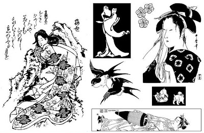
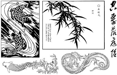
Oh, and also, the newest sheets for Art Neko are out:


Art Neko P050 - Hokusai Dragon Sheet by Taylored Stamps
And the second half-sheet:

Art Neko P050 - Hokusai Swallows Sheet by Taylored Stamps
Enjoy!

Thursday, January 10, 2008

More on Combining Efforts

The place where it all began was on OSA, Oriental Stamping Art. Side note: I found out about OSA because of my friend Brenda Marks, who's branched off from stamping into her own stuff, which you can admire at http://www.brendamarks.com/ (I'm particularly enjoying her embossed pastels right now). Anyway, Asian art has always been a fascination of mine, and stamping in a westernized Asian style has fit me to a "T" (bad pun alert, sorry... ;). Now that I've started delving into digiscrapping I'm exploring a more Western style--my family and I are unfortunately way too white to fit, photographically, with a lot of Asian-style layouts (though I do try and sneak it in, of course! *lol*).

But (I was going somewhere with all this, I promise), I can combine techniques, and reuse what I make for stamping with what I do in digiscrapping. Who knows--eventually maybe I'll be able to make stuff commercially, too! In this case, I'm referring to this card, which I made for the OSA ACE9 round for January (ACE=Asian Card Exchange; you send 3 cards a month rotating down a list until you get back to your own name):

Heather Taylor, Winter Pine


(Pine Bough by Stampendous, Winter kanji by Art Neko, punched branch by McGill)

The background is a piece of 8.5" x 8.5" white column cardstock that I distressed with sanding paper, an embroidery needle, and the sharp point of my X-acto knife, then covered with blue dye ink and silver pigment ink. I added the darker inked edges after I cut up the paper (I made 4 cards of this style), but I'll have to do another like it--love the effect, and it would work great for a photo frame in digiscrapping. I scanned the larger square piece. Now (with a bit of fiddling in the contrast area) I have a great grunged overlay that I can use!

I can foresee a lot more of these stamping/digiscrapping combos coming down the line... ;)

Saturday, January 5, 2008

Making Your Own Stuff

There is so much beautiful stuff for digiscrapping out there, it's hard to know where to start. When I began last June, I Googled for freebies and challenges--I like challenges, because they force me to do stuff I wouldn't do on my own--and rapidly became rather overwhelmed with the profusion of papers, elements, and fonts out there (I got over myself on the fonts, though ;).


'Sides which, I don't much like to be beholden, so I began to explore how to make my own stuff. There were a couple of things that I really wanted: frames, and ribbons. I still haven't figured out the ribbon thing (mostly because I can't tie a nice knot, so it looks ridiculous when I scan something), but I quickly found a great source for all kinds of different frames: vintage photographs.


There are many places on the net where you can find photos that have wonderful, old-timey frames. There's even a Live Journal group called vintage-photos that posts all kinds of family stuff from way back when (and they give permission to use the pics, of course).


It's usually pretty easy to isolate the frame--I just make paths with the pen (working very close-up), convert them to selections by clicking on the little round dotted circle at the bottom of the paths window, then invert the selection, and delete. Do the same for the inside and the outside of the frame, and make sure you have it on its own layer, and there you go, instant frame! Make sure you go around the edges with your blur tool to soften them. Changing sizes slightly to fit your photo is pretty easy, because many of these frames are very worn. Simply drag the corner boxes to fit around your photo, and you may find it doesn't even affect the quality very much.


Here's one I used recently:


Fonts: You Are Loved and The King and the Queen for the word art; Baby Boston for the journaling. Background guitar picture by 'xenia' from the Morgue File, small metal guitar made from a guitar picture by 'messa' (also Morgue File). Everything else mine.


For this particular layout, I also incorporated a couple of images that I found on Morgue File, a free photo-sharing site. One of them (by "xenia") is blended into the background (which, by the way, is simply a scan of wallpaper used in exclusion mode over a simple fill--the texture is the same in the word art), and the other (by "messa") I extracted, then made into a little metallic pin (Johnny is an excellent guitar player and musician, and he's really keen for Erik to follow in his footsteps!) by using the bevel and emboss function, and filters for bas relief and chrome, then adjusting the hue/saturation sliders until it looked passable.

Of course, the scanner is your best friend, but it's amazing what you can do with old photos--yours, or others'!

Friday, January 4, 2008

Musings on the Subconscious in Art

I remember, a long time ago when I was taking a Creative Writing poetry class in college, a shocking moment: somebody--quite innocently--pointed out something my poem was saying that I hadn't known about. I forget the exact words, but the gist of it was that one way the poem could be read, seemed to refer to a certain kind of situation. And indeed, that very unpleasant situation -had- happened to me, but I certainly had never intended to make it "public"!

The subconscious really can sneak things through on you. And as much control as you'd like to think you have over your creations--be they words, or pixels--you can't prevent the reader or viewer from interpreting the work, and sometimes their interpretation might surprise you by its truth.

Somebody (Mary Ann, from 2Peas) did this to me just the other day, by remarking on how the vines and the water images in the layout below really supported my journaling:


Fonts: The Blue Cabin & BD Oxford. "The Cape" color palette by "High 5" on pantone.com. Vine is clip art from Dover. Journaling reads: "What a wonderful little boy you are... full of smiles-most of the time-and joy and interests... just a perfect addition to the family. The younger years have now passed. With reading and writing come more weighty concerns, and we're definitely in the "Why?" stage instead of the "What is... ?" stage. This is the time to try out defiance and opposition, to test limits, to see for yourself what rules really are, and how flexible they are. This is the time when we can really start to communicate concepts, when we can begin to make nuances in our requests or explanations, and know that you'll understand. This is the time for experimentation no longer on physics, but on sociology. It's... an interesting time, but one in which we have some small nostalgia for simplicity."

Allen growing like a vine, time passing like water, memories rippling to the surface like sand... all these are elements that work along with the content--but it was entirely subconscious. First of all, I started with the background, then found some pictures, and as I added them, I started thinking about his growing up, and then I did the journaling, then I found the vine, and it tied things together perfectly--from an aesthetic point of view. I wasn't even thinking about subtext!

I also notice these synchronicities from a purely artistic point of view: once I've finished something, I'll see that all the elements point to the focal point, for example, despite me not being conscious of that fact at the time. I often move things around until they feel "right"--but it's not until I'm done that I'll understand why something feels right.

I'm not talking about anything earth-shattering here, but just little things, for example how the clouds and the horizon line point to Allen's eyes and face:


(Click on image for credits)

or here, where the two half-circles tie the main image together with the smaller ones by creating an intersection kind of in the middle:

(Click on image for credits)

Such a cool thing, the brain, eh?
Wednesday, January 2, 2008

Single Photo Layouts

I find it really difficult to suborn some of my amazing nature shots (I rush to clarify: amazing because of the content, not the technical skill) to the dictates of scrapbooking--I always want the photo to be front and center. It's really difficult to figure out what to do if you have a photo that just claims all the attention!


Here's a recent shot that I hope I've managed to frame subtly, without detracting from the photograph itself. I think it does help, also, if you really pay attention to the narrative that accompanies the visuals--journaling should enrich and deepen the viewer's understanding of the layout's story.


Fonts: Times New Roman Italic & Mea Culpa. Journaling reads: "If the tide shoulders its way through this narrow, rocky gullet deep against the sheer cliff--the highest point along the Oregon coast--the incoming waves bear a weighty layer of dense foam that splatters against the patient and frigid shore in dripping white frocks. The waters may be turbulent, but it is really that ocean-whipped cream that calls forth the name of Devil's Churn."


Sea Foam by Heather Taylor