Items used: Birdy from the Birdies Element Pack (just out in the shop today), little butterfly from the Girls'N'Boys Element Pack, overlay from Botanical Overlays No. 1. Fonts: Riesling and Baby Boston.
Monday, June 9, 2008
And A Birdy Layout: Small Treasures
Items used: Birdy from the Birdies Element Pack (just out in the shop today), little butterfly from the Girls'N'Boys Element Pack, overlay from Botanical Overlays No. 1. Fonts: Riesling and Baby Boston.
Sunday, June 8, 2008
Experimental Digiscrapping
I just happened to read a post on 2Peas the other day referring to a RAD set of actions by a guy named Boutwell (Totally Rad). They give away a set of 3 actions as a demo, too, so of course I wrote off for them. Although the actions themselves are probably nothing I'll ever use, I did have fun breaking them down and trying to analyze just how Boutwell accomplished certain of his steps.
A lot of it seems really complicated and lock-step dependent (i.e., if you just do 1 or 2 of the things, you'll end up with something unrecognizable as a photo--you really need to do all of them to get somewhere). But, I did some fooling around, and came up with a pretty nifty way to jazz up a totally unremarkable bedroom background, as seen in the Flying Sitflop layout. One of the main concepts I finally grasped was the idea of doubling up layers, with one being blurred, and the other still crisp, and using varying degrees of opacity or layer modes to blend the two. In this particular layout I first extracted Allen, and duplicated that layer into a new document (for safe-keeping purposes). Then I desaturated the original photo, hiked up the contrast, duplicated it, blurred the bottom-most layer, then lowered the opacity on the top one to produce this kind of blurry crisp background that really gives the picture a neat dreamy effect. I think I did the same thing with the extraction of Allen as well, though what I was going after there was just the slightest halo effect--there's no opacity change for the figure, or else it wouldn't pop as it does... (click for credits and larger version).

The second layout I had a great deal of fun with tonight was inspired by the wonderful ad challenge freebie by Kellie Mize over at Designer Digitals. She offered up a grunged up, be-splattered background clipped to a blue gradient, with blue text in a very cool tilted cross pattern. She suggested completing all the typography work, then merging the layers together before clipping to a photograph (I think that's what she was suggesting!), but the photograph I chose really didn't work for that--there wasn't enough detail left and it was totally confusing. So I kind of changed the layers around a bit...
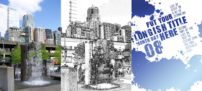
The photo ended up looking really cool as well: I desaturated it, hiked the contrast, then did a "Find Edges" filter on it. I ended up with a very neat-looking line drawing; unfortunately, the photo was from my old camera and just WAYYYYY too small to do anything cool with it. So, I brought it into Illustrator, live-traced it on the "detailed illustration" setting, then brought it back as vector art into Photoshop. Now I was able to enlarge it as much as I needed and wanted to without losing resolution. Here's an image of the 2 versions of the photo, and the original look of Kellie Mize's template:
And here's my layout, Another Beautiful Day (click for credits and larger version):

To get this effect, I put the gradient at the bottom of the layer stack, then just the splotches from Kellie's template, set to overlay. On the layer above that I put the line drawing of my photo, also set to overlay. Above that I put the text in multiply blending mode. To make the second portion of the journaling stand out better, I duplicated that part of the layer and put it on its own layer at the very top, then filled it with a much lighter gradient, gave it a slight outer glow with a dark color, and set the whole layer to Linear Dodge. I'm really in love with the way it turned out, if I do say so myself! *lol*
A lot of it seems really complicated and lock-step dependent (i.e., if you just do 1 or 2 of the things, you'll end up with something unrecognizable as a photo--you really need to do all of them to get somewhere). But, I did some fooling around, and came up with a pretty nifty way to jazz up a totally unremarkable bedroom background, as seen in the Flying Sitflop layout. One of the main concepts I finally grasped was the idea of doubling up layers, with one being blurred, and the other still crisp, and using varying degrees of opacity or layer modes to blend the two. In this particular layout I first extracted Allen, and duplicated that layer into a new document (for safe-keeping purposes). Then I desaturated the original photo, hiked up the contrast, duplicated it, blurred the bottom-most layer, then lowered the opacity on the top one to produce this kind of blurry crisp background that really gives the picture a neat dreamy effect. I think I did the same thing with the extraction of Allen as well, though what I was going after there was just the slightest halo effect--there's no opacity change for the figure, or else it wouldn't pop as it does... (click for credits and larger version).
The second layout I had a great deal of fun with tonight was inspired by the wonderful ad challenge freebie by Kellie Mize over at Designer Digitals. She offered up a grunged up, be-splattered background clipped to a blue gradient, with blue text in a very cool tilted cross pattern. She suggested completing all the typography work, then merging the layers together before clipping to a photograph (I think that's what she was suggesting!), but the photograph I chose really didn't work for that--there wasn't enough detail left and it was totally confusing. So I kind of changed the layers around a bit...
The photo ended up looking really cool as well: I desaturated it, hiked the contrast, then did a "Find Edges" filter on it. I ended up with a very neat-looking line drawing; unfortunately, the photo was from my old camera and just WAYYYYY too small to do anything cool with it. So, I brought it into Illustrator, live-traced it on the "detailed illustration" setting, then brought it back as vector art into Photoshop. Now I was able to enlarge it as much as I needed and wanted to without losing resolution. Here's an image of the 2 versions of the photo, and the original look of Kellie Mize's template:

And here's my layout, Another Beautiful Day (click for credits and larger version):
To get this effect, I put the gradient at the bottom of the layer stack, then just the splotches from Kellie's template, set to overlay. On the layer above that I put the line drawing of my photo, also set to overlay. Above that I put the text in multiply blending mode. To make the second portion of the journaling stand out better, I duplicated that part of the layer and put it on its own layer at the very top, then filled it with a much lighter gradient, gave it a slight outer glow with a dark color, and set the whole layer to Linear Dodge. I'm really in love with the way it turned out, if I do say so myself! *lol*
Saturday, June 7, 2008
Quickie: Colorizing Black and White Photos
Stefanie Eskander over at 2Peas just wrote an interesting method of colorizing a black and white photo using the "Tint" method featured in Photoshop CS3. Not having that available to me, I decided to see what variations I could come up with. Here are 3:

You should be able to click on the photo to read the text more legibly...

You should be able to click on the photo to read the text more legibly...
Friday, June 6, 2008
A New Camera (Oh, and Jamesie, Too!)
Ok you guys, I'm in 7th heaven... I just got a VERY advance birthday present from my ILs: a new camera! It's still a point and shoot (Casio Exilim Z1050), BUT it shoots in 10.1 megapixels, unlike the 3.1 on my old camera!! It also gives me all the readouts on Fstops and exposure and all this other stuff that I know nothing about, so perhaps I'll learn by osmosis. It's funny, but I've stayed away from photography most of my life because my eyes start crossing when I try and learn what the numbers mean. But here, I am sooooooooo in heaven... =) Looky looky! Ok, I still have to scrap in 8x8 to get this kind of good close-up, but wowwowowowowow! So fun! Fonts: Felix Titling and Garamond.
Thursday, June 5, 2008
Light Is Life - Layered Template Freebie
I was inspired by the blog post of Idea Books 4 U and made a sketch (actually, a layered template, albeit without drop shadows) as well as a layout using a kit that I'll be reviewing for the July SN&R: Modish Boy Collection by Shabby Princess Designs.
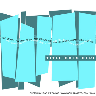
Here's the sketch (click on image to download):

And here's the layout:

Just a note: It's ok to be a bit crazy! For example, my photo wasn't big enough to fit some of the shapes in my template, and the width was too much. So I imported the photo for *each* shape, enlarged it where necessary, and only eyeballed approximate seams so that the left edge of the photo is on the left edge of the layout, and the right on the right, but the middle is stretched out a bit. Because of the nature of the photo (i.e., it doesn't matter to the eye here that the breaks are not quite lining up) it works out pretty well! You'll notice that I also moved things around (and even took some stuff out!), even from my own sketch! I never could leave well enough alone... *grins*
Thanks for looking!
Here's the sketch (click on image to download):

And here's the layout:
Just a note: It's ok to be a bit crazy! For example, my photo wasn't big enough to fit some of the shapes in my template, and the width was too much. So I imported the photo for *each* shape, enlarged it where necessary, and only eyeballed approximate seams so that the left edge of the photo is on the left edge of the layout, and the right on the right, but the middle is stretched out a bit. Because of the nature of the photo (i.e., it doesn't matter to the eye here that the breaks are not quite lining up) it works out pretty well! You'll notice that I also moved things around (and even took some stuff out!), even from my own sketch! I never could leave well enough alone... *grins*
Thanks for looking!
Wednesday, June 4, 2008
4-Meme
Vinnie Pearce tagged me for this meme:
4 jobs I've held
4 movies I could watch over and over
4 places i've lived
4 tv shows i like
4 people who e-mail me regularly
4 things i do every day without fail
4 favorite foods
4 places i'd rather be
4 people i'm tagging
And here's my take on it:
4 jobs I've held
4 movies I could watch over and over
4 places i've lived
4 tv shows i like
4 people who e-mail me regularly
4 things i do every day without fail
4 favorite foods
4 places i'd rather be
4 people i'm tagging
And here's my take on it:
Subscribe to:
Posts (Atom)