A lot of it seems really complicated and lock-step dependent (i.e., if you just do 1 or 2 of the things, you'll end up with something unrecognizable as a photo--you really need to do all of them to get somewhere). But, I did some fooling around, and came up with a pretty nifty way to jazz up a totally unremarkable bedroom background, as seen in the Flying Sitflop layout. One of the main concepts I finally grasped was the idea of doubling up layers, with one being blurred, and the other still crisp, and using varying degrees of opacity or layer modes to blend the two. In this particular layout I first extracted Allen, and duplicated that layer into a new document (for safe-keeping purposes). Then I desaturated the original photo, hiked up the contrast, duplicated it, blurred the bottom-most layer, then lowered the opacity on the top one to produce this kind of blurry crisp background that really gives the picture a neat dreamy effect. I think I did the same thing with the extraction of Allen as well, though what I was going after there was just the slightest halo effect--there's no opacity change for the figure, or else it wouldn't pop as it does... (click for credits and larger version).
The second layout I had a great deal of fun with tonight was inspired by the wonderful ad challenge freebie by Kellie Mize over at Designer Digitals. She offered up a grunged up, be-splattered background clipped to a blue gradient, with blue text in a very cool tilted cross pattern. She suggested completing all the typography work, then merging the layers together before clipping to a photograph (I think that's what she was suggesting!), but the photograph I chose really didn't work for that--there wasn't enough detail left and it was totally confusing. So I kind of changed the layers around a bit...
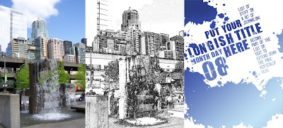
The photo ended up looking really cool as well: I desaturated it, hiked the contrast, then did a "Find Edges" filter on it. I ended up with a very neat-looking line drawing; unfortunately, the photo was from my old camera and just WAYYYYY too small to do anything cool with it. So, I brought it into Illustrator, live-traced it on the "detailed illustration" setting, then brought it back as vector art into Photoshop. Now I was able to enlarge it as much as I needed and wanted to without losing resolution. Here's an image of the 2 versions of the photo, and the original look of Kellie Mize's template:

And here's my layout, Another Beautiful Day (click for credits and larger version):
To get this effect, I put the gradient at the bottom of the layer stack, then just the splotches from Kellie's template, set to overlay. On the layer above that I put the line drawing of my photo, also set to overlay. Above that I put the text in multiply blending mode. To make the second portion of the journaling stand out better, I duplicated that part of the layer and put it on its own layer at the very top, then filled it with a much lighter gradient, gave it a slight outer glow with a dark color, and set the whole layer to Linear Dodge. I'm really in love with the way it turned out, if I do say so myself! *lol*
No comments:
Post a Comment
If you want an answer directly, please provide your e-mail, as I'm unable to access it... =) Thanks!